
隙間のある積層レンガに包まれた書店 - 中国のイタリア風景区に調和しつつ、伝統的な建築要素であるレンガを現代的に再解釈した〈天津鐘書閣〉

© SFAP

© SFAP
中国・天津に位置する〈天津鐘書閣(Tianjin Zhongshuge)〉は、イタリア風景区である敷地の周りに広がる赤レンガ建築に調和するよう、レンガを主な要素としつつ、ブラインドのように隙間を設けて配置された壁が特徴的な書店です。
アート作品のようなビジュアルと没入感のある空間体験を得意とする中国の女性建築家 李想(Li Xiang)が創設した設計事務所X+LIVINGが設計しました。
注目ポイント
- 敷地であるイタリア風景区の赤レンガ建築に調和する、レンガを用いた建築
- ブラインドの重なり合う構造を応用した、隙間のあるレンガ壁
- レンガという古典的な建築要素を分解・再構築し、新たな空間体験を創出
- 従来の形状にとらわれない、プロジェクト専用にカスタマイズされた約40万個のレンガ
- 伝統的な素材を現代的に再解釈し、文化の境界を超えた建築の可能性を提示
(以下、X+LIVINGから提供されたプレスキットのテキストの抄訳)

© SFAP

© SFAP
建築家 李想は次のように語る。
「このデザインは、建築物の物理的な境界を曖昧にすることを目的としており、それは、知識や認識の境界は曖昧であるが、精神的な核は明確で揺るぎないことを示唆している。」
「商業と文化のハイブリッドな性質をもつこの書店は、利益追求型の事業と公共の利益のための共有の境界を曖昧にする。それは、一般の人々に対して開放性とアクセスしやすさをアピールしている。境界は硬直性を意味するものではない。それどころか、私は境界には探求と論争が満ちていると考えている。定義を宣言する一方で、ギャップを残し、衝突や挑戦を招く余地も残している。」

© SFAP

© SFAP
建築とインテリアデザインの統合
このプロジェクトは天津のイタリア風景区に位置しており、周囲には赤レンガが特徴的な100年以上の歴史を有するイタリア建築群が立ち並んでいる。
既存の建物はモダンなデザインとなっており、周囲のクラシックな雰囲気とはかけ離れていた。そのため、建築とインテリアデザインを総合的に考慮するだけでなく、近隣の文化的な雰囲気にも適合させる必要があった。

© SFAP
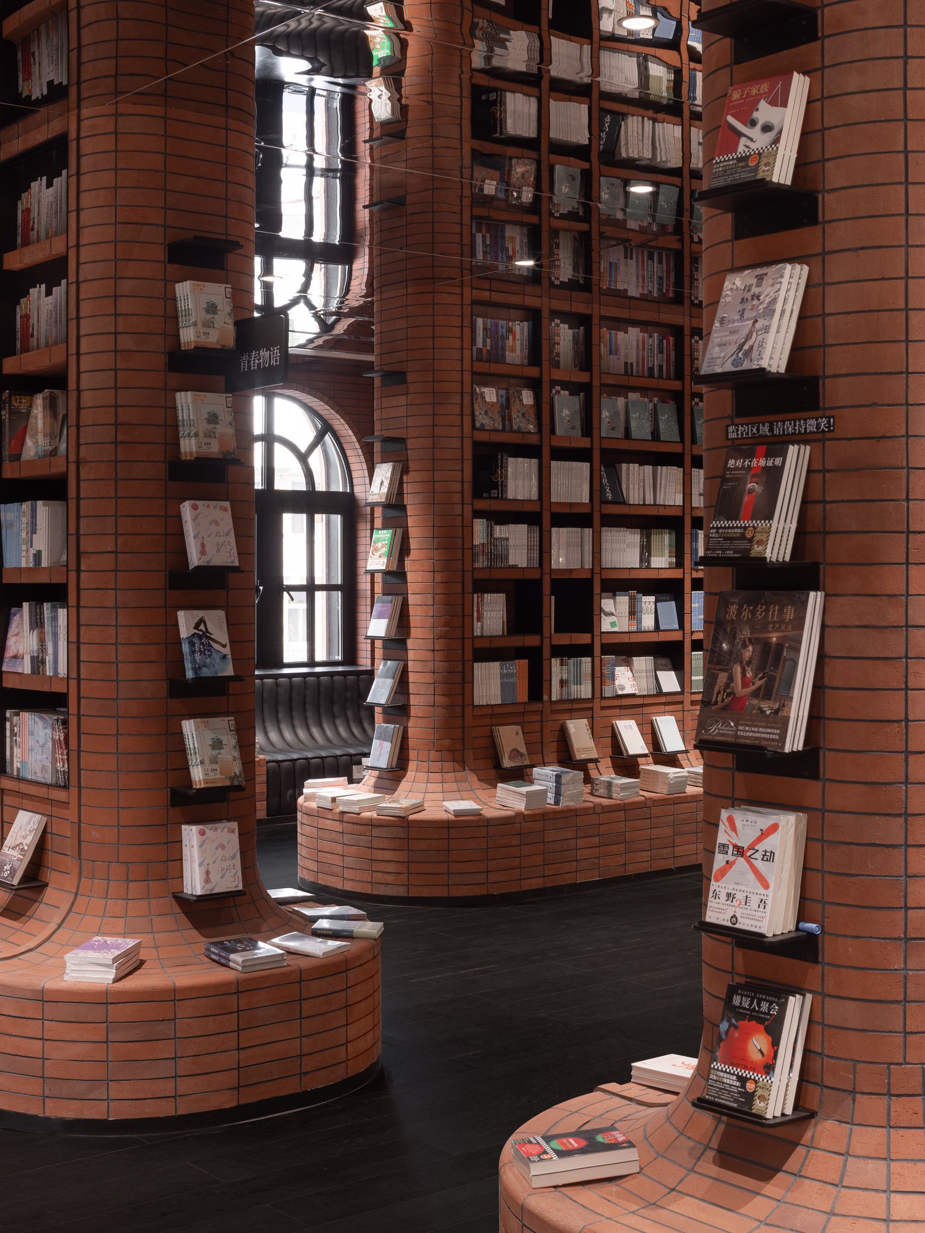
イタリア古典建築の重要な建築材料である赤レンガは、必須のデザイン要素となった。赤レンガの歴史は古代ローマ時代にまで遡る。
その用途の発展に伴い、赤レンガの使用はローマからイタリア半島全体へと徐々に拡大した。赤レンガの建物は、そのシンプルなスタイルと長い歴史により、イタリア文化を知るための重要な入り口となっている。

© SFAP
© SFAP
デザイナーは、中国とイタリアという2つの文化背景から赤レンガの共通する建築的意義を抽出し、この素材に内在する職人精神を表現した。
レンガの彫刻や積み重ねに見られる緻密な職人技は、空間の繊細さを考慮し、また、急速な時代の流れの中で、人々に立ち止まることを意識させることを試みている。読書も同じである。言葉の1つ1つを読み、考えを巡らせることによってのみ、自分の精神の安定を見出すことができるのである。

© SFAP
抽象を具象に注ぎ込む
このプロジェクトは、ブラインドという身近な物体から着想を得て、未知の知覚を抽出している。
ブラインドの羽根を通過した光は糸のように細分化され、光と影が絡み合う。デザイナーはブラインドの重なり合う構造におけるカッティング技術に着目し、それを書店の建設プロセスに取り入れた。

© SFAP
従来は密に積まれるレンガの壁にブラインドのような隙間を取り入れることで、素材の質感が重厚なものから軽快なものへと変化し、仮想と現実の相互浸透という視覚効果を生み出し、空間を透明かつダイナミックに演出している。
積層に分節の論理を介入させるという設計戦略は、古典的な建築要素を分解し再構築するという芸術的な実践であるだけでなく、深い伝統的建築言語の枠組みの中で、独自に思考し、革新を追求するという姿勢を強調するものでもある。

© SFAP
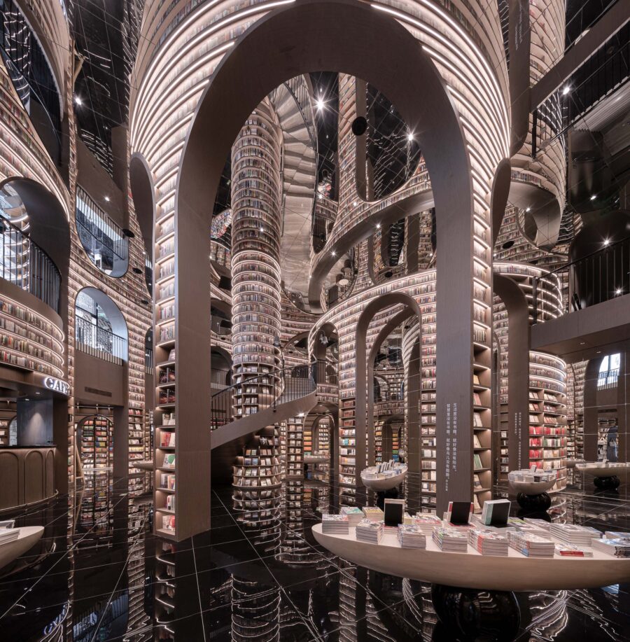
建物の中心には、天津港の海水から抽出した色調の濃紺の鋼材が何層にもわたって広がり、繊細なカッティング形状はうねるような波を表現し、あらゆる河川を受け入れる海の精神と天津の都市の気質を表現している。
大きなアーチ型の入り口は、まるで波紋とともに潮が押し寄せるかのように上に向かって広がり、書籍を通じて知識が普及し広がっていくことを象徴している。

© SFAP
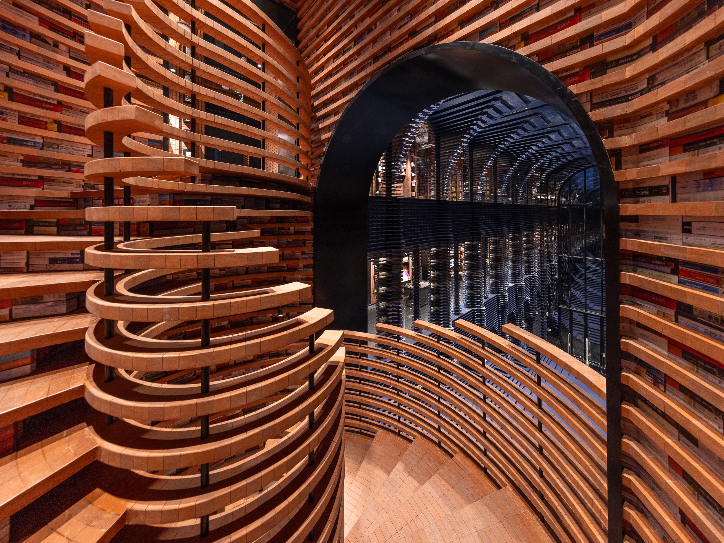
書店に一歩足を踏み入れると、階段の層が次々と現れ、延び、深まっていく。書店のメインスペースへと移動するには、この階段を上らなければならない。これは、人類が真理を絶え間なく追い求めることを比喩的に表現している。
身体が動くと、精神は本を通じて旅をし、身体と精神を共に追求していく。階段は本棚へと続き、その伸びやかな形状は、船が出航し、深みに向かって進んでいくという港町の地域的特性を暗示している。

© SFAP
伝統的な素材と新しい境界
〈天津鐘書閣〉は、補完する鉄骨とレンガのみで構成されており、余計な介入は一切ない。
現代の工業的な強度をもつスチールが、レンガのクラシックな魅力と調和し、暖色と寒色のコントラストが視覚的な緊張感を生み出している。

© SFAP
素材の織り交ぜ方やずらし方は、単に物理的な構造として存在するだけでなく、本棚の形状にも活かされている。これらの本棚は、空間とともに自然に広がり、座席や階段のレイアウトへとスムーズにつながっている。
機能的なレイアウトは自然に形づくられ、デザインの高い統合性と調和的な共存を反映している。このように、展示、休憩、動線などの多様な機能は、一貫したデザインロジックによって統合され、各要素は独立しながらも密接に結びついている。

© SFAP
建築技術の面では、組み立ての論理は最小限に抑え、レンガは1つずつ積み上げ、鋼板は段階的に重ねられている。壮大な建築物は、最終的には2つの素材と1つの動作から始まる。それは、愚者が山を動かして大きな仕事を成し遂げるというようなものである。
リングの連結、層状の入れ子、小さな努力の積み重ねが、大きな成果につながる。もし、あるレンガや層を交換したい場合は、現在の建設シーケンスの最後から逆に解体する必要があり、建設者には間違いなく高い集中力と精度が求められる。
ここでは、レンガや鉄骨といった構造材が、装飾により隠されるのではなく、繊細な空間表現に用いられ、建築の精神を直接的に表現するものとなっている。

© SFAP

© SFAP
レンガに対するまったく新しいビジョン
一般的な長方形のレンガは規則的で単調であり、伝統的な積み方では、ある程度のパターンは表現できるものの、どうしても形式的な感覚に縛られてしまう。
私たちは彫刻的な視点からレンガの形状の輪郭を精査し、伝統的な硬直した形への挑戦を行った。
最終的に、このプロジェクト全体で約40万個のレンガが使用された。それぞれのレンガは異なるニーズに合わせて細かく設計されており、素材に豊かな表現力とミクロレベルの変化を与えている。

© SFAP

© SFAP
レンガの形状は、この書店のために特別に設計されたものであり、カスタマイズされた設計ソリューションにより、材料の反復が必要となった。書店の全体的なスタイル、空間レイアウト、機能要件に基づいて、さまざまな形状とサイズのレンガが設計された。
最初のコンセプトスケッチから詳細な3Dモデルの構築まで、デザインチームは実際の使用時に細部まで完璧に表現されるよう、さまざまな状況を予測し、それに対応できるよう、数えきれないほどのシミュレーションと検証を行った。
© SFAP
本棚を例にとると、異なる方向からの視認性を考慮しつつ、下部には本を置ける連続したテーブルが設計され、曲線状の輪郭で変化している。
このエリアのレンガはすべて台形であるがサイズが異なり、それぞれのサイズに対応するため別の型が必要となる。そのため小さなスペースでも、コストをかける必要がある。

© SFAP
型破りなデザインは、メーカーに思考の転換を求め、惰性的な思考から脱却し、経験に頼らずに物事に取り組むことを要求する。
レンガの形状のニーズを説明し、微細な違いを強調するため、デザインチームは1つのレンガについて、上面図、断面図、ノード図をさまざまな角度から提供する必要がある。またレンガの製造においては、職人が手作業で1つ1つをカットし、形状が設計要件を満たしていることを確認する必要がある。

© SFAP
建築物の物理的な性質をぼかすようなカッティング技術を用いることで、人間の認知の限界もまた曖昧であることを比喩的に表現している。
レンガという素材をめぐる新たな探求は、テクノロジーへの重点を軽減し、形そのものについて考えることに立ち戻ろうとするものである。デザインは西洋の古典建築の空間的言語を解体し、職人技の核心を地域の文化と融合させ、最終的には都市そのものの感情的な物語を表現している。
© SFAP

© SFAP

© SFAP

© SFAP

© SFAP

© SFAP

© SFAP

© SFAP

© SFAP

© SFAP

© SFAP

1F Plan

2F Plan

3F Plan
以下、X+LIVINGのリリース(英文)です。
The design aims to blur the physical boundaries of the architecture, suggesting that the boundaries of knowledge and cognition are vague, yet the spiritual core is clear and resolute. Just as the bookstore’s hybrid nature of commerce and culture dissolves the boundary between profit-oriented operations and public-spirited sharing. It appeals to an openness and accessibility to the public. The boundary does not represent rigidity; on the contrary, I believe it is filled with exploration and contention. While it proclaims a definition, it also leaves room for gaps, inviting conflict and challenge to occur.
—— Li XiangIntegrated Architecture and Interior Design
Classical Under the Discourse of InnovationThe project is located in the Italian-style district of Tianjin, surrounded by a century-old Italian architectural cluster characterized by red bricks. The original site is a modern building that is detached from the surrounding classical context, and the Tianjin Zhongshuge needs to be rebuilt. This not only requires integrated consideration of individual architecture and interior design but also needs to fit into the cultural atmosphere of the neighborhood.
Red brick, as an important construction material in Italian classical architecture, becomes a required design element. The history of red brick can be traced back to the ancient Roman period. With the development of its application, the use gradually expanded from Rome to the entire Italian peninsula. Red brick buildings, with their simple style and long-standing heritage, have become an important window for people to explore Italian culture.
The designer extracts the common constructive significance of red bricks from the dual cultural context of China and Italy, pointing to the spirit of craftsmanship inherent in the material. The meticulous craftsmanship of brick carving and stacking considers the subtlety of space, and also tries to remind people to be conscious of slowing down in the fast-paced era. Reading is the same; only by reading and contemplating word by word can one find the stability of their own spirit.
Infuse the Abstract into the Concrete
Carve the TangibleThe project draws inspiration from the familiar everyday object of blinds, extracting a sense of unfamiliar perception. Light passing through the slats is separated into threads, intertwining light and shadow. The designer observes a cutting technique in the overlapping structure of the blinds and translates it into the construction order of the bookstore.
The gaps of the blinds are introduced into the originally dense brickwork, transforming the material texture from heavy to light, creating a visual effect of interpenetration between the virtual and the real, making the space transparent and dynamic. The design strategy of intervening in the stacking technique with a cutting logic is not only an artistic practice of disassembling and reassembling classical architectural elements but also emphasizes the persistence in independent thinking and the pursuit of innovation within the framework of profound traditional architectural vocabulary.
In the center of the building, layers of dark blue steel are spread out, with the color extracted from the seawater of the Tianjin port, and the more delicate cutting form corresponds to the undulating waves, interpreting the spirit of the sea that embraces all rivers and the urban temperament of Tianjin. The large arched doorways progress upwards, as if the tide is surging with ripples, symbolizing the dissemination and spread of knowledge through books.
As soon as one steps into the bookstore, the layers of steps rise, extend, and deepen. One must ascend the steps to transition into the main body of the bookstore, metaphorically representing the relentless pursuit of truth by humanity. As one’s physical steps move, the spirit journeys through books, with body and mind pursuing together. The steps extend into bookshelves, and the progressive form implies the local characteristics of the port city—ships setting sail, diverse thoughts carried by the sea, moving towards the depths, thus the path always moves forward.
Traditional Material and New Boundary
Innovative Redefinition of Brick ApplicationSimplicity: Using Only Two Main Materials
The entire main body of Tianjin Zhongshuge is completed solely with bricks, complemented by ironwork, without any superfluous intervention. Steel, with its modern industrial strength, harmonizes with the classical charm of red bricks, and the collision of warm and cool tones displays a visual tension.
The interweaving and staggering of materials not only exist as a physical structure but also give birth to the form of bookshelves. These bookshelves naturally extend with the space, smoothly guiding the layout of seats and steps. The functional layout naturally takes shape, reflecting the design’s high level of integration and harmonious coexistence. Thus, diverse functions such as exhibition, rest, and traffic flow lines are integrated through a consistent design logic, with each element being both independent and closely connected.
In terms of construction technology, the logic of assembly is minimalist, with bricks being stacked one by one and steel plates layered progressively. The grand building ultimately begins with two materials and one action, akin to the determination of Mr. Fool moving mountains to accomplish a huge task. Interlocking rings, nested layers, and the accumulation of small efforts lead to significant outcomes. If one wishes to replace a certain brick or layer, it would require disassembling from the end of the current construction sequence in reverse, which undoubtedly demands a high level of concentration and precision from the builders.
Here, bricks and steel, these structural building materials, are used for delicate spatial expression, no longer hidden beneath decoration as just another “material,” but becoming a direct expression of the spirit of construction.
Innovation: A Whole New Vision for Bricks
Common rectangular bricks are regular yet monotonous, and traditional laying techniques, though they can show certain patterns, are inevitably bound by a sense of formality. We scrutinized the contours of the brick shape from a sculptural dimension, completing a rebellion against the traditional rigid form. In the end, the entire project used about 400,000 bricks, with each type of brick finely confirmed according to different scale needs, endowing the material with a rich range of expressions and micro-level changes.
Each shape of brick was designed specifically for this bookstore, with a customized design solution that retroactively demanded the iteration of materials. Based on the overall style, spatial layout, and functional requirements of the bookstore, bricks of different shapes and sizes were designed. From the initial conceptual sketches to the construction of detailed three-dimensional models, the design team conducted countless simulations and validations to ensure the perfect presentation of every detail in actual application, while also anticipating and addressing potential various situations.
Taking a single bookshelf as an example, considering the visibility needs of the bookshelf from different directions, a continuous book-placing table was designed at the bottom, transitioning with a curved contour. The transition trend extends to an increasing area, making the bricks in this area, although all trapezoidal, vary in size, and each size requires a separate mold. Even in a small space, there is an undeniable investment.
The unconventional design requires the manufacturer to keep up with the thinking, break away from inertial thinking, and try to do things without any experience to draw upon. In order to illustrate the needs of the brick shape and emphasize subtle differences, the design team may need to provide top views, cross-sections, and node diagrams from different angles for a single brick. The production of bricks requires craftsmen to cut each one by hand to ensure the shape meets the design requirements.
By using cutting techniques to blur the physicality of architecture, it metaphorically conveys that human cognition boundaries are also vague, which is why we need to seek clear insights from reading. The new exploration around brick materials tries to reduce the emphasis on technology and return to thinking about the form itself, fundamentally and originally innovating the material. The design deconstructs the spatial vocabulary of Western classical architecture, translates the core of craftsmanship with local culture, and ultimately it is the emotional narrative of the city itself.
Project Name丨Tianjin Zhongshuge Bookstore
Project Location丨Tianjin, China
Project Area丨1821m²
Design Company丨X+Living
Completion Time丨2024.9
Chief Designer丨Li Xiang
Technical Director丨Wu Feng
Project Director丨Cui Zehuan
Designer丨Chengqing Zhang Zhiyu Xiao Yuting
Photographer丨SFAP
X+LIVING 公式サイト
http://www.xl-muse.com/index.php?ac=article&at=read&did=373