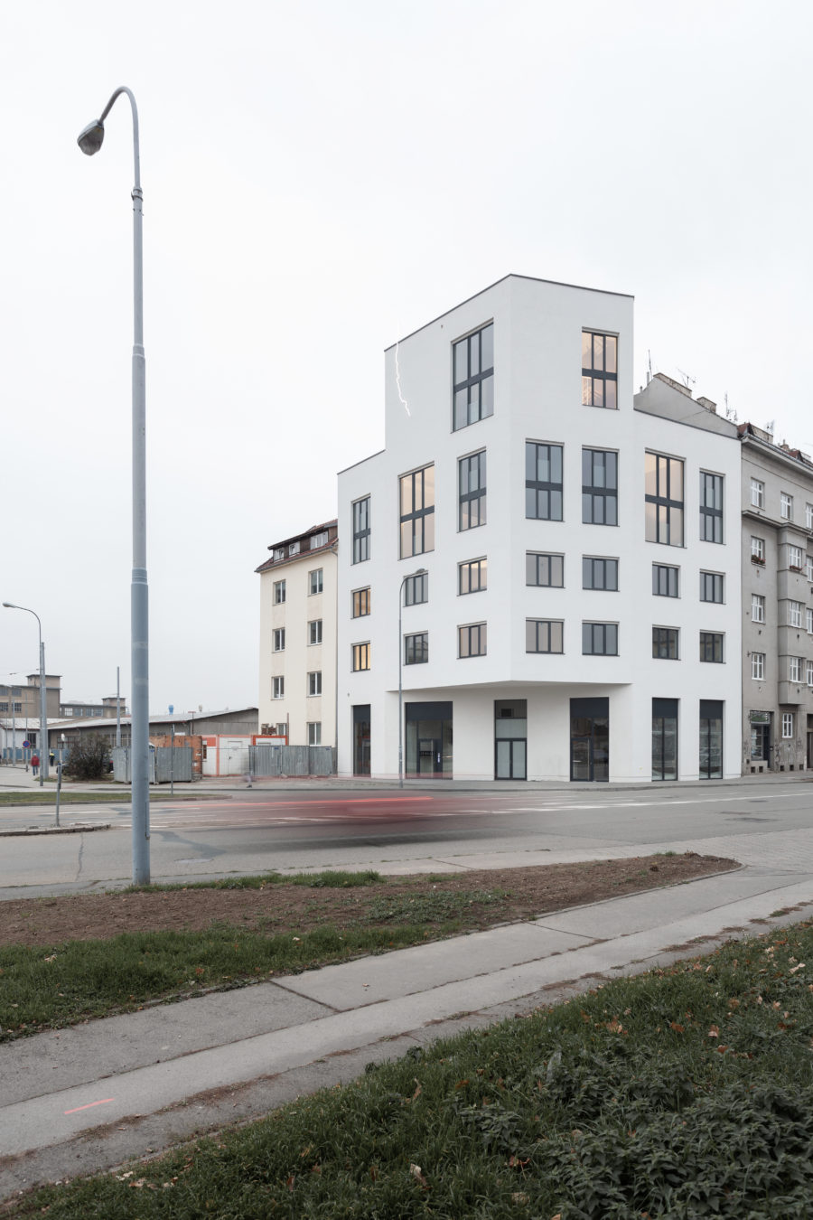
新宿東口アルタ前の広場から視認できる一等地にヒューリックの商業シリーズ「HULIC & New」として計画。「何色も拒まないような透き通る美しさ」をもった白いPCパネルを反復させたファサードが特徴である。
新宿区東口地区計画の第1号として斜線緩和を活用。歌舞伎町区役所通りへと続くMoa5番街に面し周辺は世界有数の繁華街であり袖看板が文化的特徴となっている。
コアテナントが決定していた1〜4階、新宿区東口地区計画上のガイドラインである100尺ライン、100 m²区画の合理的なボリュームである10〜12階、3つのセットバックを隅切りのある平面形状のまますることでボリュームを分節反復させ建物全体のボリュームをリズミカルに一体感のあるものとするとともに、高さのある建物の周辺に対する圧迫感を軽減し周辺環境との調和を図った。
隅切りと並行な白いPCパネルを屋外避難階段から2m範囲の耐火壁として挿入し、反復させることで袖看板が並ぶ街並みと呼応しつつ、品格をもって商業施設で必要な視認性を確立させた。
セットバックによって生み出された3つのバルコニーには植栽を行い、インテリアと街並みへ潤いを提供。ファサードにはLow-e複層ガラスを採用して縦強調のサッシが西日を遮る。
商業施設ではあるがヒューリックブランドとして最大限の環境配慮を採用し、これからの商業施設のベンチマークとなることを願う。(櫻井建人)
A dignified commercial facility with white panels and a glass façade
This building is one of a commercial series, HULIC & New, which is highly visible from the plaza in front of JR Shinjuku Station’s east exit. The building next door is the famous Kinokuniya Bookstore, which is designed by Kunio Maekawa.
As a leading project for the district plan of Shinjuku-Station-East-Exit-Area and due to the deregulation, the staggering stories of the building are effectively utilized.
It faces MOA 5 ban-Gai-Street, which leads to the Kabuki-cho and Kuyakusho (Shinjuku Ward Office) Dohri Street area, one of the most bustling shopping and entertainment districts significantly featured with many projecting signs recognized as a cultural characteristic.
The aim of the architect is to take advantage of the shape of the building site, which has a chamfered corner. The lower volume of the building occupies the whole site for profitability. This type of building shape is often seen in traffic corners, but designers must have been struggling with the design.
There are three volumes; The first volume is from the ground floor to the fourth floor, which had already a main tenant from the beginning. The second volume is from the 10th to the 12th floor, which is the limit of the 31m line for the height of the facade in this district. The third volume is the rest of the floors with 100m² restrictions on fire protection. These three volumes of the building are stacked on top of each other. The part which setbacks from the corner is also chamfered to let the volumes make rhythmical and to reduce the impact on the surroundings and create a harmonized appearance in the cityscape.
The white precast concrete panels parallel to the chamfered corner placed on the exterior are repeated as a firewall 2m away from the exterior emergency stairs so that the façade responds to the projecting signs around the building. At the same time, the building wins a powerful presence.
The balcony, which was created from the gap in the volumes, is covered with plants to provide greenery to the building inside and to the city. At the façade, the architect developed a doubled glassed Low-e structure only with a horizontal joint sealing to emphasize the verticality of the curtain wall made of steel. The vertical rib prevents the afternoon sun.
This project is a commercial building for the HULIC brand image. The architect pays attention to the environmental concerns and wishes that it will set a new benchmark for the commercial spaces. (Tatehito Sakurai)
【HURIC &New SHINJUKU】
所在地:東京都新宿区新宿3-17-10
用途:その他商業施設
クライアント:ヒューリック
竣工:2021年
設計:ETHNOS
担当:櫻井建人、夏井 俊
構造設計:Arup
機械設備:イーエスアソシエイツ
電気設備:環境トータルシステム
施工:大成建設
撮影:Takashi Nakamura(kkpo)
工事種別:新築
構造:鉄骨造
規模:地上12階
敷地面積:393.73m²
建築面積:344.81m²
延床面積:3408.31m²
設計期間:2017.06-2019.06
施工期間:2019.07-2021.05
【HURIC &New SHINJUKU】
Location: 3-17-10, Shinjuku, Shinjuku-ku, Tokyo, Japan
Principal use: Commercial facilities
Client: Hulic
Completion: 2021
Architects: ETHNOS
Design team: Tatehito Sakurai, Toshi Natsui
Structure engineer: Arup
Mechanical equipment: ES ASSOCIATES
Electrical equipment: KANKYO Total System
Contractor: TAISEI CORPORATION
Photographs: Takashi Nakamura / kkpo
Construction type: New Building
Main structure: Steel
Building scale: 12 stories
Site area: 393.73m²
Building area: 344.81m²
Total floor area: 3408.31m²
Design term: 2017.06-2019.06
Construction term: 2019.07-2021.05


