ファレル・レイ・アーキテクツがオーストラリアに手がけた、樹木をつつみ校舎をつなぐ歩道橋兼ギャラリー〈マーセリン・フライオーバー・ギャラリー〉
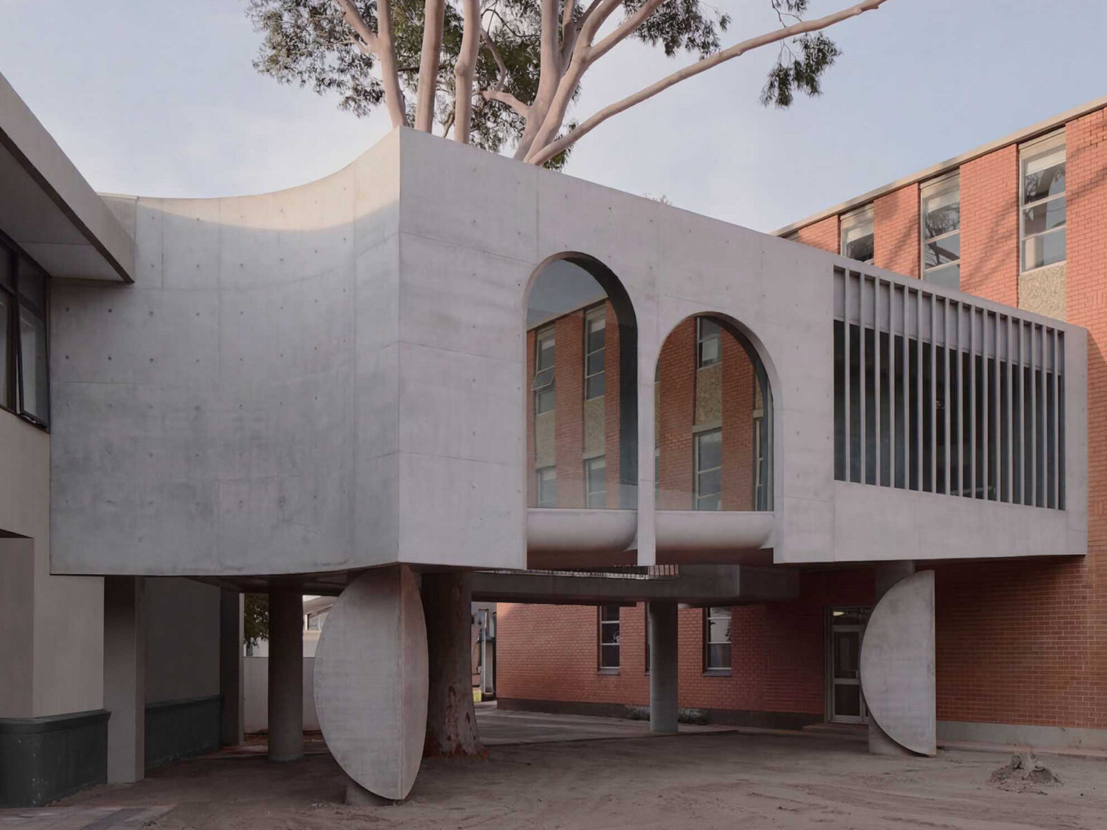
〈マーセリン・フライオーバー・ギャラリー(Marcellin Flyover Gallery)〉は、オーストラリアのマーセリン・カレッジにファレル・レイ・アーキテクツ(Farrell Wray Architects)が設計した、2つの校舎を連結する高架歩道橋兼ギャラリーです。
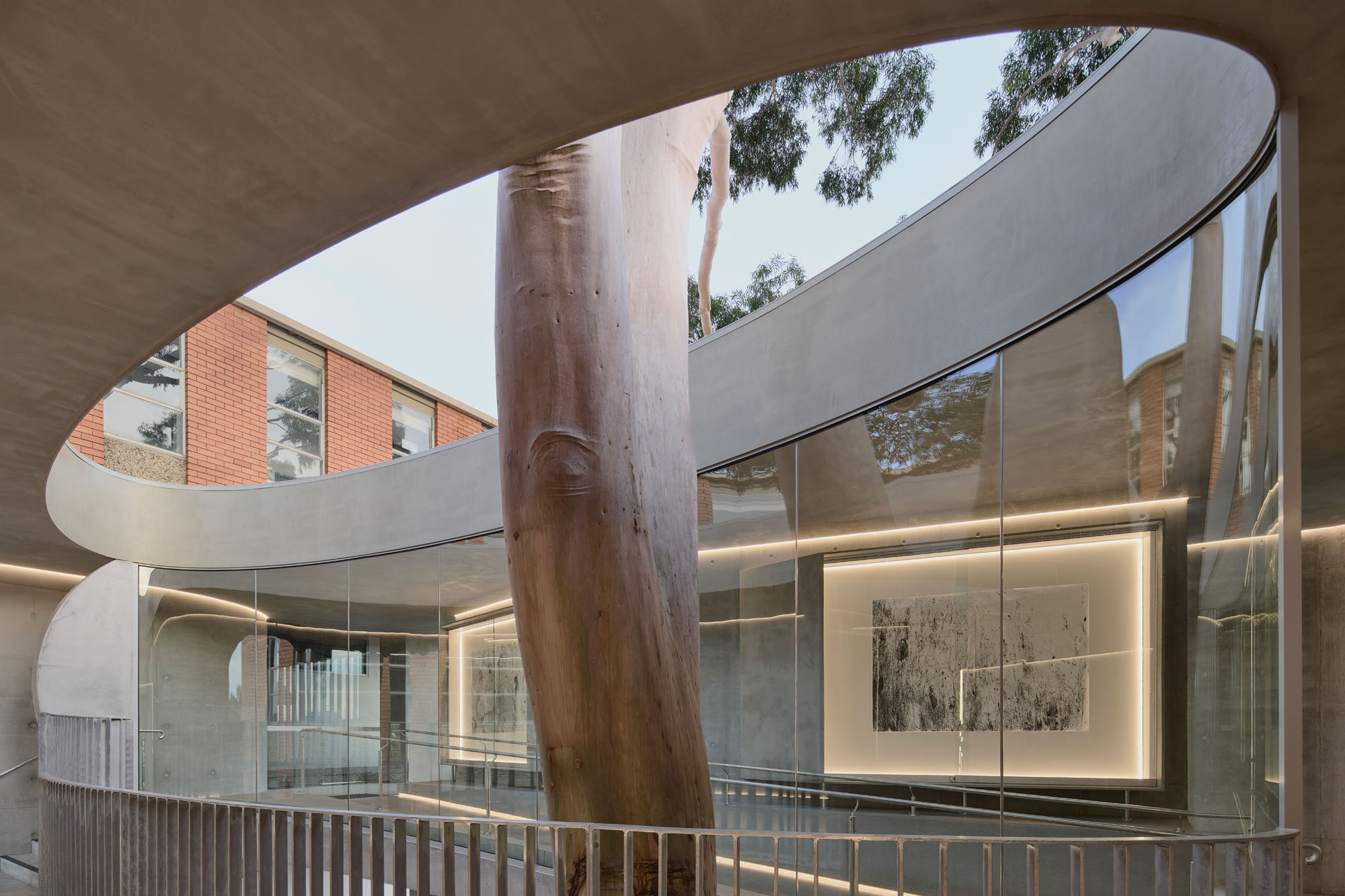
敷地にそびえ立つ1本のユーカリの木を主役に据え、それを楕円形に包み込むように計画された、自然の有機性と建築の幾何学が対比する空間となっています。
注目ポイント
- 単なる移動通路にとどまらない、生徒たちの集いや内省、アート展示の場
- 学校の新たなビジュアル・アイデンティティの確立
- 根系を傷つけない、スキャン調査などによる高度な基礎設計
- アートや歴史的な文脈を組み込む空間構成
(以下、ファレル・レイ・アーキテクツから提供されたプレスキットのテキストの抄訳)
©︎ Peter Clarke
©︎ Peter Clarke
プロジェクトの背景:ビジュアル・アイデンティティの刷新
このプロジェクトの構想は、2013年から2015年にかけて、ブレイブルックにあるキャロライン・チザム・カレッジ(Caroline Chisholm College)で始まった。当時も現在もクライアントである校長のマルコ・デ・チェザーレ(Marco De Cesare)のために、私たちは高架構造の最初の案を設計した。このプロジェクトは、同校にとって斬新かつ高く評価されるビジュアル・アイデンティティとなった。
このデザインは、ブレイブルックやフットスクレイ一帯の公共の看板や学校の刊行物に掲載されたほか、建築メディアを通じて国際的にも紹介された。プロジェクトの成果と、中庭の景観に対する大規模な改修が相まって、同校の生徒数は増加し、新たな希望と誇りが生まれた。
©︎ Peter Clarke
©︎ Peter Clarke
©︎ Peter Clarke
敷地の状況:2つの校舎をつなぐ中庭と1本の樹木
〈マーセリン・フライオーバー・ギャラリー〉の敷地は、2つの建物を結ぶ既存の屋外歩道橋である。東側には、1963年に建設されたこの敷地で最初の建物である高等部の教育・学習棟があり、西側には7年生と8年生が通う中等部の校舎がある。アスファルト敷きの中庭の端、2つの建物の間には、見事なユーカリの木がそびえ立っており、この中庭は同校の主要な集いの場となっていた。
©︎ Peter Clarke
©︎ Peter Clarke
デザインの起点:ユーカリの木との対話
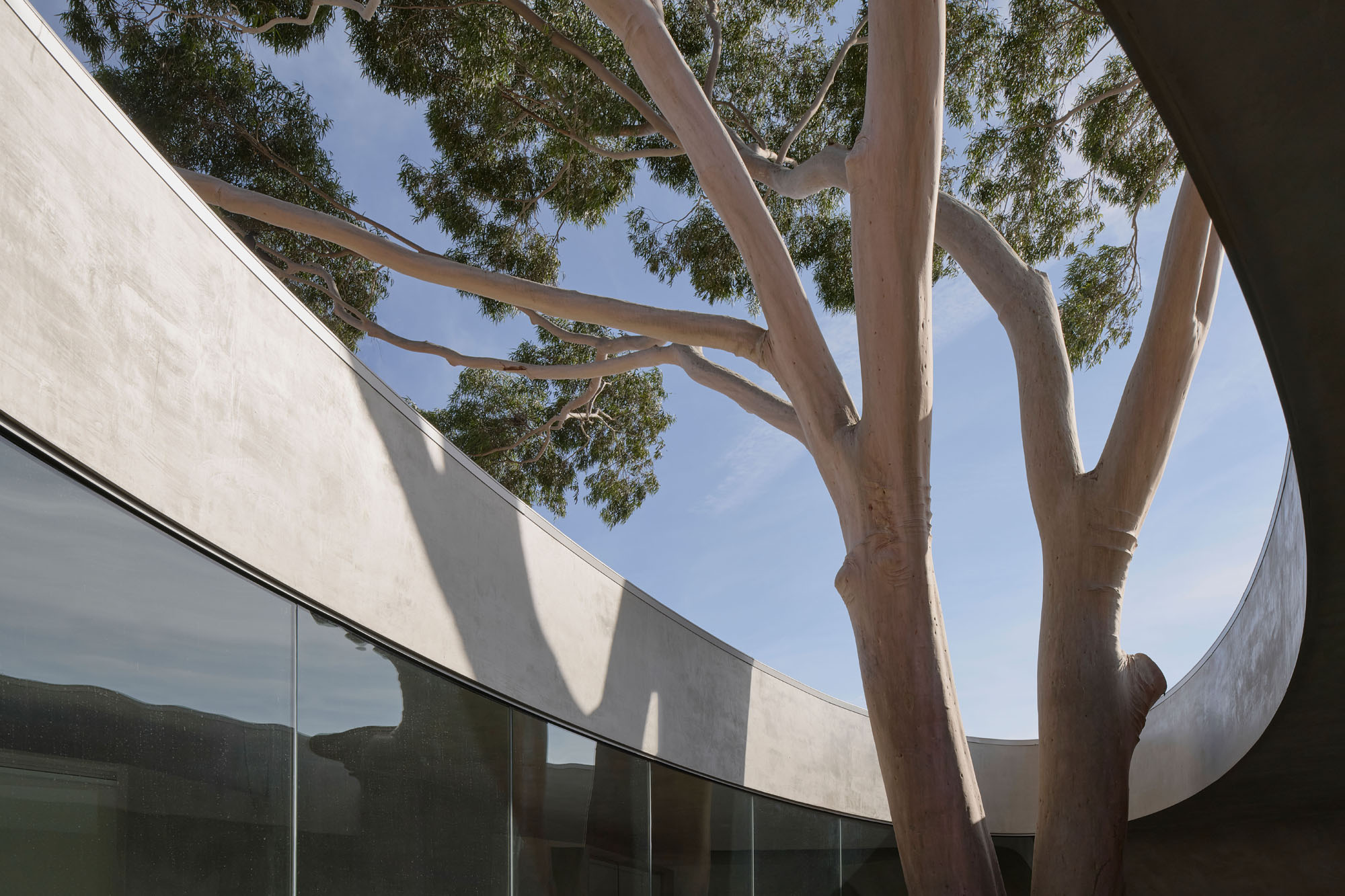
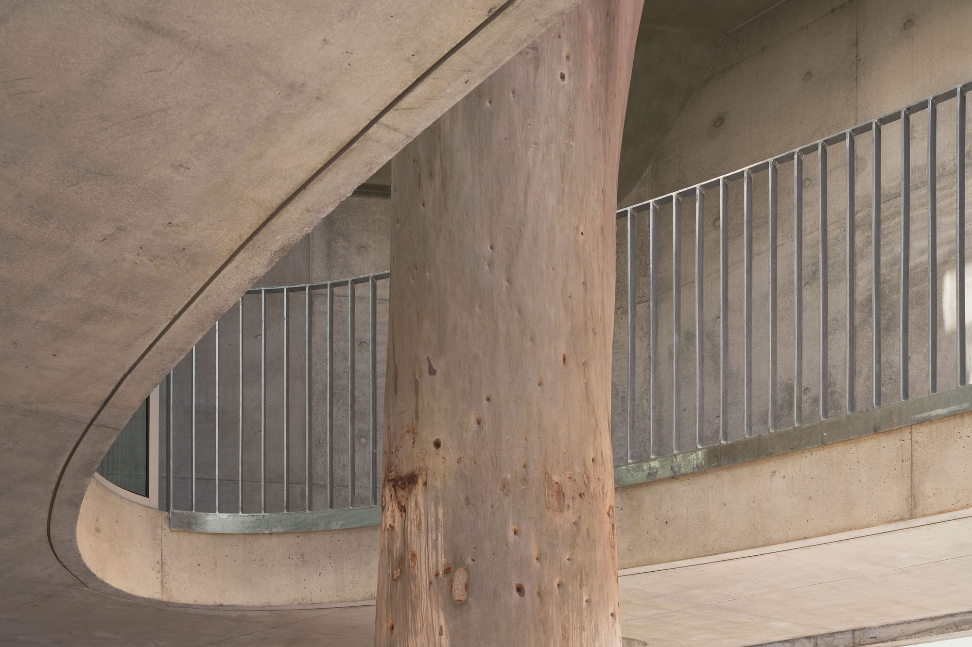
私たちがカレッジに最初に提示したイメージは、このユーカリの木を楕円で囲んだものであった。これは、プロジェクトの中心点としてこの木を際立たせるために、まったくの偶然から生まれたものであった。
新しい高架歩道橋がこの木と直接的な関係をもつことは、私たちにとって非常に重要であった。そこでまず、どのようにしてこの木をフレームに収めるかの検討から始めた。これは、木をプロジェクトの中心とするために、木を取り囲み、包み込むような手法へと発展していった。初期の一連のスケッチは極めて有機的な形で進化し、その結果、木がもつ有機的な性質と、それを取り巻く建築的アプローチとの関係について疑問が生まれた。私たちは、単なるパロディをつくるのではなく、形式的な幾何学と、木がもつ有機的な幾何学との対比を生み出すことに興味を抱いていた。
©︎ Peter Clarke
地上平面における庭園としての楕円
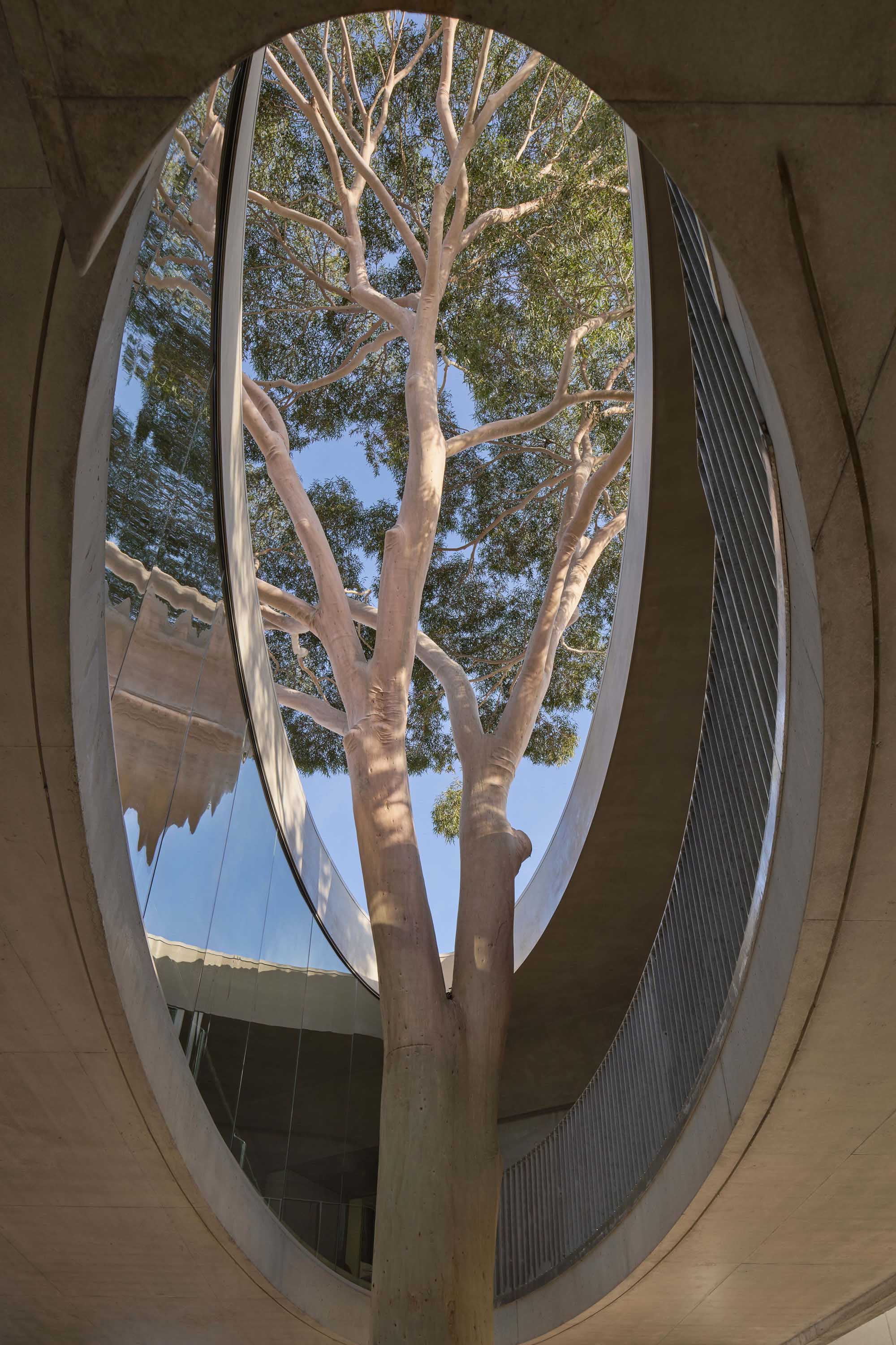
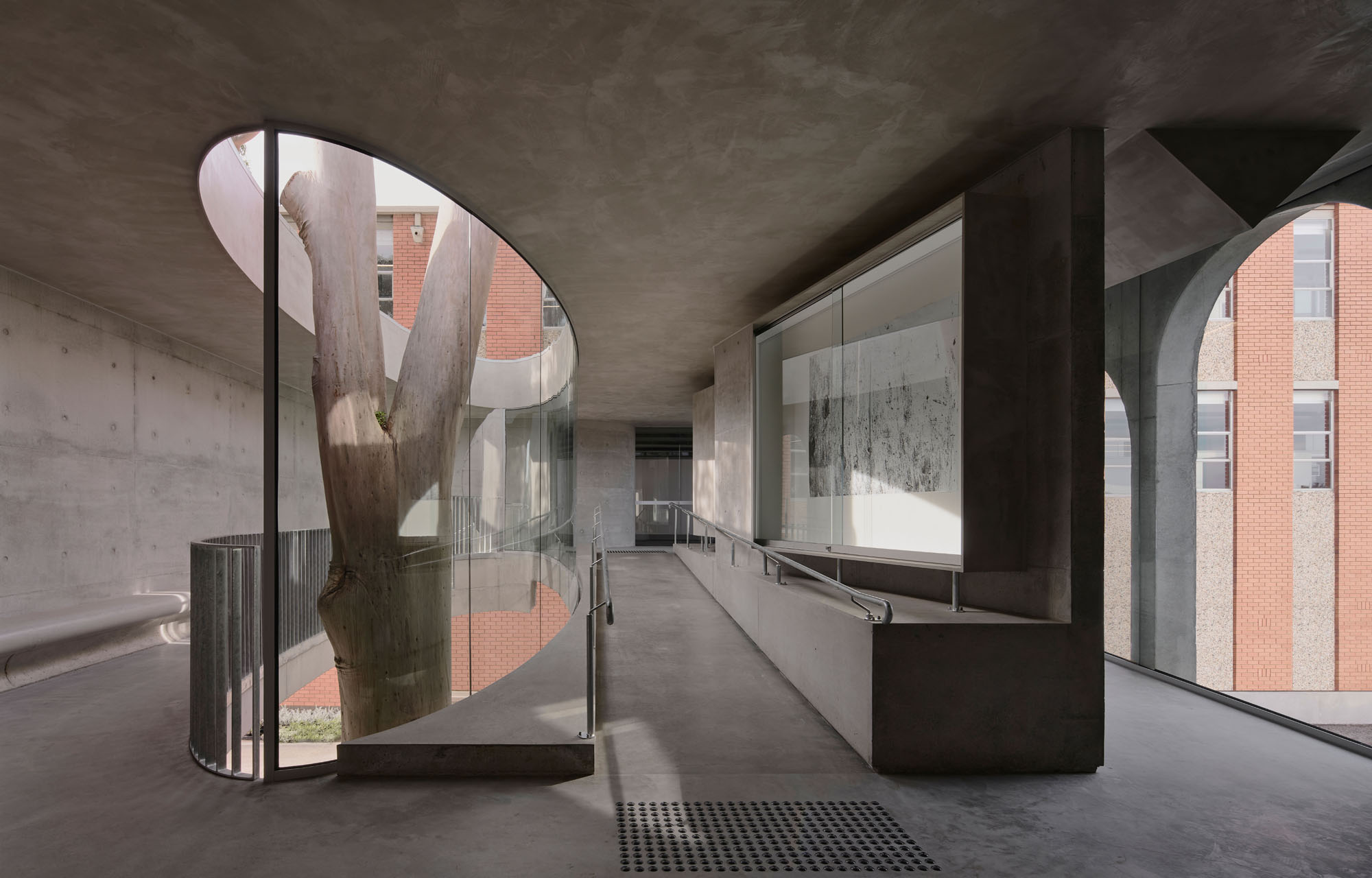
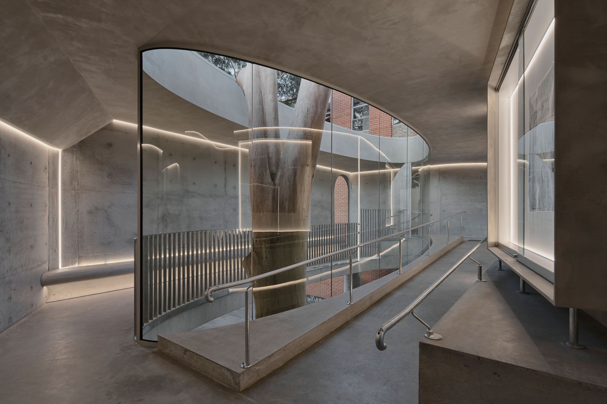
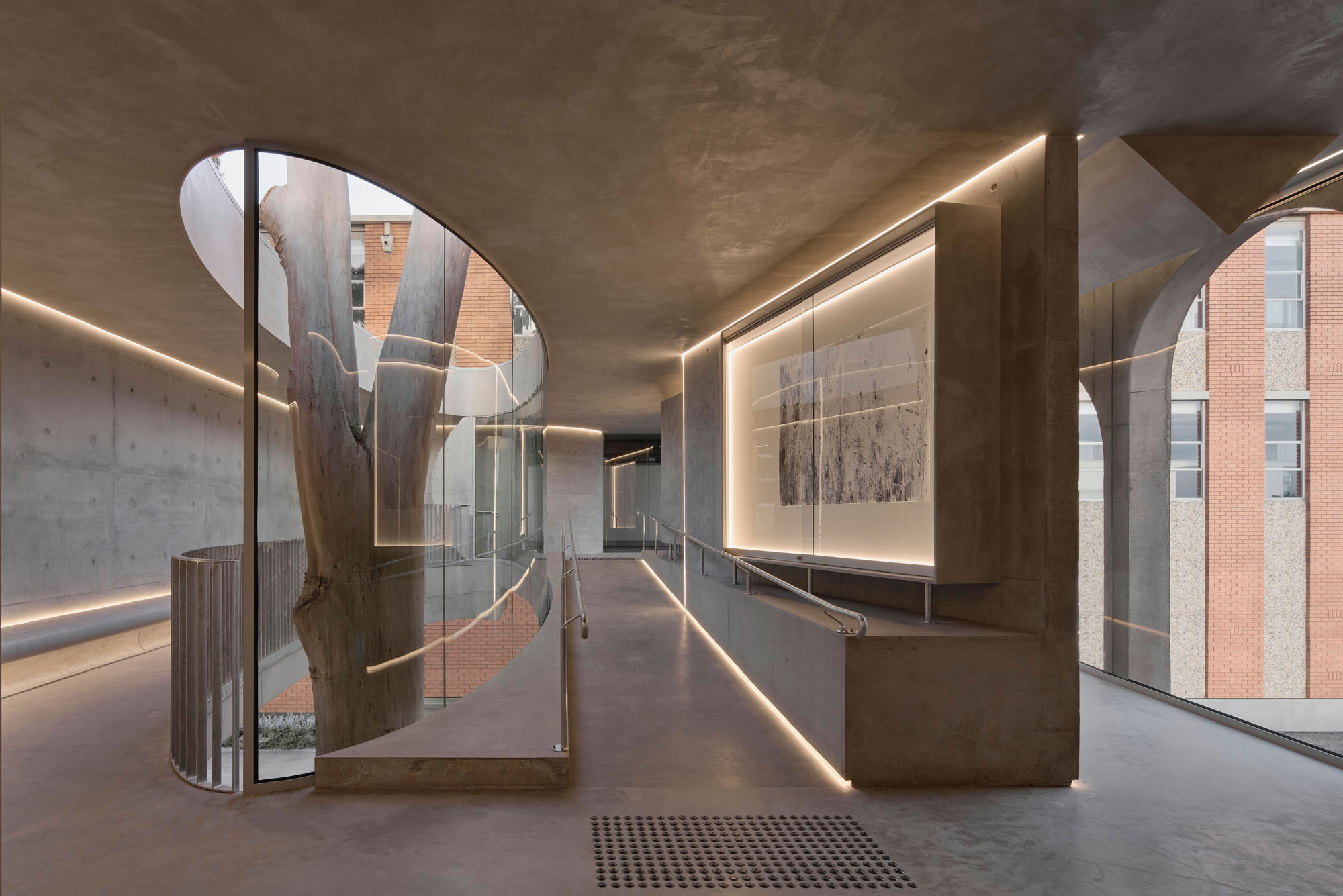
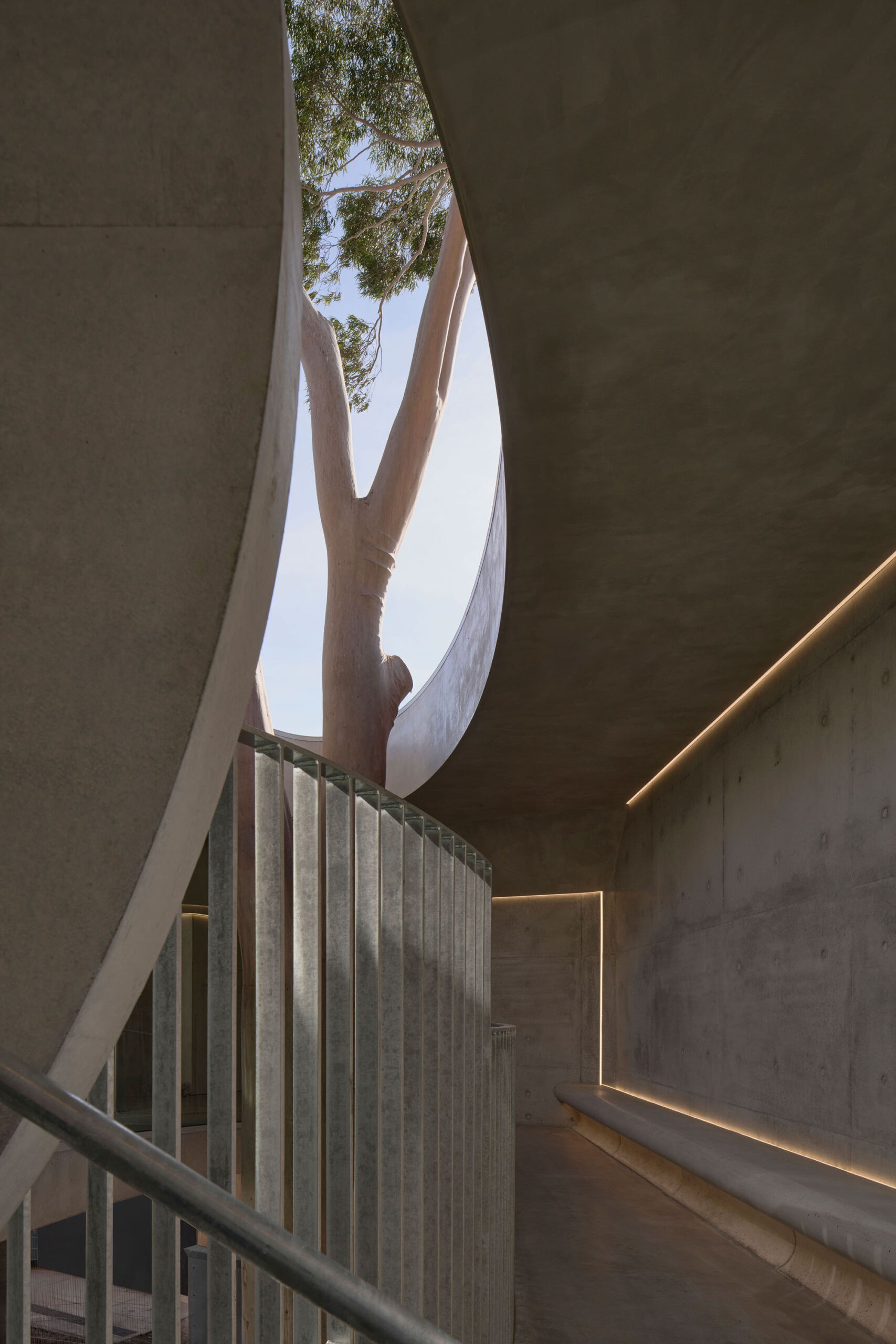
平面図上の構成要素の展開として、出発点は木の幹であり、そこから木を取り囲む楕円が生まれた。楕円は木を取り囲んでいるが、その境界は明確である。これは空間内における、非常に意識的な階層的・構成的な決定であった。また、生徒たちが物理的に木に近づけるようにしたかったため、手を伸ばして触れたければ、そうできるようにした。この楕円は、プロジェクトのさまざまな平面で読み取ることができる。
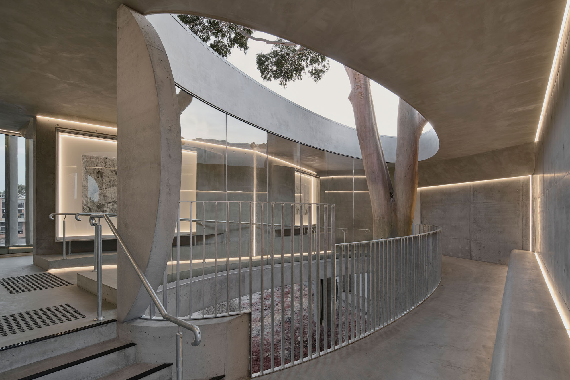
楕円の幾何学的な形状と、庭園の野性味や自由さを対比させるというアイデアが気に入り、また、木々の樹冠を見上げたり、色鮮やかな庭園を見下ろしたりできる点も魅力的であった。
©︎ Peter Clarke
樹木の根への配慮と基礎設計
木とこれほど至近距離で作業する上で非常に興味深い点は、幹のもう一方の端、つまり根系である。私たちは、根系を乱さないようにプロジェクトを建設する方法を、非常に慎重に検討しなければならなかった。
現場での作業を開始する前に、樹木の根のスキャン調査を実施し、その結果、最終的に4本の柱を設置する位置について柔軟に対応する必要が生じた。基礎は手作業で掘削する必要があり、その上のコンクリートスラブは基本的にマスビームとして設計された。これにより、施工中に根へのダメージを最小限に抑えつつ、柱の位置を効果的に変更することができた。柱の配置場所についてはある程度見当がついたが、掘削作業中に実際に何が発見されるかによって柔軟に対応する必要があった。というのも、樹木に深刻な影響を与えたり、実際に枯死させたりすることなく、根を切断・除去できる許容範囲が極めて狭かったからである。
アートからのインスピレーション
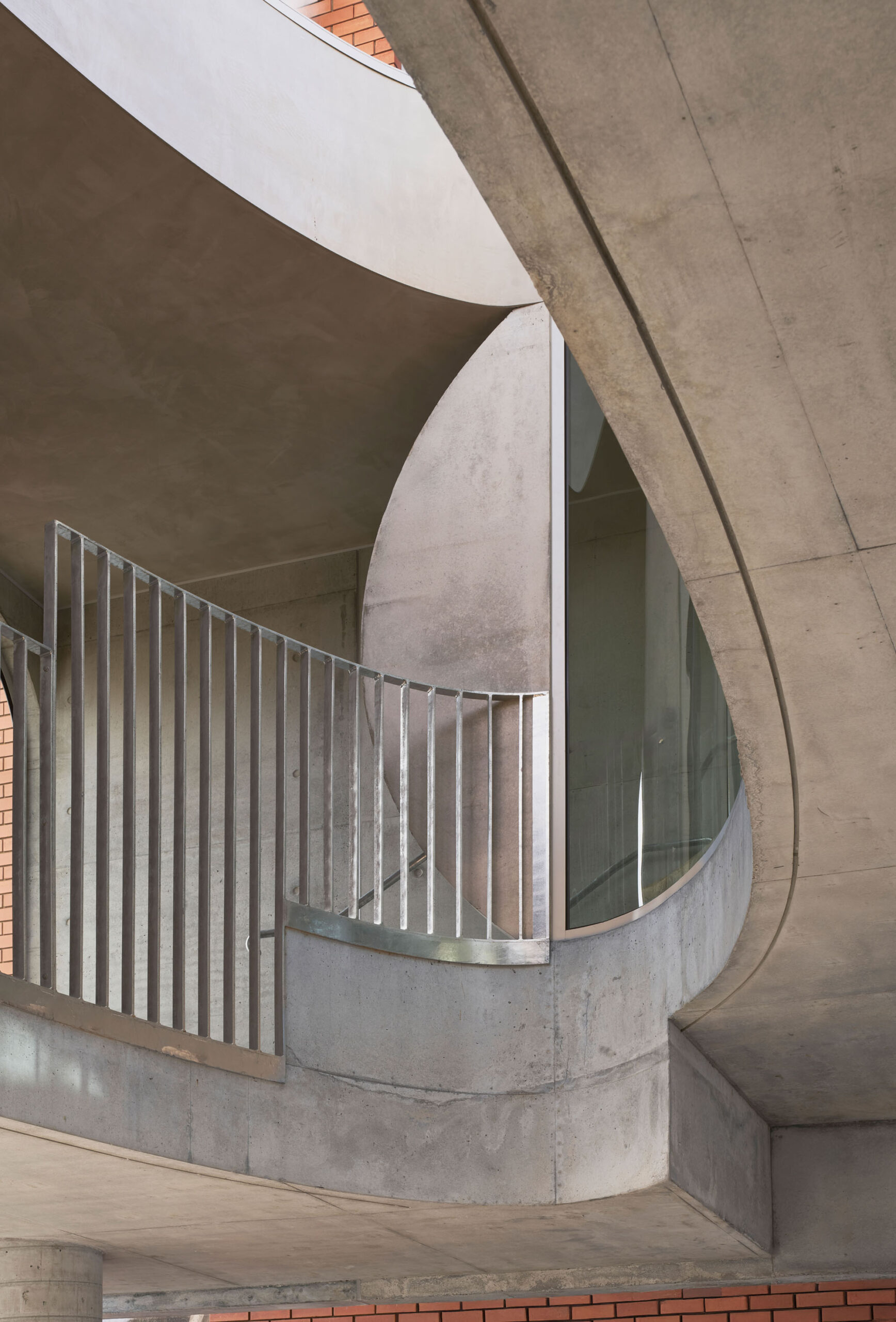
内部の楕円形と戯れるように、ボリュームの縁は既存の建物条件の周囲に合わせてオフセットされ、彫刻のように形づくられている。私たちがプロジェクトのデザイン思想に取り組む際に、インスピレーションやアイデアを探求する手段として、しばしば芸術に目を向ける。
今回のケースでは、エルズワース・ケリー(Ellsworth Kelly)、テッド・スタム(Ted Stamm)、ロバート・マンゴールド(Robert Mangold)といった、幾何学的ミニマリズムやハードエッジのアーティストたちの作品を詳しく検討した。ロバート・マンゴールドは、この高架橋の設計を構想する際、形式的な空間的観点からも、単一の素材という観点からも、極めて重要かつ鍵となる存在であった。具体的には、彼が幾何学的な形態やその内部で生み出す関係性や緊張感である。
©︎ Peter Clarke
幾何学による空間分割
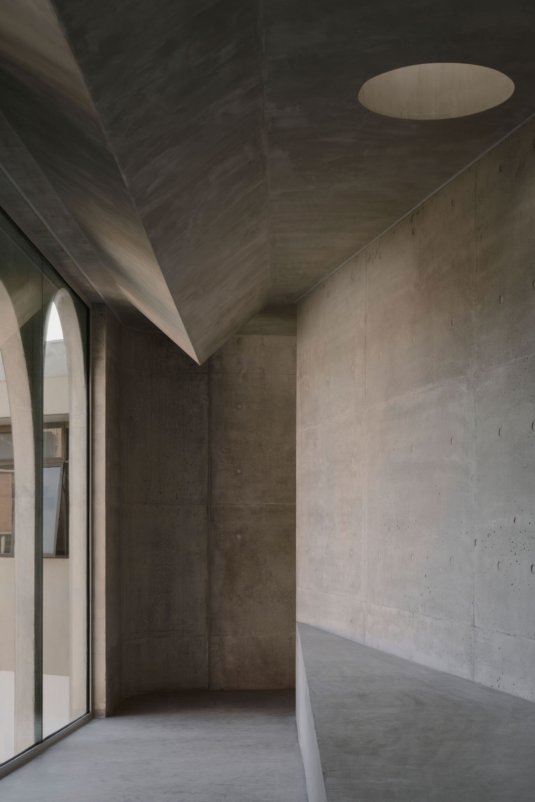
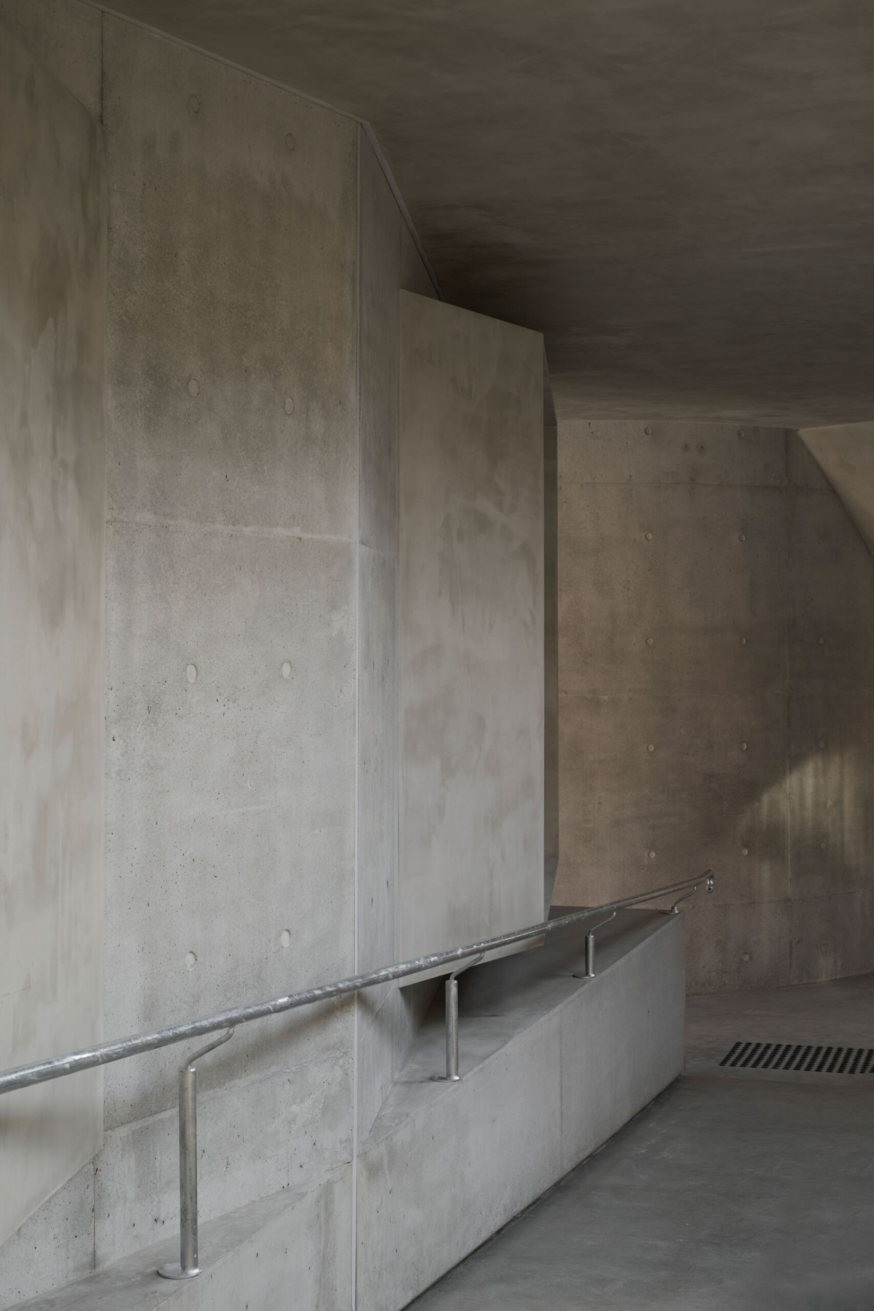
これと並行して高架道路の平面図は、楕円を中央のヴォイドとする直線的なコンテナとして形式化されている。曲がりくねった壁が、それ自体と楕円との間に緊張点をつくり出している。
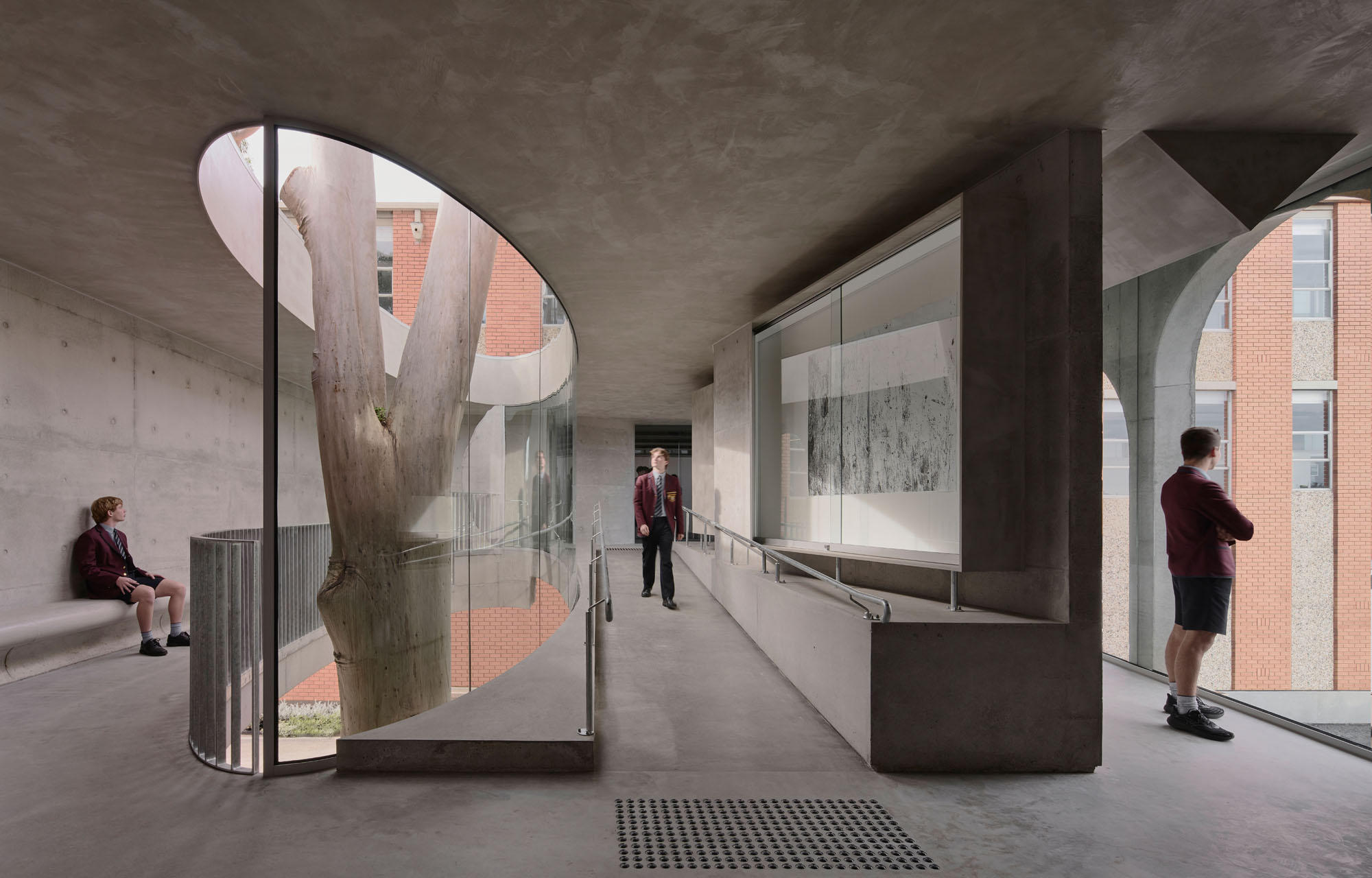
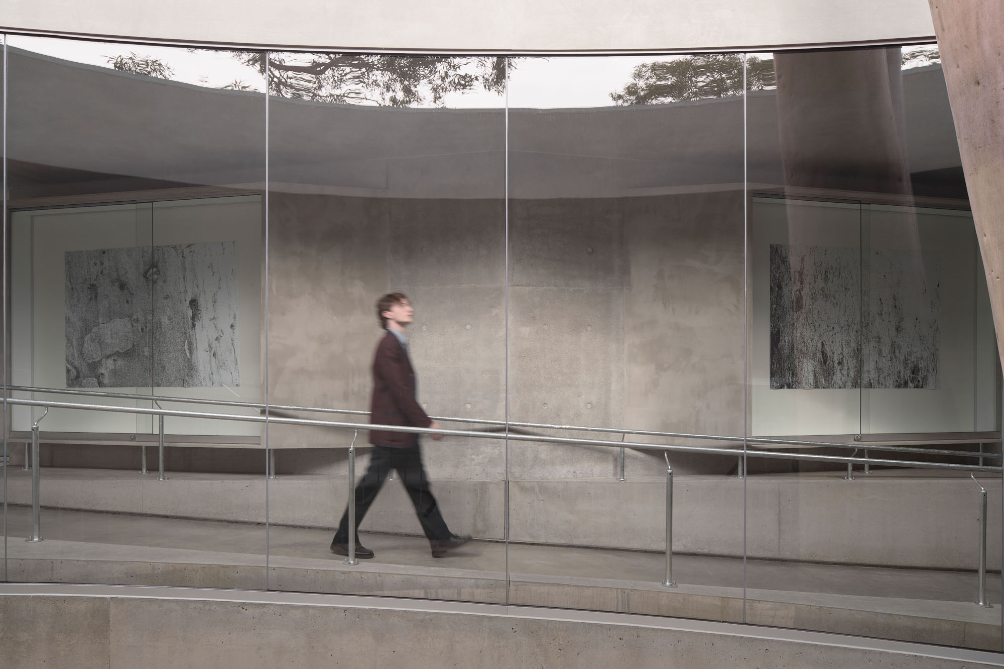
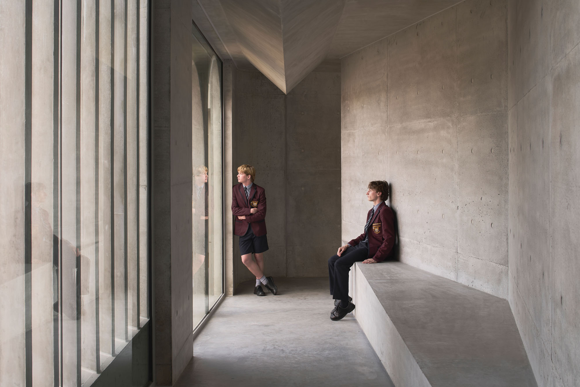
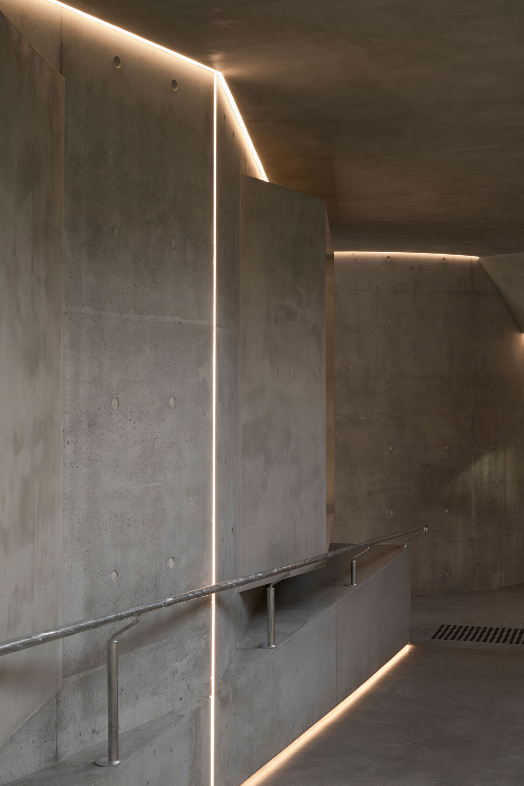
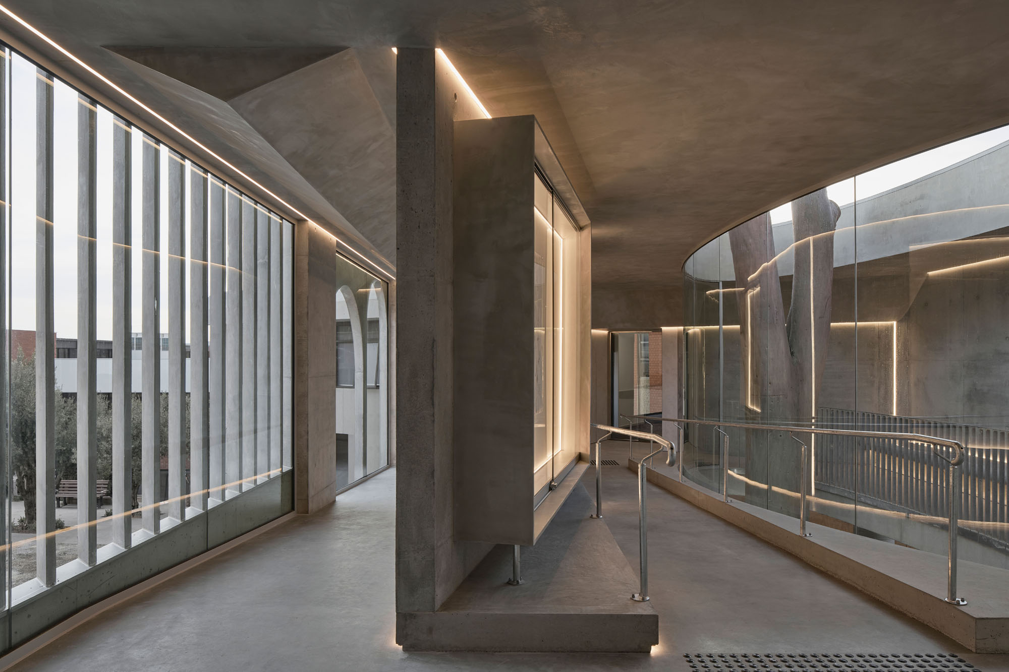
実用的な観点から言えば、この曲がりくねった壁は空間を分割する三角形を形成し、中央の主要なアクセスポイントを創出すると同時に、その背後の曲がりくねりによって反射的な空間を生み出している。この屈曲した壁と楕円がつくり出す緊張点は、立ち止まりたくなるような親密な瞬間を生み出す。一方の方向には木を眺め、もう一方の方向にはアートボックスに展示された作品が目に飛び込んでくる。
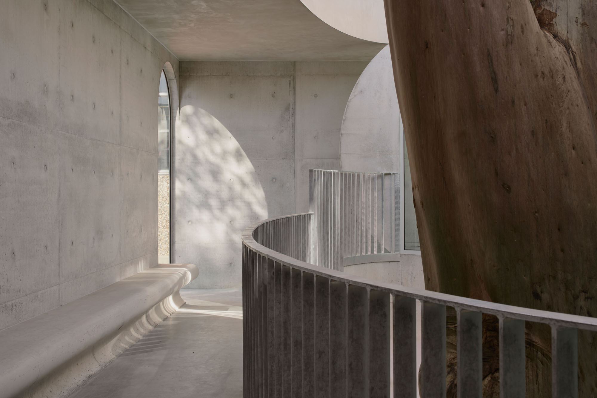
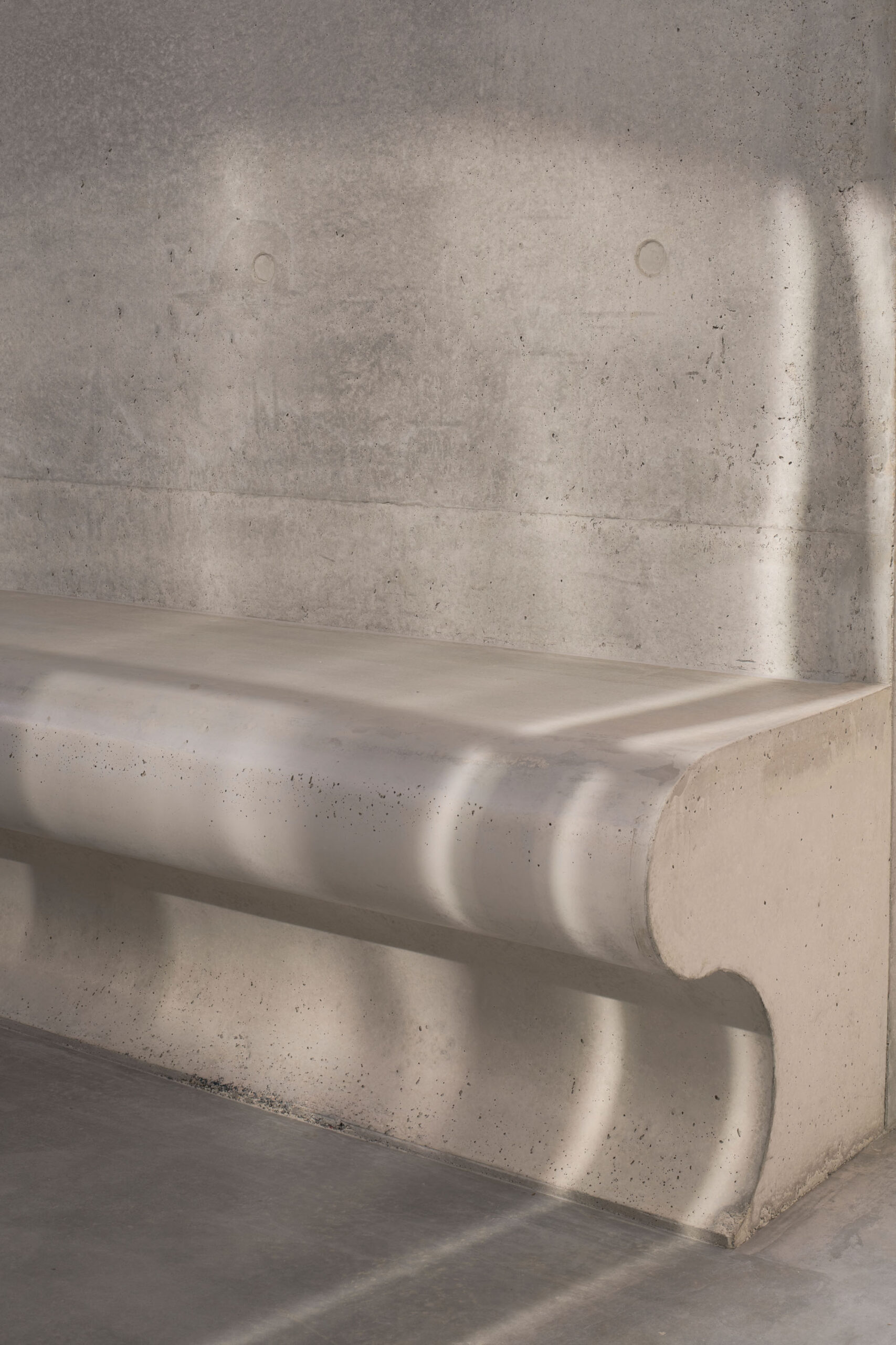
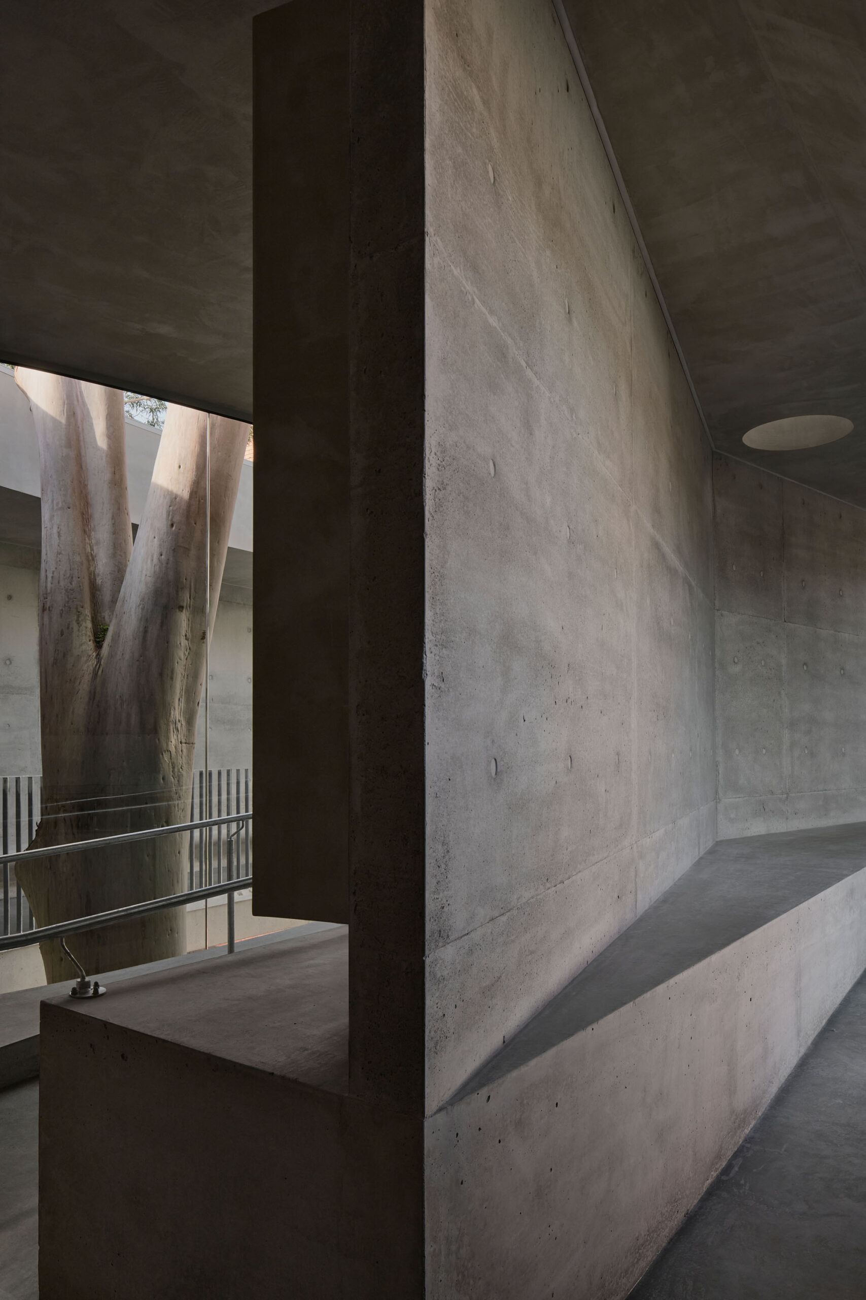
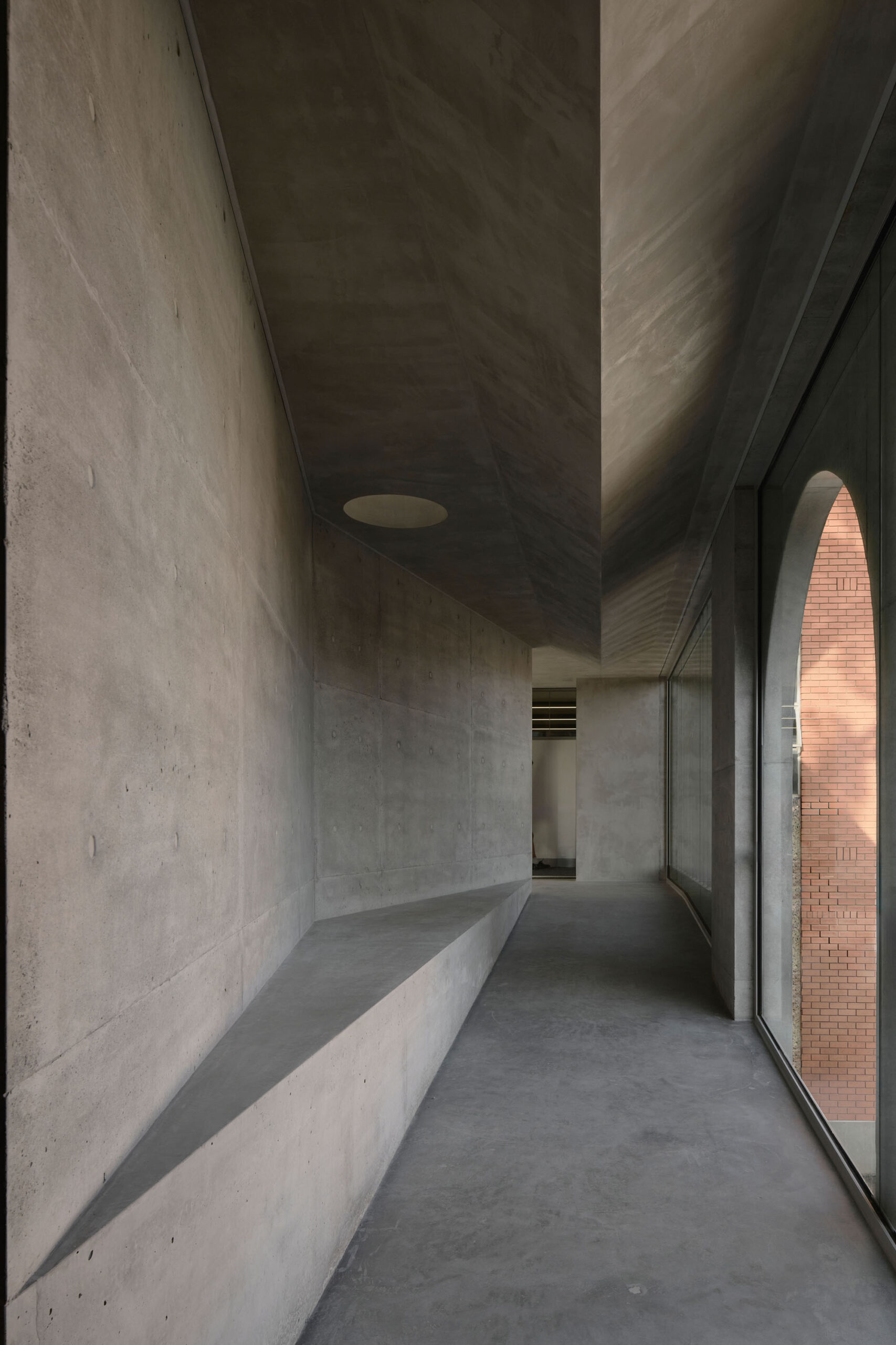
楕円の反対側には、長いベンチへと段差を下りていくエリアがある。ここは、気取らない授業活動のためのスペースであると同時に、座って木を鑑賞するための場所でもある。この空間の一方はガラスで覆われ、天候の影響を受けない。もう一方は開放されており、自然の風雨にさらされている。ここは、座ったり立ったりして手を伸ばし、木に触れたり、樹冠を見上げたりできる空間である。
©︎ Peter Clarke
©︎ Peter Clarke
壁面の「逆」がもたらす内省的空間
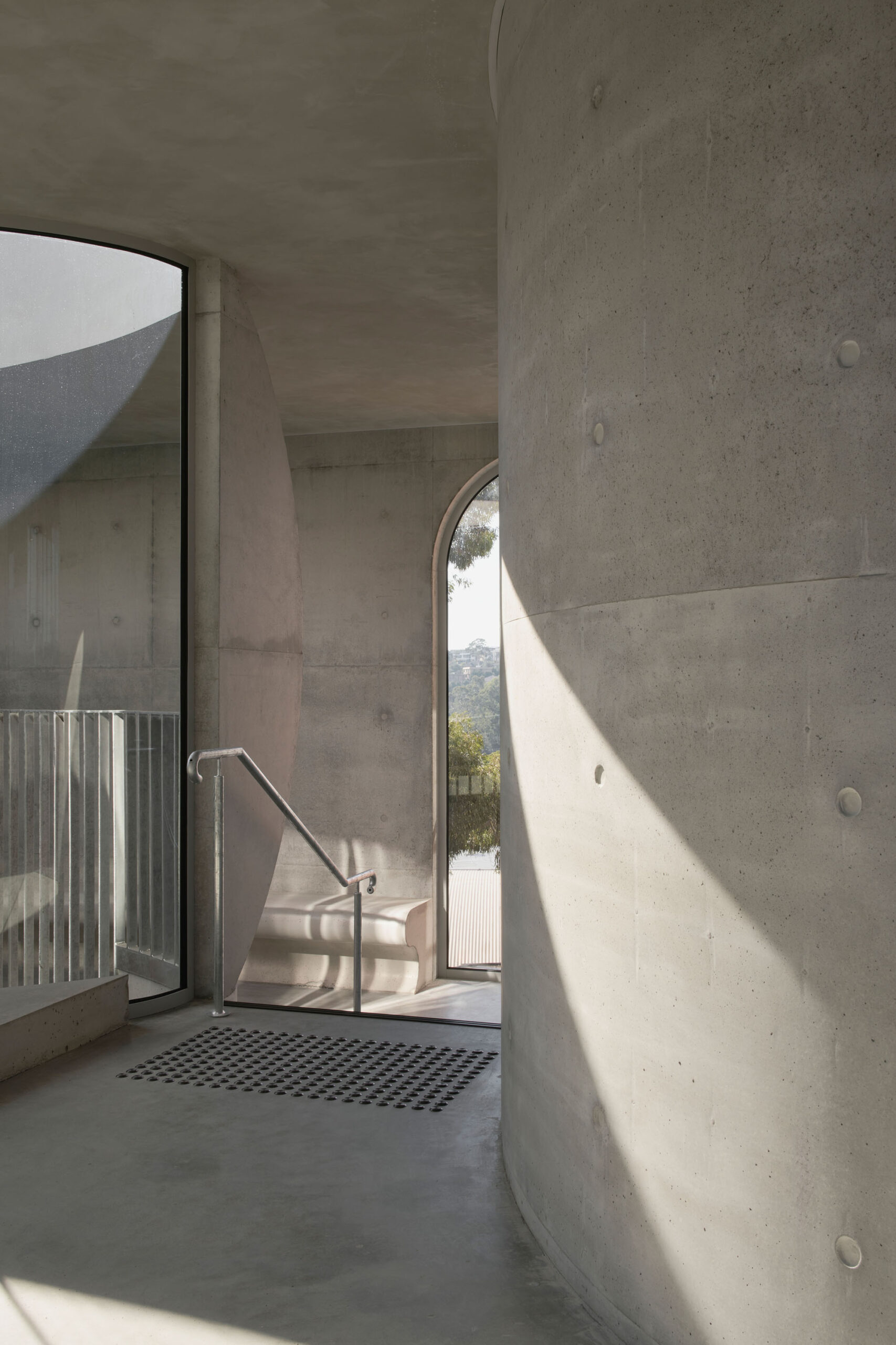
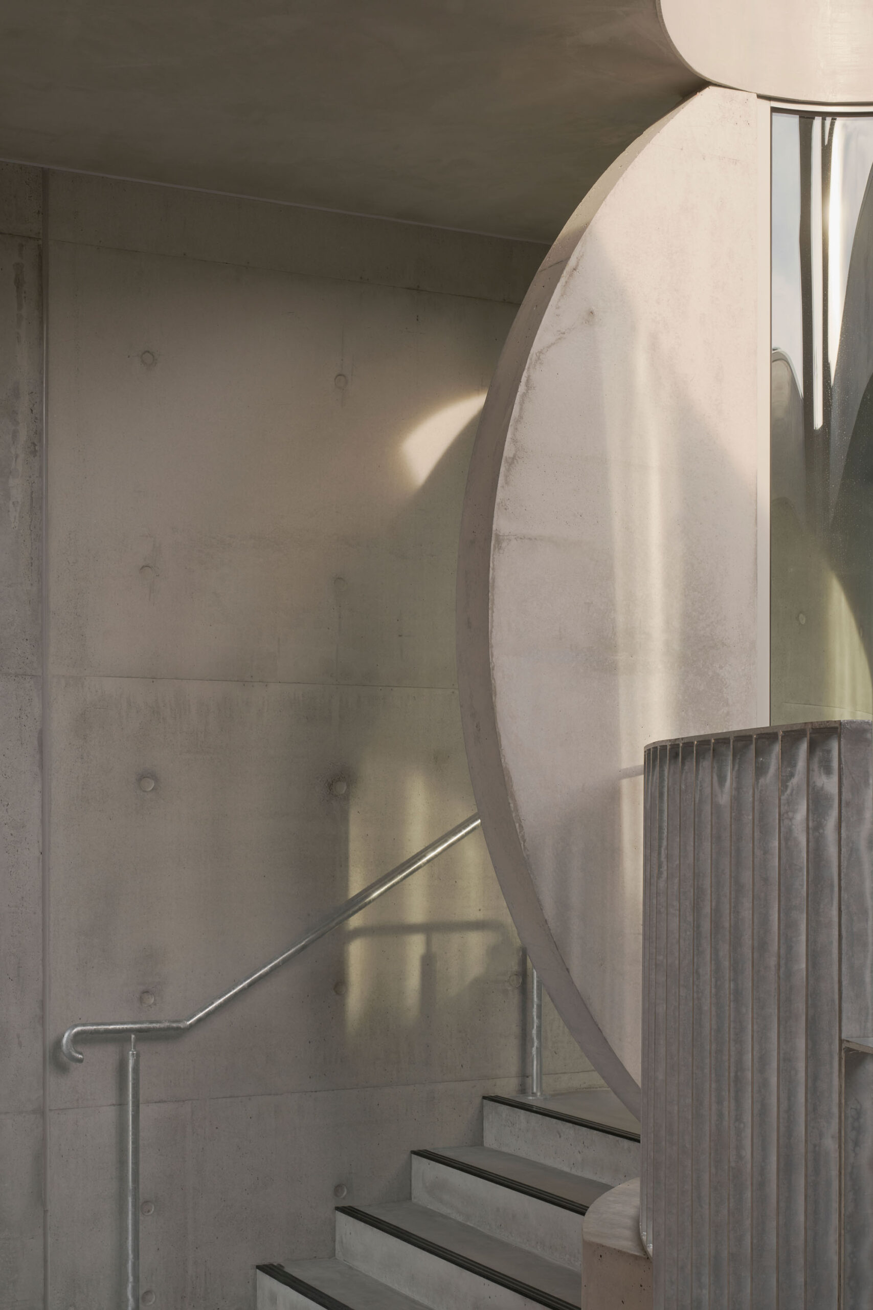
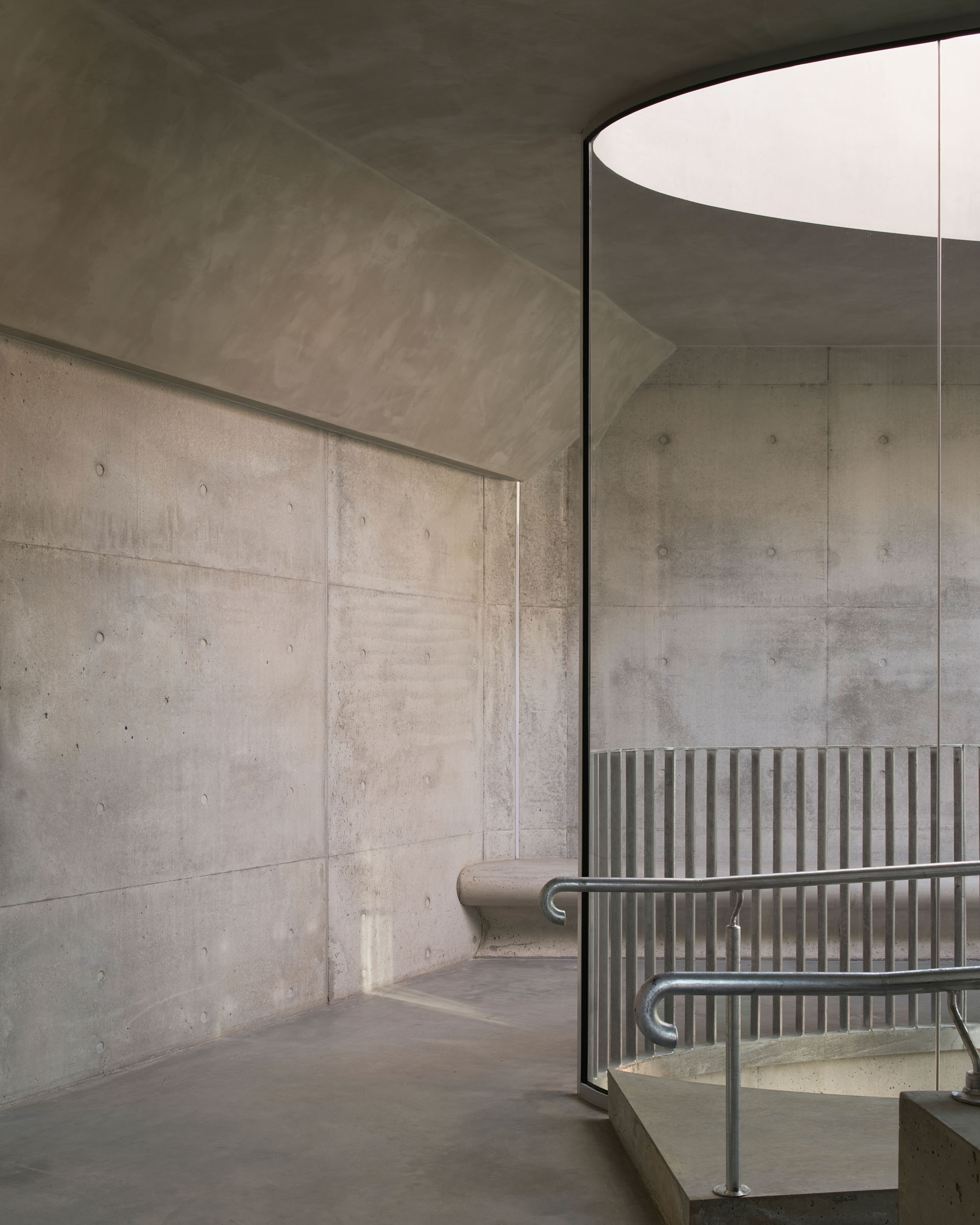
湾曲した中央壁の「逆」の形状が、内省的な空間を生み出すきっかけとなった。座って隣接する中庭を見渡せる空間である。壁の中心点が天井と交わる部分には円形の天窓が設けられており、日中は太陽が空を横切るにつれて光の戯れを生み出す。この地点からは、中庭を挟んで学校のメインチャペルを見渡すことができ、視覚的な対話が生まれる。学校側では、この壁面に典礼のテキストを掲示し、両者の結びつきをさらに深める計画がある。
©︎ Peter Clarke
空間の展開とプロポーションの変化
瞑想スペースの上部に設けられた三角形の天井は、空間の展開を生み出し、断面において床の傾斜と調和した関係性を形成している。既存の建物の隣接する床レベルに合わせるため、両建物を連結するスロープが必要であった。スロープの上端にある天井の最も低い地点では親密な空間が創出され、スロープを下るにつれて空間は広がり、中庭を見渡す2つの大きなアーチ窓へと開けていく。空間を移動するにつれて、プロポーションが開放されていく。
全体的な形態における開口部は、周囲の文脈との関係を強化し、焦点を絞るために、視界の枠取りを意図的かつ慎重に制限したものである。木との内部的な関係を損なうことなく、具体的かつ比例的な開口部を創出することも同様に重要であった。
©︎ Peter Clarke
©︎ Peter Clarke
歴史的・文化的参照:フランスのエルミタージュから導かれたファサード
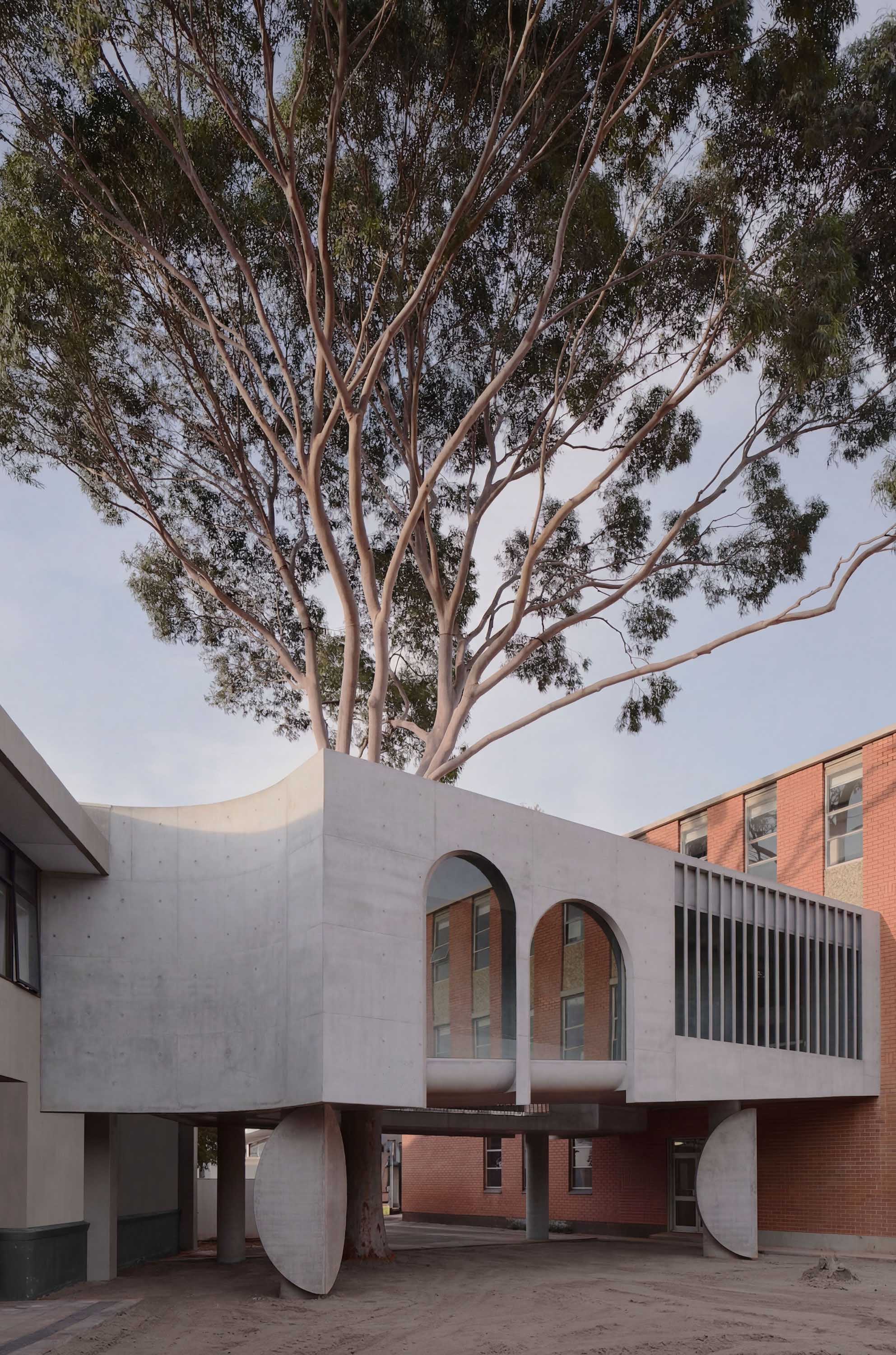
正面立面は、このプロジェクトにおいて最も重要な立面である。私たちは、学校の歴史と起源を物語る、ある種のシンボルとなるものを創り出したいと強く願っていた。以前、この学校でいくつかのプロジェクトを手掛けた際、学校の名称の由来となった聖マルセラン・シャンパニャ、特にマリスト・カトリック信仰の発祥地であるフランスにある〈エルミタージュ〉を参照として用いていた。この視覚的アイデンティティを、学校環境全体からよく見えるものとして、高架橋プロジェクトの中でも引き継いでいきたいと考えた。
この高架橋では、2つの比例的なアーチが、一方が他方より大きな開口部を形成している。アーチの縁のディテールは、まるで彫り出されたかのように面取りされている。刃状の列柱がファサードの一部を横切り、ファサードの下端は片端からもう片端へと傾斜している。
©︎ Peter Clarke
新たな物語の始まり
生徒たちが初めてこの空間に触れ、喜びの声を上げ、その様子を目の当たりにできたことは、本当に素晴らしい体験であった。学校の美術科はすでに、アートボックスに生徒たちの作品を展示することに誇りを持って取り組んでおり、それは実に素晴らしいことである。
このプロジェクトでは、成形コンクリートを担当した「SteelFox」のヒラリー(Hillary)をはじめ、卓越した技術を持つ職人たちと協働できたことは幸運であった。また、このプロジェクトを細部に至るまで美しく、丹念に現実のものとして仕上げてくれた、素晴らしい建設業者であるブレントン・マクラウド(Brenton McLeod)氏と「MDCビルディング・グループ」にも感謝する。
マーセリン・カレッジのマルコ・デ・チェザーレ校長には、このプロジェクトに対するビジョン、信頼、そして献身的な取り組みに対し、心から感謝する。このような特別なプロジェクトは、多くの学校クライアントにとって大きな課題となり得るが、私たちは過去にも、こうしたプロジェクトがどのような成果をもたらすかを目の当たりにしてきた。生徒たちや学校コミュニティに対するマルコ校長の揺るぎない献身は、実に称賛に値するものである。
©︎ Peter Clarke
©︎ Peter Clarke
©︎ Peter Clarke
©︎ Peter Clarke
©︎ Peter Clarke
©︎ Peter Clarke
©︎ Peter Clarke
以下、ファレル・レイ・アーキテクツのリリース(英文)です。
GALLERY FOR A TREE – [FLYOVER] – MARCELLIN COLLEGE
By Farrell Wray ArchitectsTeam:
Ellie Farrell & Brad Wray.
Client:
Marco Di Cesare – Principal
Marcellin College, Bulleen, Victoria, Australia
Location:
Level 01, Linkway between Junior School & Senior Learning Buildings
Marcellin College, Bulleen, Victoria, Australia
Size:
91m2
Completed:
2026
Materials:
Formed concrete [Primary structure & volume], Glass, Aluminium, Glass-Face concrete
render & GRC – [Glass-re-enforced concrete vertical blades to facade].
Builder:
MDC Building Group
Formed Concrete:
Steelfox
Building Surveyor:
Michel Group Building Surveyors
Structural Engineer:
Ipsum Structures
Photographer:
Peter ClarkeBackground:
The evolution for the idea for this project began back in 2013-2015 at Caroline Chisholm College in Braybrook, where we designed the first iteration of a flyover typology for our then and now client, Principal Marco De Cesare. This project became a new and highly celebrated visual identity for the college. Seen on public billboards in wider Braybrook and Footscray, school publications and published internationally through architectural media. The outcome of the project, along with extensive renovation to the quadrangle landscape, led to increased school enrolments and a new sense of optimism and pride for the college.Site:
The site for the Marcellin Flyover Gallery is an existing open air walkway bridge between two buildings. A senior school teaching and learning building to the east, which was the first building on the site, constructed back in 1963, and a year 7 and 8 junior school building to the west. A spectacular gum tree sits between the two buildings at the end of a bitumen quadrangle. This quadrangle is the primary gathering space for the college.Tree:
The very first image we presented to the college was this tree circled with an ellipse, which came to be completely serendipitous, to highlight it as the centre point to the project. It was really important to us that the new flyover have a direct relationship with this tree. We then began by looking at ways we could frame the tree. This developed into ways that we could frame around and encircle the tree to make it the heart of the project. A series of early sketches evolved in quite an organic way, which led to questions about the relationship of the organic nature of the tree versus how to approach an architectural response around it. We were interested in not attempting to create a parody, but rather a contrast between a formal geometry and the organic sort of geometry of the tree.Encompassing Ellipse
As an evolution of parts in plan, the starting point was the tree trunk and then an ellipse around the tree. The ellipse is placed around the tree, but to an end. This was a really conscious hierarchical and compositional decision within the space. We also wanted to make the tree physically accessible by students, so if they wanted to reach out and touch it, they could. The ellipse is read in various planes of the project.Ellipse as a garden in the ground plane.
We liked the idea to contrast the geometry of the ellipse with the wildness and freedom of a garden. We also liked the idea you could look up into the tree canopy and look down into a colour filled garden.Tree beyond the ground plane:
A really interesting part of working in such close proximity to a tree, is the other end of the trunk – the root system. We had to really carefully look at the way that we could build the project and not disturb the root system. Before any works had commenced on site – we had a tree root scan undertaken and as a result – we had to be flexible in where the four final column locations would be. Footings had to be dug by hand and the concrete slab above was designed essentially as a mass beam. So we could effectively relocate the column locations in accordance with the least amount of damage to the roots during construction. We had a fairly good idea where the columns would lie, but really had to be flexible in what we found upon digging upon the ground, as there was a really small tolerance to the number of routes which could be cut and and or removed before the tree is dramatically affected or actually could die.Art as reference:
In contrast and at play with the internal ellipse, the edges of the volume are offset and sculpted around the perimeter of existing building conditions. Like a lot of the way we approach the thinking behind the design of our projects, we often look at art for inspiration and ways to investigate ideas. In this case we looked closely to geometric minimalist and hard edged artists like Ellsworth Kelly, Ted Stamm and Robert Mangold. Robert Mangold was really important and a key figure, when we were thinking about designing this flyover, both from a formal spatial perspective and the idea of a singular material perspective as well. Specifically, the relationships and tensions he creates with geometries and within geometries, such as his Attic Series 5 from 1990, where he sets up these moments of tension and contrast with a formal geometric language vs its relationship to clear space where, in this case the external rectilinear form and internal ellipsoid form almost meet. This is then rendered in a singular colour and texture.Geometry as spatial divider:
In parallel, the plan of the flyover is formalised as a rectilinear container with an ellipse as a central void. A cranked wall creates a tension point between itself and the ellipse. Pragmatically, this cranked wall creates a triangle which divides the space, creating a central main point of access from point A to point B, and as a result of the cranking behind it creates a reflective space. The tension point of the cranked wall and ellipse creates – a moment of intimacy where you could stop. And in one direction, look at the tree. And then in the other, art boxes display literal art. On the other side of the ellipse, there is an area which steps down to a long bench seat. This creates a space for informal class activities, and generally a space to sit and admire the tree. One side of the void is sheltered from the weather with glass. The other is open air to the elements. It’s a space where you can sit or stand and reach out, touch the tree and look up into the canopy.The Inverse:
The inverse of the cranked central wall created an opportunity for a reflective space. A space to sit and view out over the adjacent quadrangle. Where the central point of the wall meets the ceiling, a circular skylight creates light play during the day as the sun moves across the sky. From this point, you are able to look across the quad to the main school chapel and a visual dialogue is created. There are plans for the school to install some liturgical text on the wall here to further link the two.Spatial Unfolding:
A triangular ceiling over the top of the reflective space, creates a spatial unfolding and relationship in section with the ramping of the floor. A ramp was required to meet the adjacent floor levels of existing building – to link both buildings together. A moment of intimacy with the point of the ceiling is created at its lowest point at the upper end of the ramp, which enlarges as you progress down the ramp and opens up to two large arched windows which look over the quad. There is an opening up of proportion as you move through the space.Curated Openings:
The openings in the overall form were very intentional and carefully limited in framing views to create enhanced and focused relationships with the surrounding context. It was of equal importance to create specific and proportional openings, without taking away from the internal relationship with the tree.Historical & Cultural Reference – through subtle visual identity.
The primary elevation is the most important elevation in the project. We really wanted to create a somewhat emblem for the school, that spoke about the school’s history and origins. We had previously designed some some other projects in the school and used references from St. Marcellin Champagnat, who the school’s named after, specifically his Hermitage in France, where the Marist Catholic faith originated from. We wanted to continue this visual identity within the flyover project – as something that could be quite visible to the wider school environment. Using the Hermitage in France as a primary reference, one of the very early buildings on its site after the chapel, was this link way which was made from the local stone, literally carved out of rock on site. It has these two beautiful little archways which are not proportionally equal and at varying heights, which we found really interesting. It has a strong visual character and clear to see that it was made by hand by the apprentices. We were quite fond of how the Chapel of Mary sits into the archway. We likened it to a student standing under one of the archways and looking out over the quad. We also really liked the rigid steel balustrade at the top, which was obviously a later addition, but reminded us proportionally of a vertical colonnade. Another interesting element of the Hermitage linkway was the slight fall in the land which creates this sloping proportional ground line. Like many of our projects – we often use references and visual cues to tell stories about people, place and history. We like the references to appear abstracted and not-initially obvious – revealing themselves through time and through story. We used these series of references to derive the Marcellin flyover’s primary elevation, where by- two a-proportional archways create openings – one bigger than the other. The edge details to the arches are chamfered as if they’ve been carved out. A bladed colonnade runs part ways across the facade and the bottom line of the facade slopes from one end to the other.New Stories Begin:
The Flyover or ‘Gallery for a tree’ as we have named it – opened for students earlier this week and it was wonderful to see and hear the delight from students as they engaged with their new space for the first time. The school’s art department have already taken pride in showcasing student art in the art boxes – which is fantastic. We were fortunate to work and collaborate with some exceptionally skilled craftsman on this project from Hillary at SteelFox on the formed concrete to our exceptional builders – Brenton McLeod and MDC Building Group who meticulously and beautifully crafted the project in reality. A very special thanks to principal of Marcellin College, Marco Di Cesare for his vision, trust and commitment to the project. These types of special projects can be a real challenge for a lot of school clients, but we’ve seen in the past what the outcome of projects such as this can lead to. Marco unwavering commitment to his students and school community is hugely admirable.
ファレル・レイ・アーキテクツ 公式サイト
https://www.farrellwray.com/