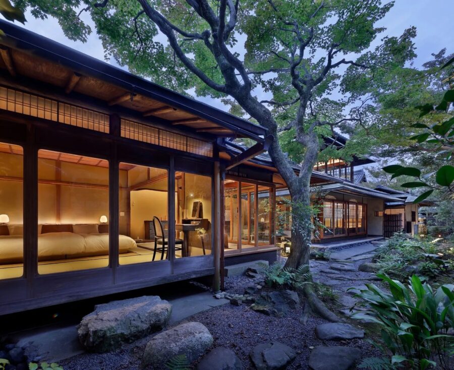
90年の歴史をもつモロゾフ旗艦店のショップデザインを手がけるにあたって、2つのテーマを掲げた。1つは今までの利用客にも愛されるショップであること、もう1つはモロゾフの未来に、より期待感を抱かせるようなデザインである。
モロゾフを代表する菓子「アルカディア」の缶は、世間でも認知されている馴染みあるグラフィックであり、「アルカディア」とは古代ギリシャの「理想郷」を意味している。このパッケージから受ける印象をファサードに取り入れた。ゴールドと黒のパターンは、真鍮と黒皮鉄で重厚感と同時に繊細な印象で表し、ペイズリー柄の有機的な曲線は、ガラス越しに見えてくる葉型(リーフ)のアートで表情を現している。葉型のオブジェは、モロゾフのアイコン的な菓子「ファヤージュ」と同じ形状でレーザーカットされたアルミパネルである。コーポレートカラーのグリーンとゴールドカラーで仕上げたリーフはライティングによって煌びやかな光を反射させ、その姿は期待感や幻想的な印象を与えてくれている。
一方で、ショップの奥にあるカフェエリアはあえてクラシックな意匠に仕上げた。より現代的な手前の販売エリアと、奥のカフェエリアを対照的に構成し、その間にガラスパーティションを施している。パーティションのガラスは、3色3種の異なるモールガラスで構成されており、それぞれのエリアに吊られたペンダントライトや、光で反射するリーフがガラスへ不規則に屈折し映り込み、大きなシャンデリアのように光を反射する。ガラスパーティションを通して先にあるエリアを見ると、それは過去からの歩みと、これからの未来を予感させるような関係性をつくれるのではないかと考えた。この店舗では、モロゾフの歴史と未来をつなぐようなデザインを目指した。(神田亮平)
An iconic flagship store that represents history with corporate colors and motifs
In designing the store for the Morozoff flagship store, which has a 90-year history, we had two themes in mind: one was to create a store that existing customers would love, and the other was to develop a sense of anticipation for the future of Morozoff.
The can of “ARCADIA,” Morozoff’s representative confectionery, is a familiar graphic recognized by the public, and “ARCADIA” means “utopia” in ancient Greece. The impression given by this package was incorporated into the façade. The gold and black pattern is expressed in brass and black leather iron with a massive yet delicate impression. The organic curves of the paisley pattern are expressed in the leaf-shaped (leaf) art that can be seen through the glass. The leaf-shaped object is a laser-cut aluminum panel in the same shape as Morozoff’s iconic confectionary “FEUILLAGE.” The leaf, finished in the corporate colors of green and gold, reflects the glittering light of the lighting, giving the impression of anticipation and fantasy.
On the other hand, the café area at the store’s back is deliberately designed in a classic style. The more modern sales area in the front contrasts with the café area in the back, with a glass partition between them. The glass of the partitions is made up of three different types of molded glass in three different colors. The pendant lights hanging in each area and the leaves reflecting in the light are irregularly refracted and reflected in the glass, reflecting light like a large chandelier. Looking at the area ahead through the glass partition, I thought it would create a relationship between the past and the future that would foreshadow the future. Therefore, I aimed to create a design that would connect Morozoff’s history with the future in this store. (Ryohei Kanda)
【モロゾフ神戸本店】
所在地:兵庫県神戸市中央区三宮1-8-1
用途:物販・飲食店
クライアント:モロゾフ
竣工:2019年
設計:ロイト
担当:神田亮平
照明計画:小林由幸(大光電機)
アートワーク:小栗裕介(リーグ)
椅子:タイムアンドスタイル、コンプレックス ユニバーサル ファニチャー サプライ
施工:スペース
撮影:アドホック
工事種別:リノベーション
構造:RC造
規模:地上1階
敷地面積:201.42m²
建築面積:201.42m²
延床面積:201.42m²
設計期間:2018.04-2019.10
施工期間:2019.07-2019.10
【MOROZOFF FLAGSHIP STORE】
Location: 1-8-1, Sannomiya-cho, Chuo-ku, Kobe-shi, Hyogo, Japan
Principal use: Shop, Cafe
Client: Morozoff
Completion: 2019
Architects: Roito
Design team: Ryohei Kanda
Lighting plan: Yoshiyuki Kobayashi / DAIKO ELECTRIC
Art work: Yusuke Oguri / LEAGUE
Chair: TIME and STYLE, COMPLEX UNIVERSAL FURNITURE SUPPLY
Contractor: SPACE
Photographs: Adhoc
Construction type: Renovation
Main structure: Reinforced Concrete construction
Building scale: 1 story
Site area: 201.42m²
Building area: 201.42m²
Total floor area: 201.42m²
Design term: 2018.04-2019.10
Construction term: 2019.07-2019.10
![[Report]TOTOギャラリー・間「山田紗子展 parallel tunes」見どころをレポート](https://magazine-asset.tecture.jp/wpcms/wp-content/uploads/2026/06/02181020/20260602suzuko-yamada-ex_tecturemag-endo01_3552-900x676.jpeg)
![[建築と経営のあいだ]「経営と承継」を両立するための組織設計術 NAP建築設計事務所・中村拓志](https://magazine-asset.tecture.jp/wpcms/wp-content/uploads/2026/06/18084531/thumbnail_nap_260618-900x675.jpg)