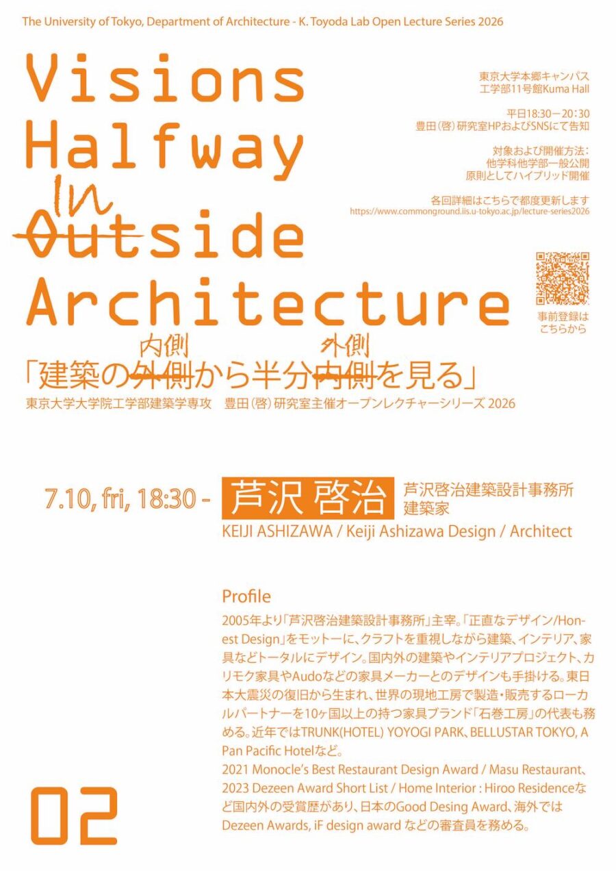
広島県呉市の呉駅前にオープンしたベーカリーショップ。
オーナーからの最初の要望は透明度の高い空間づくり。
厨房と売り場の境界をスチールとガラスで組み、フルオープンにできるように仕切ることで、厨房は売り場に開かれライブ感のある演出が可能となった。
しかし、視覚的には透明度を演出できたが、オーナーが求めるカタチはより感覚的な意味での透明度ではないだろうか?
そこで新たな手法として厨房と売り場の設えのバランスを平均的に揃えることで、2つの空間の連続性を高めることが感覚的な透明度に繋がっていくのではと考えた。
ここで大事なのは2つをまったく同じ空間にするのではなく、各空間の基本的な設えや機能は残しつつ平均化させることである。
厨房は少し演出し(排気フードにボリューム感をもたせ、特殊な石灰ペイントでの色ムラとグラフックデザインを入れ込む)、売り場は機能的に装飾を少しだけそぎ落とし、照明にはあえて看板照明を用いるなど、厨房機器の一部のように機械的な手法や素材での空間構成を試みた。
また厨房で3段4枚のオーブンを用いていることから、売り場部分にも3×4のコンセプトでつくられた12本の /(スラッシュ)のネオンサインを取り付けることで売り場にもオーブンの気配を感じさせることが可能となった。
2つの空間は機能を主張したままお互いに補完しあい、視覚のみではなく五感で繋がりを感じさせることに成功したのではないかと思う。
無機質な素材と色で空間を平均化したことで、有機的なものは中央の白い平台とパン、植栽、人間のみになる。
パンの焼く香りや艶感、職人のパンに対する思い、売り手の温もりが無機質な空間に対比させることでアートピースのように意思をもち、輝きを放つことでお客様には雰囲気として自然に伝達していくように設計した。(中本尋之)
A bakery store with an inorganic finish that brings out the products and people
A bakery store opened in front of Kure Station in Kure City, Hiroshima Prefecture.
The first request from the owner was to create a highly transparent space.
The boundary between the kitchen and the sales floor was partitioned with steel and glass so that it could be fully opened, allowing the kitchen to open up to the sales floor and create a live atmosphere.
However, although we could create transparency visually, we wondered if the form the owner wanted was transparency in a more sensual sense.
Therefore, a new approach was taken to create an average balance between the kitchen and the sales floor.
I thought that increasing the continuity between the two spaces would lead to a sense of transparency.
The important thing here is not to make the two spaces exactly the same but to average them out while retaining each space’s basic design and functions.
The kitchen is slightly staged (the exhaust hood has a voluminous feel, and a special lime paint is used to create an uneven color and graffiti design). At the same time, the sales floor is functionally stripped down to a few decorative elements, and sign lighting is used for lighting.
In addition, since four ovens with three levels are used in the kitchen, a neon sign with 12 “/” (slashes) created based on the 3 x 4 concept was installed in the sales area, making it possible to feel the presence of the ovens on the sales floor as well.
The two spaces complement each other while asserting their functions, and I believe that we have succeeded in making people feel a connection not only visually but also through the five senses.
By averaging out the space with inorganic materials and colors
The only organic things in the space are the white flatbed in the center, bread, plants, and people.
The scent of baking bread, the glossy texture, the artisan’s passion for bread, and the warmth of the seller are contrasted in the inorganic space, and they shine with a will like an art piece.
I designed the space so that it would naturally convey the atmosphere to the customers. (Tatsuya Tabii)
【RIPI】
所在地:広島県呉市中央1-6-3メゾンフェニックス1階
用途:店舗
クライアント:Ripi
竣工:2019年
設計:FATHOM
担当:中本尋之
花卉:フローリストなかむら
植栽:GREEN UNION
特殊金物:賀茂クラフト
特殊塗装:Shono Paint Works
施工:松原ハウジング
撮影:足袋井竜也
工事種別:リノベーション
建築面積:44.20m²
設計期間:2019.01-2019.03
施工期間:2019.03-2019.05
【RIPI】
Location: Maison Phoenix 1F, 1-6-3, Chuo, Kure-shi, Hiroshima, Japan
Principal use: Shop
Client: Ripi
Completion: 2019
Architects: FATHOM
Design team: Hiroyuki Nakamoto
Flower: Florist Nakamura
Green: GREEN UNION
Special Hardware: KAMO CRAFT
Special painting: Shono Paint Works
Contractor: MATSUBARA housing
Photographs: Tatsuya Tabii
Construction type: Renovation
Building area: 44.20m²
Design term: 2019.01-2019.03
Construction term: 2019.03-2019.05