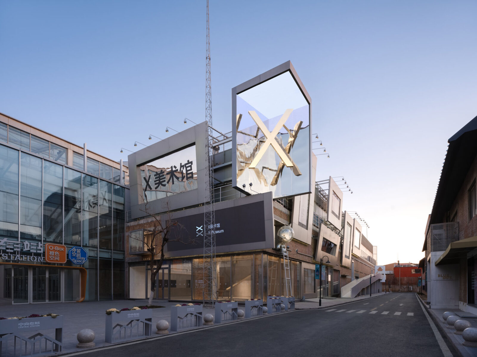
「映え」を戦略とする北京の次世代型美術館 - 街路すらもギャラリーとして機能させる〈X Museum〉
©︎ Songkai Liu
〈X Museum〉は、中国・北京の中でも「映えスポット」として知られる朗園駅に誕生した、従来の美術館の枠組みを超え、多様な可能性を受け入れる次世代型の美術館です。
北京の建築設計事務所 Studio NORが設計しました。
注目ポイント
- 若いコレクターが主導する、アート・日常・SNSが交錯する「ライフスタイル空間」としての美術館
- 既存の赤レンガ壁だけでなく、過去の改修における痕跡も継承するリノベーション手法
- 「谷」のような大空間に集積する、「岩山」のような機能空間
- 壁面をメディア化し、屋外ギャラリーとして機能させる「より騒がしい」外装デザイン
(以下、Studio NORから提供されたプレスキットのテキストの抄訳)
01. 特別な設計要件
若き創設者のビジョンと多機能なプログラム
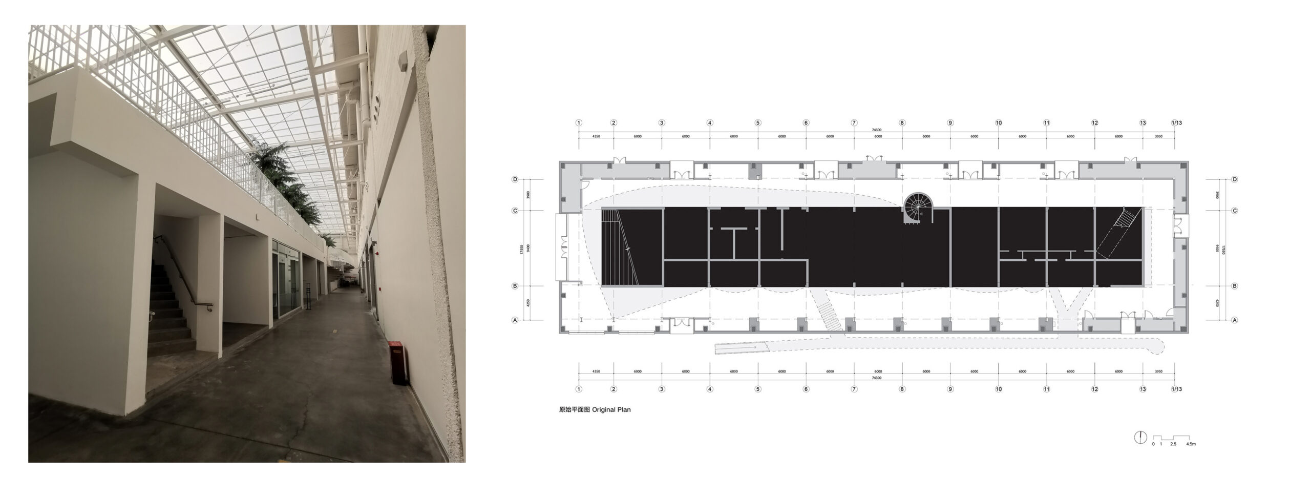
〈X Museum〉は1990年代生まれの若手コレクター2名によって設立され、若手の視点から新世代アーティストと多文化主義に特化している。新美術館の敷地として選ばれたのは、クリエイティブなブティックや流行りのレストランが集まる「映えスポット」として知られる朗園駅(Langyuan Station)に建つ古い倉庫である。
設計要件では、新たな美術館空間が単に美術展示のニーズを満たすだけでなく、多様なイベントを開催できる柔軟性を備えること、そしてSNSでの宣伝に向けた「インスタ映え」する空間シナリオを創出することが求められた。
展示ギャラリーに加え、開館時間に関わらず独立して運営可能な主要公共空間として、ギフトショップ、カフェ、レストランという3つの商業プログラムも求められた。創設者たちが新たな美術館に期待するのは、「多様な可能性を受け入れる、クールで総合的なライフスタイル空間」なのである。

©︎ Songkai Liu
ホワイトボックスから脱却する、生活に根付く美術館
美術館が現代のライフスタイルを積極的に取り入れ、未来を探求しようとする姿勢は極めて特異なものである。過去30年間で、人々が新たな情報にアクセスする手段が多様化する中、美術館と来館者の関係は「一方的な教育」から「双方向の交流」へと変化してきた。美術館の建築様式もまた、重厚で自己完結的な「ホワイトボックス」という固定観念から、より包括的で開放的な空間へと変化し、来館者に独特の空間体験を提供するようになっている。
〈X Museum〉がその立地とビジョンを慎重に選んだ背景には、芸術機関を大衆の日常生活やソーシャルメディアの人気と、さらに密接に結びつけようとする意図が明確に存在する。この「トレンド」を躊躇なく取り入れる姿勢は、設計プロセスの開始当初からプロジェクトにポップでクリティカルなタッチを与えている。
©︎ Songkai Liu
©︎ Tianzhou Yang
02. 改修された旧倉庫
歴史と改修が交錯する既存建築
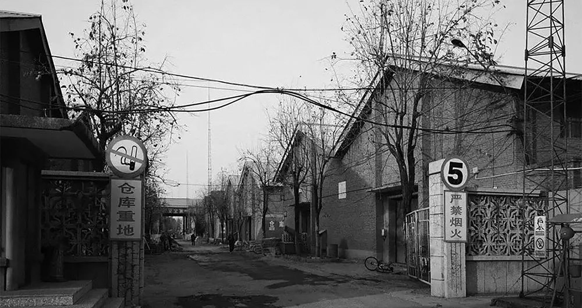
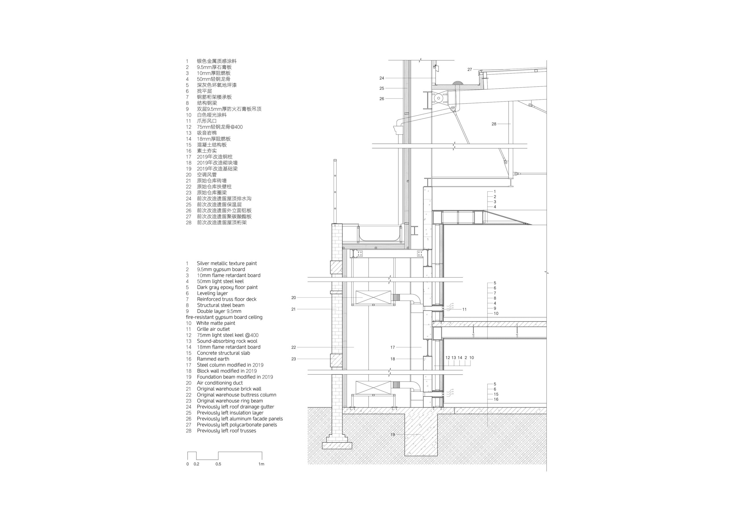
既存の赤レンガの建物は、元々は北京紡織倉庫の10号倉庫であった。1960年代に建設され、計画経済時代には綿花などの戦略物資を保管するために使用されていた。2018年に大規模な改修が行われるまで、小規模な変更や改修が随時行われてきた建物である。
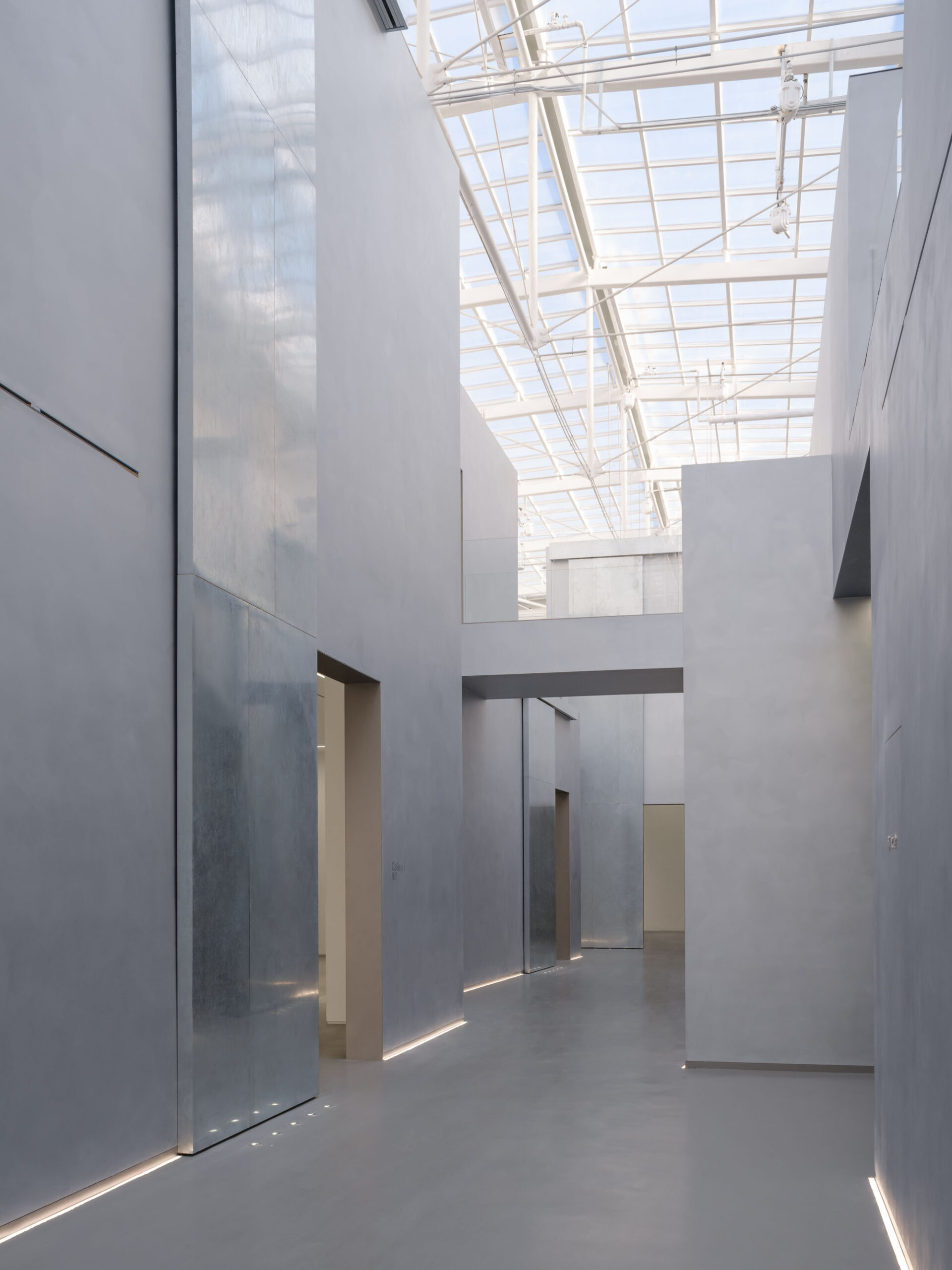
既存の建物はほとんど解体され、窓の開口部を新しいレンガで埋めた赤レンガの外壁のみが残されていた。そしてこの残存した外壁の内側に、トラス構造の天窓屋根を備えた巨大な鉄骨構造が設置されていた。新旧の壁体の間の空洞は、機械設備用のダクトや配管のための空間として利用した。また、鉄骨構造の中央部には機能空間としてコンクリートプラットフォームが新たに設けられており、2つの橋によって新設した屋外出口スロープと接続されていた。
過去の痕跡を尊重する設計アプローチ
私たちが直面したのは、上述のように劇的に改修され、異なる時代の痕跡が混在する現場であった。朗園駅にはこれ以上に過激な再生事例が数多く存在する。一方で、既存建物の最小限の残存部分は、こうした産業遺産改修プロジェクトにおける歴史的保存へのプレッシャーを軽減してくれるものでもあった。
しかし、既に施された改修を盲目的に無視したくはなかった。予算、持続可能性、そして歴史への誠実な敬意という観点から、これまでの改修成果を可能な限り維持したいと、私たちは考えた。
北京紡織倉庫の古い写真 © 朗園駅
2018年改修後の敷地 © Studio NOR
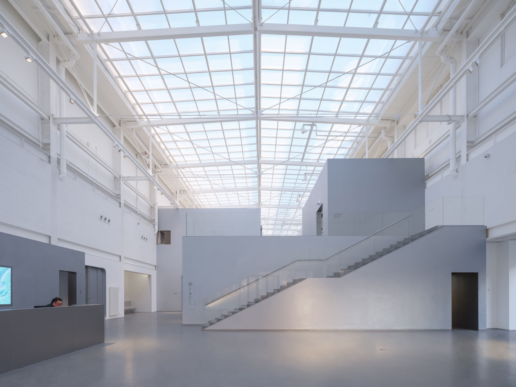
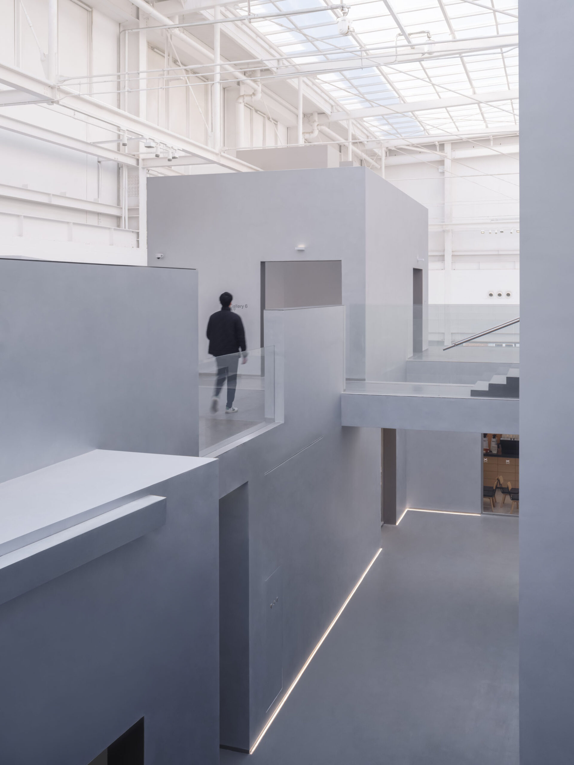
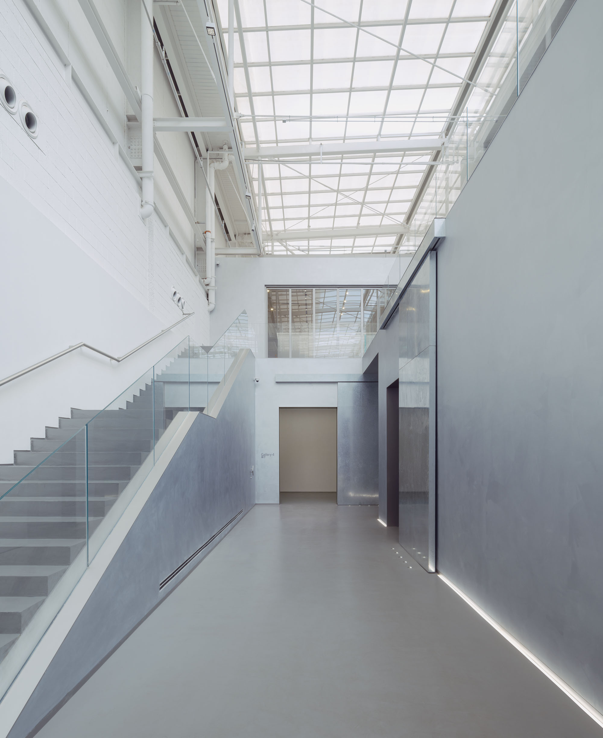
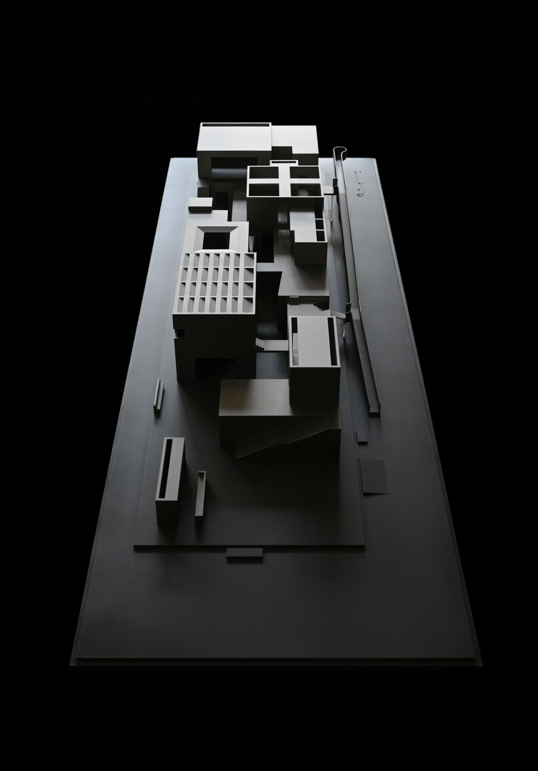
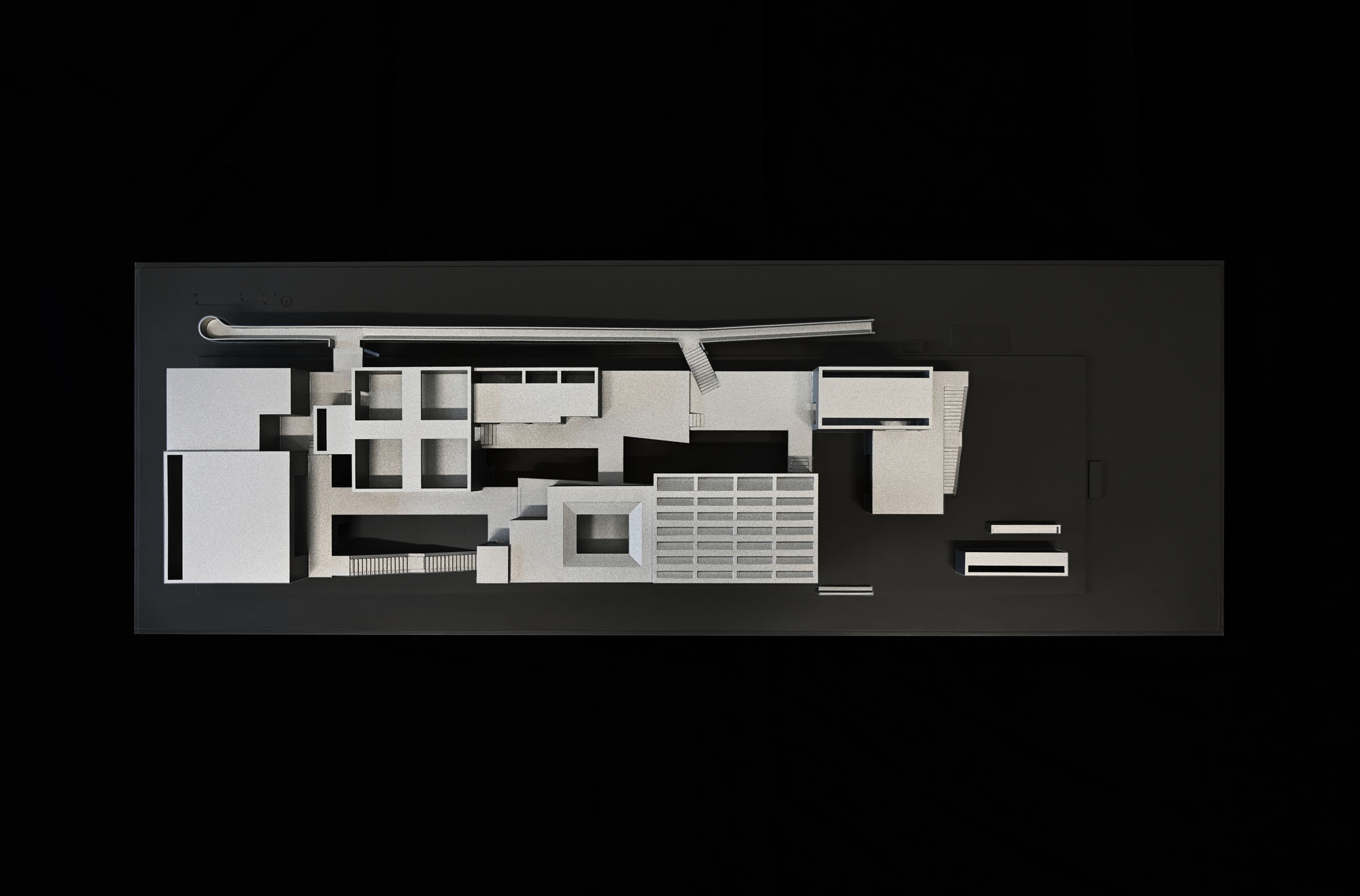
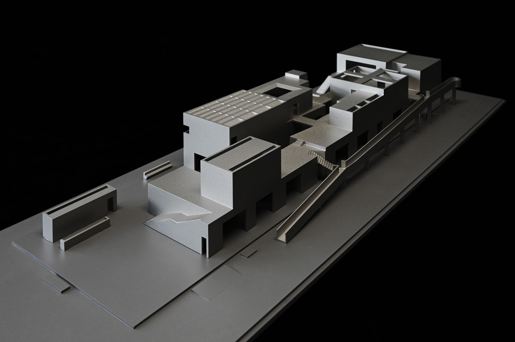
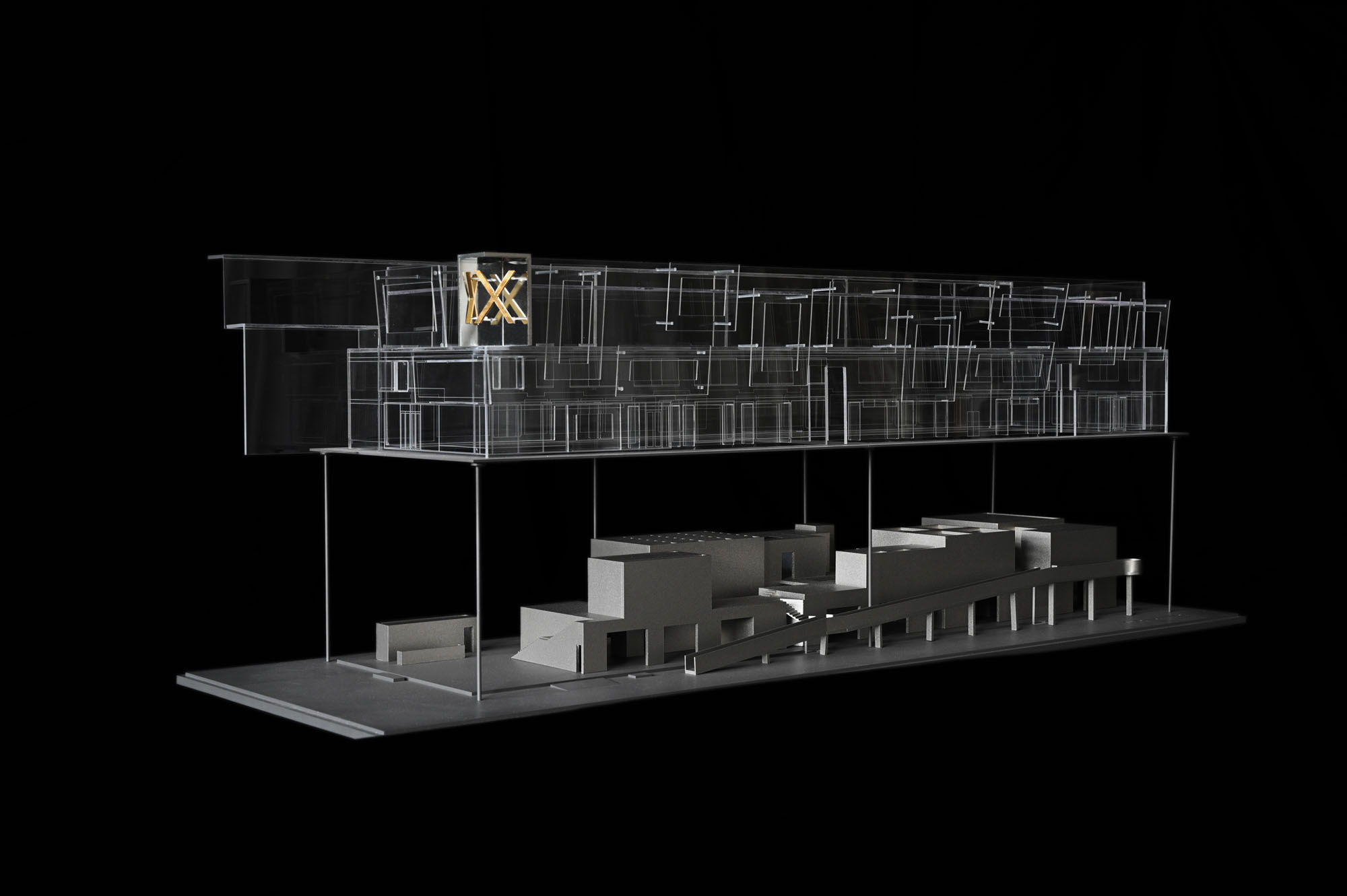
03. 谷の形成
断面から導き出された「谷」の構築
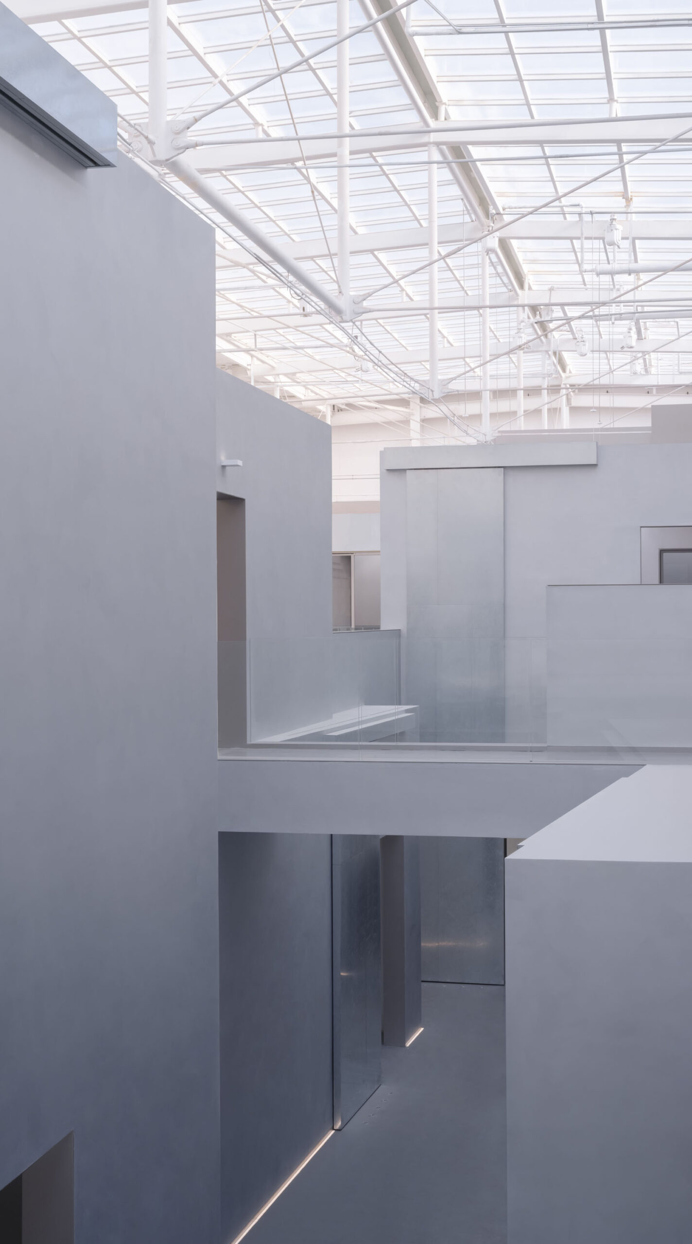
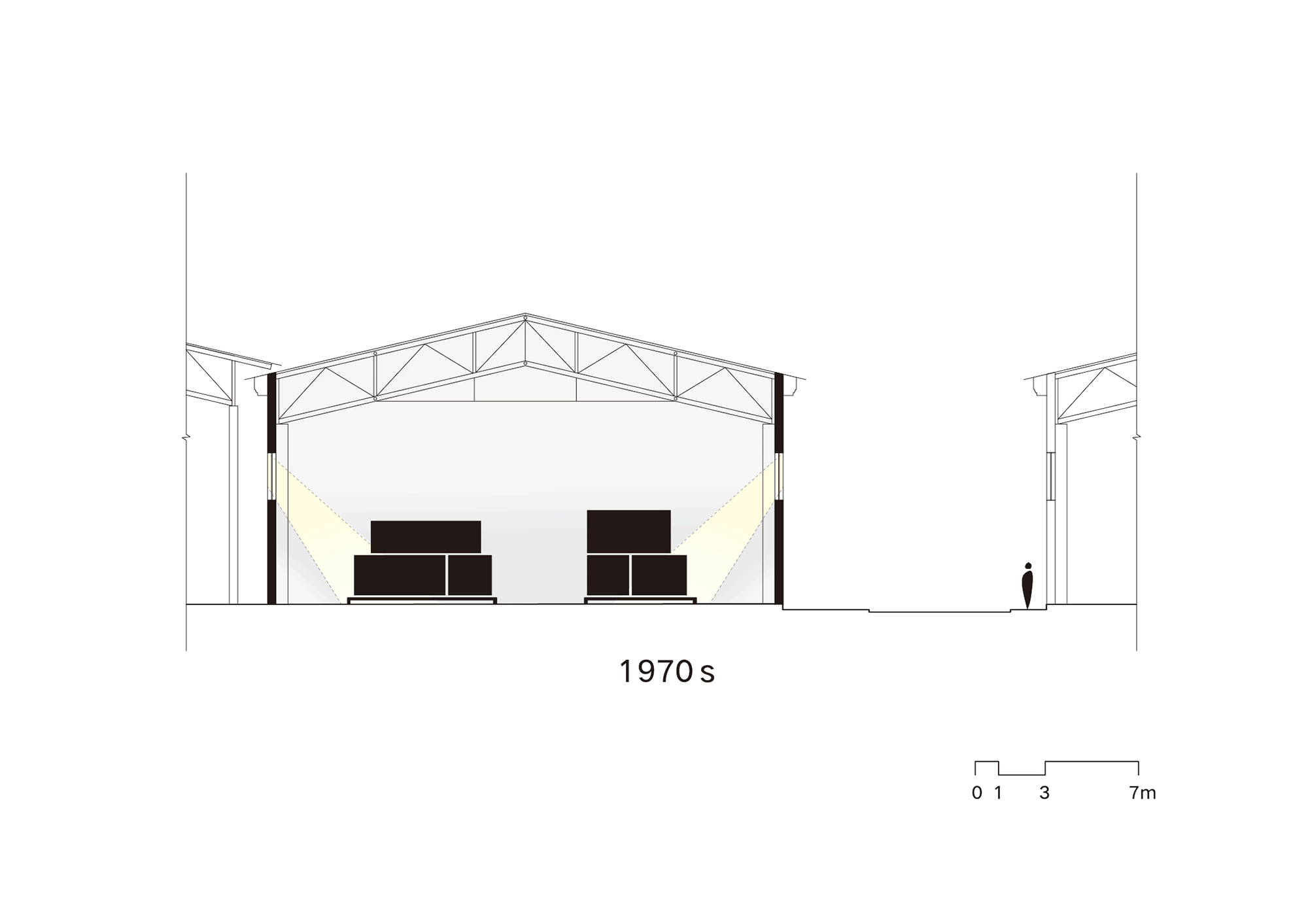
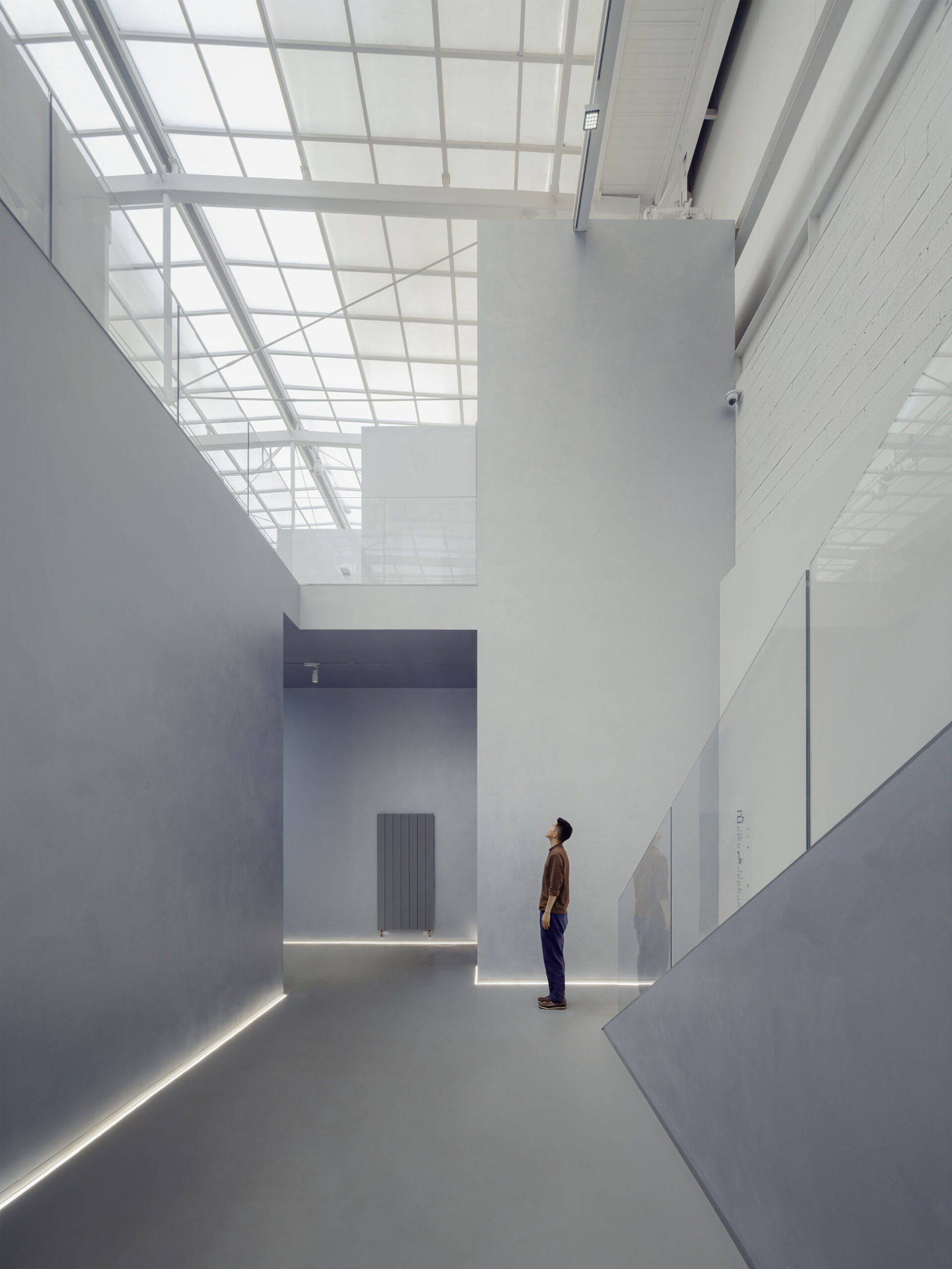
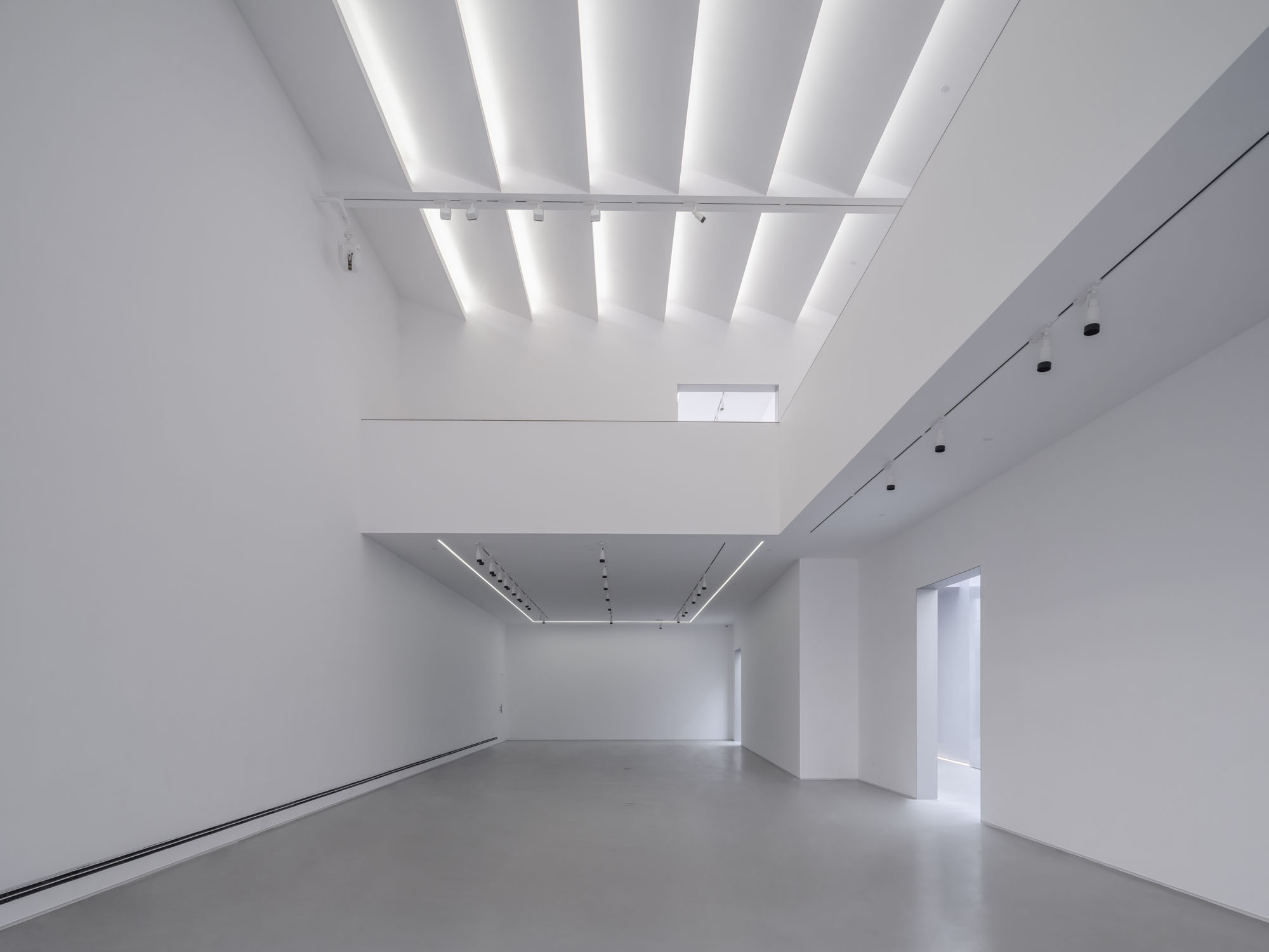
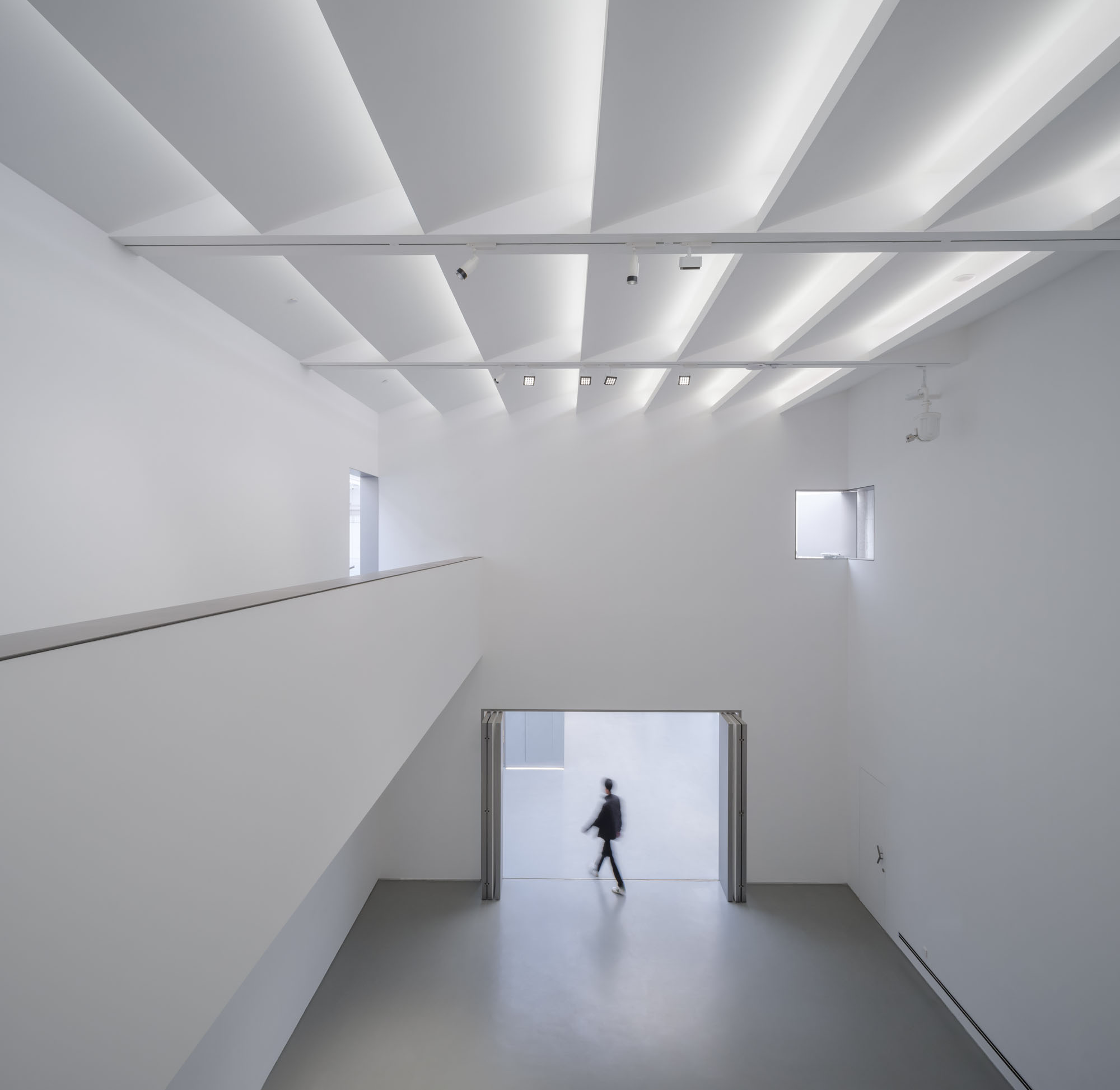
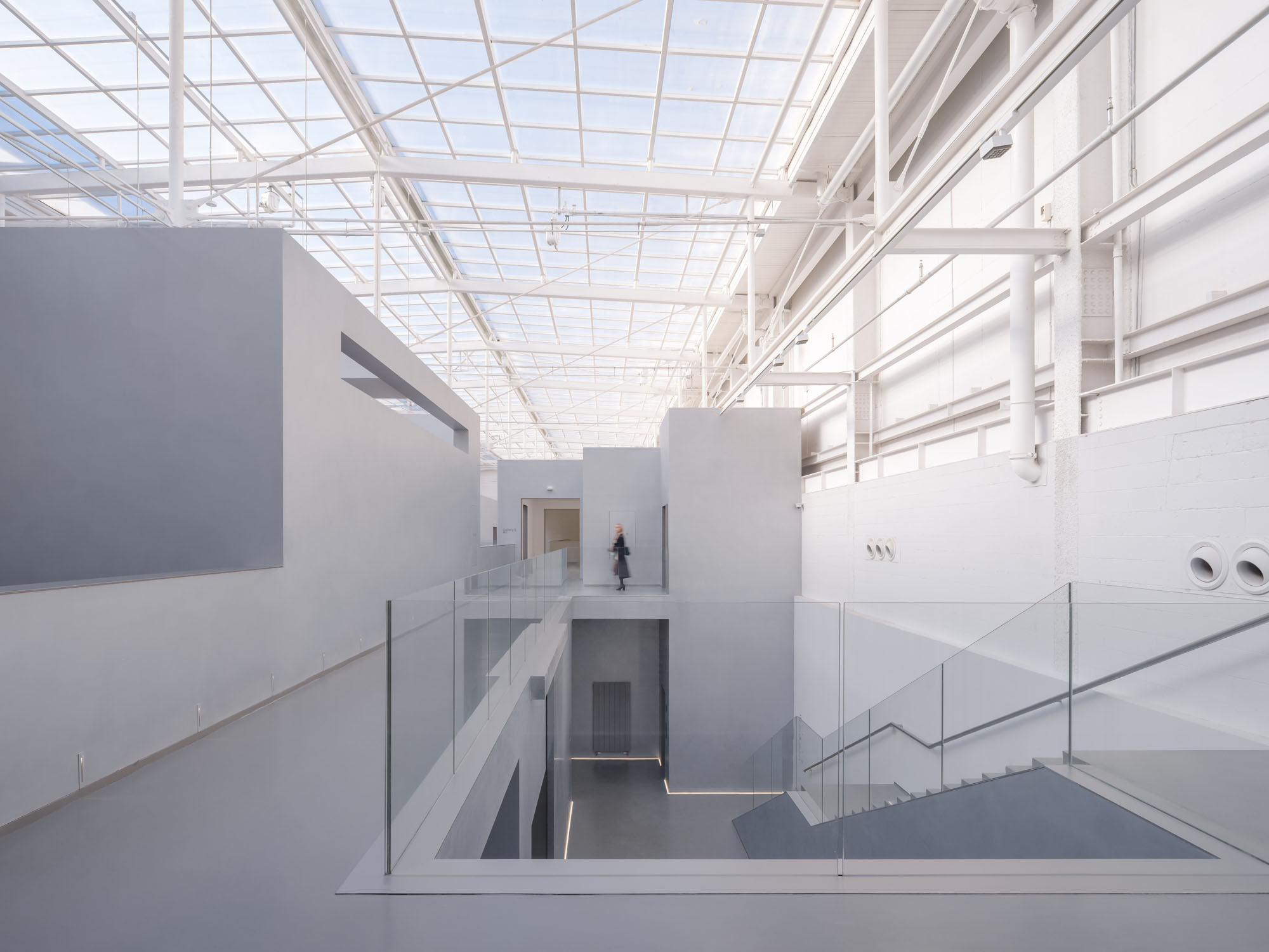
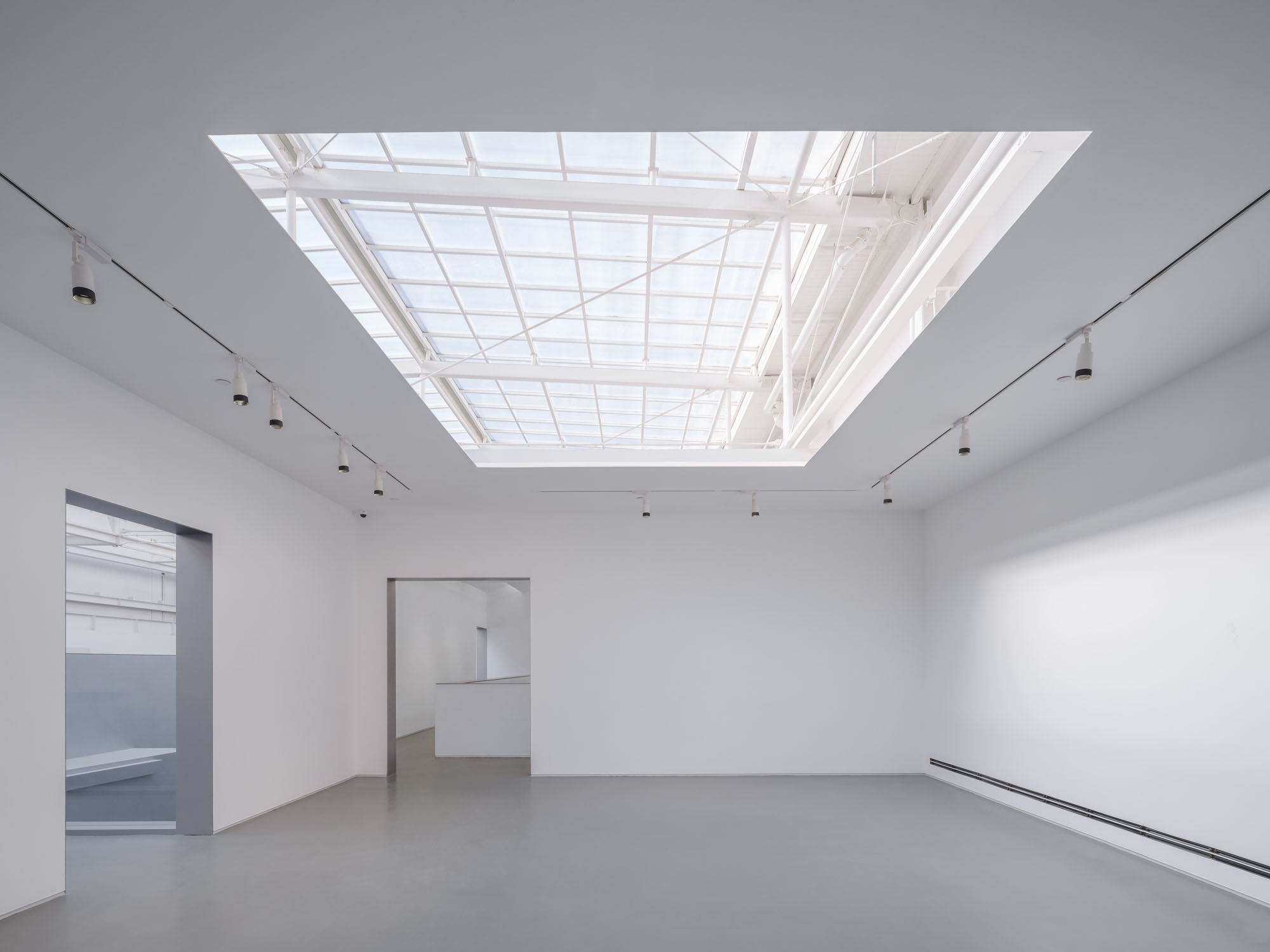
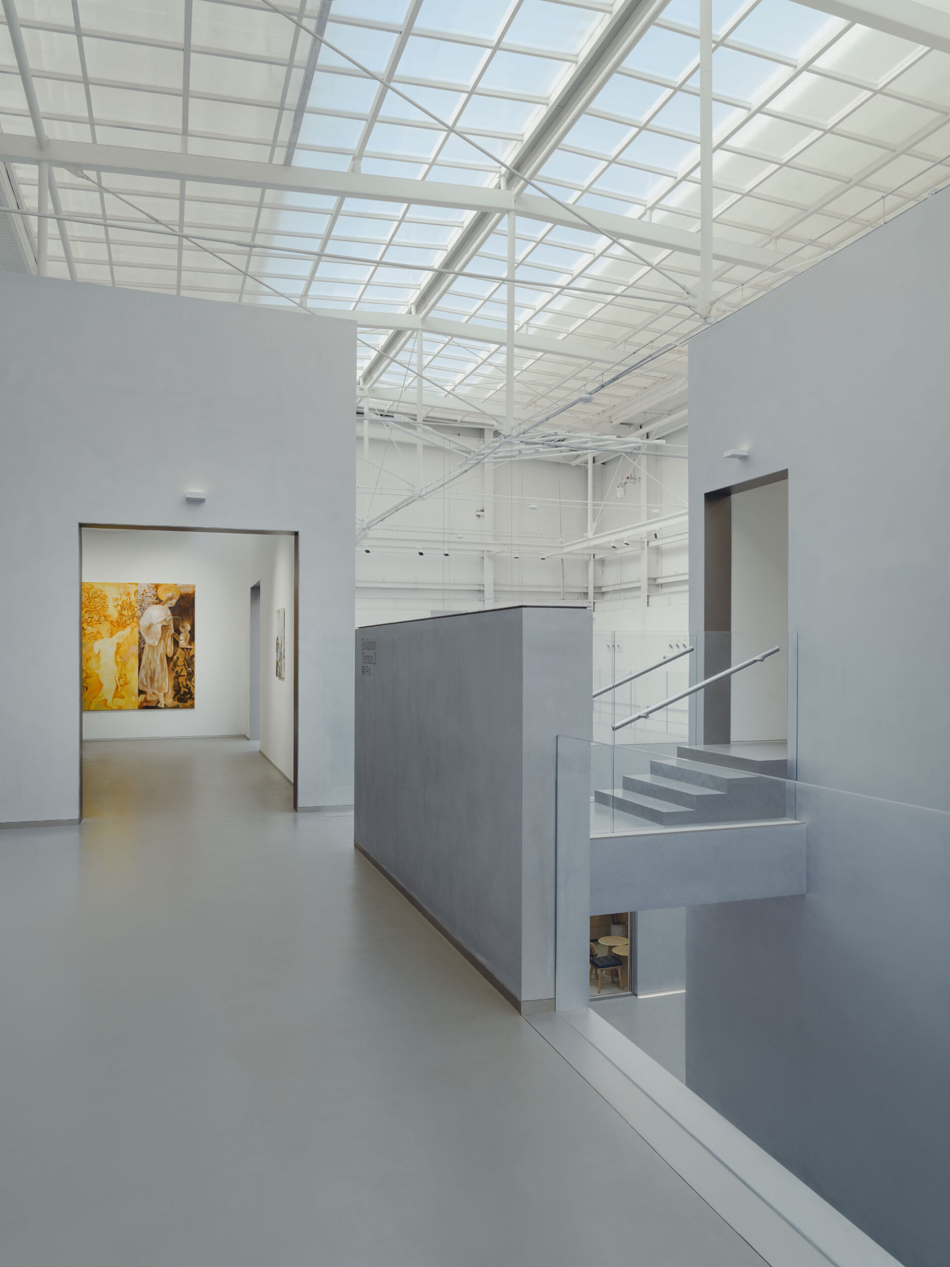
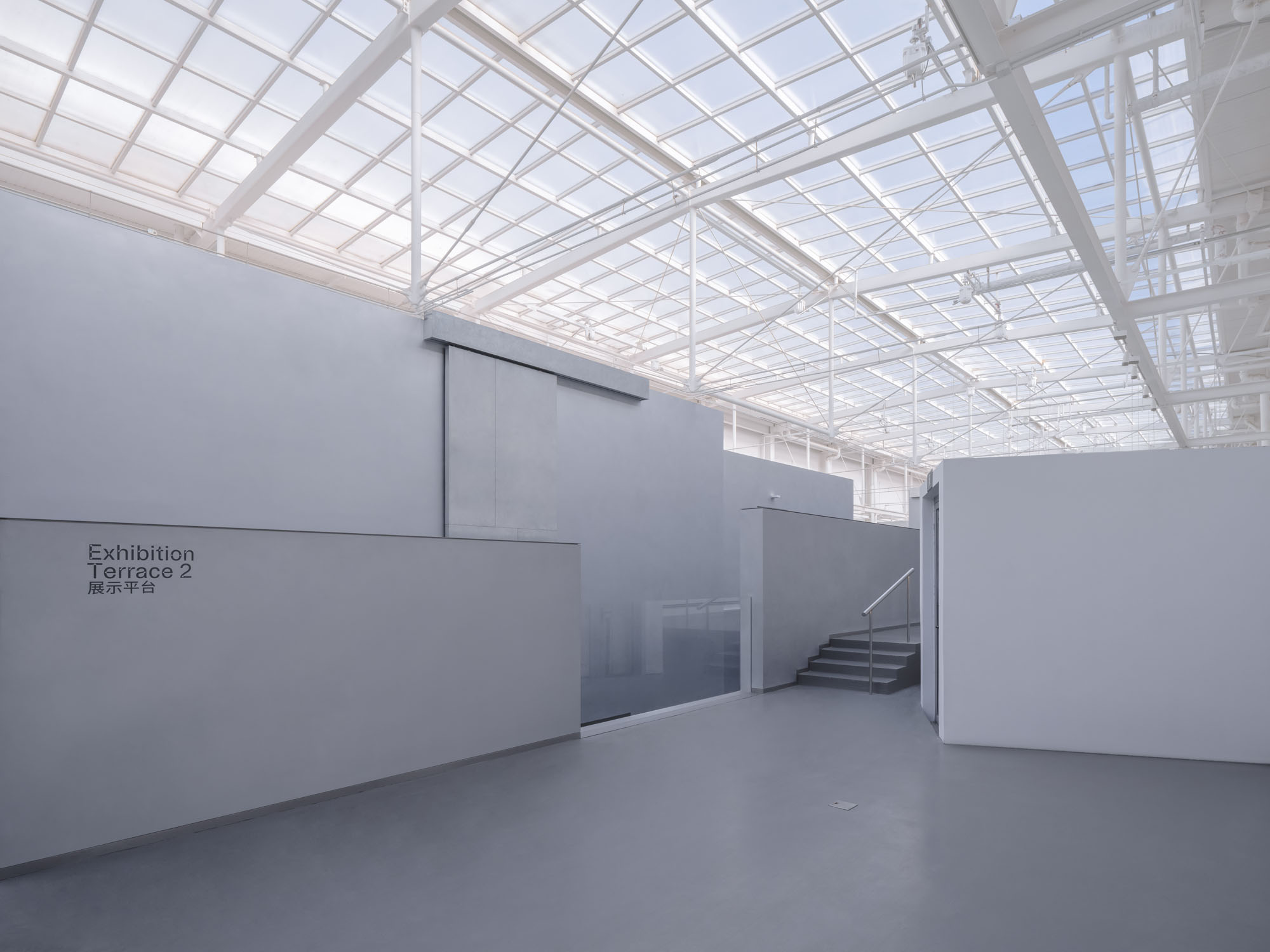
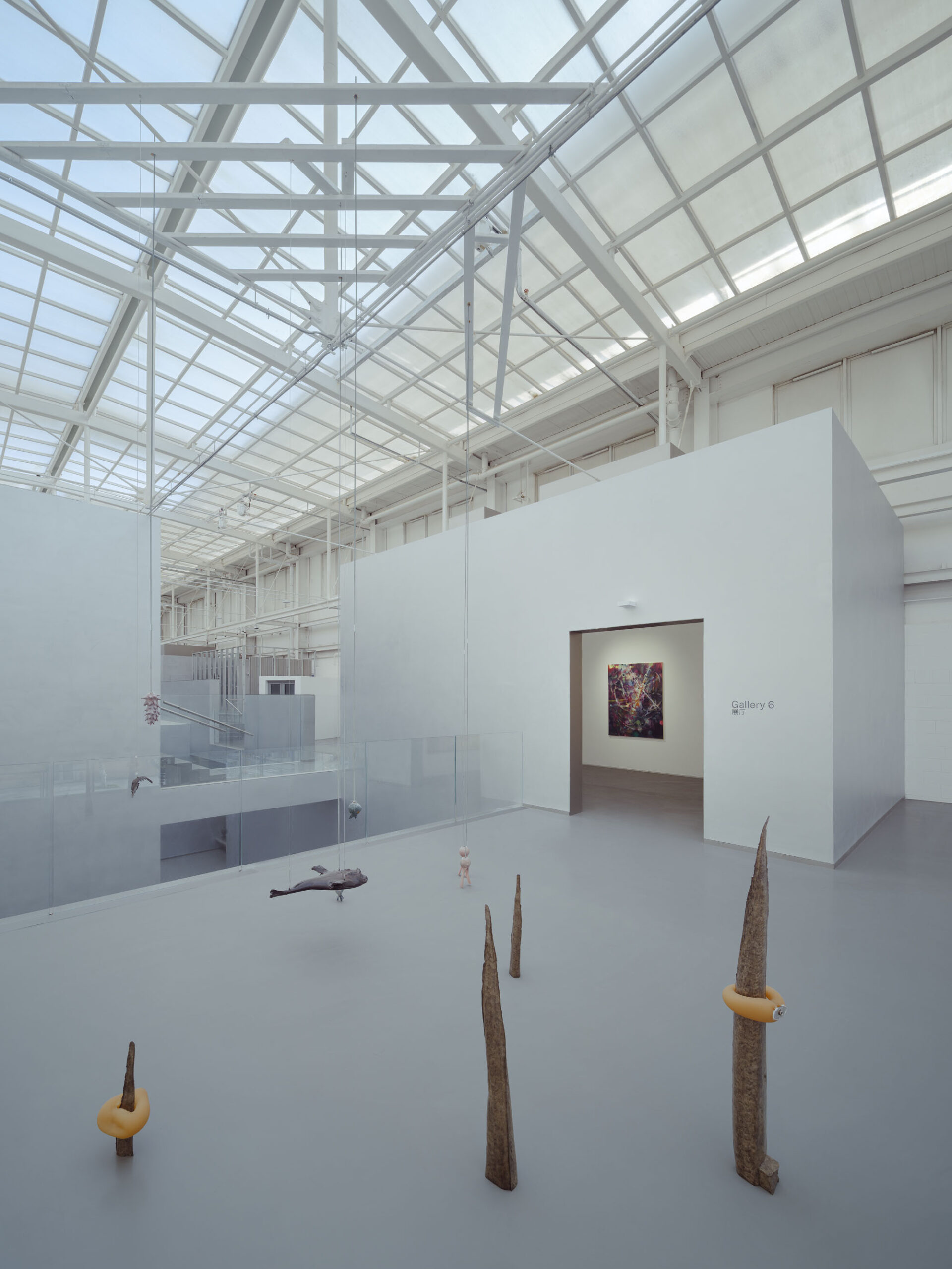
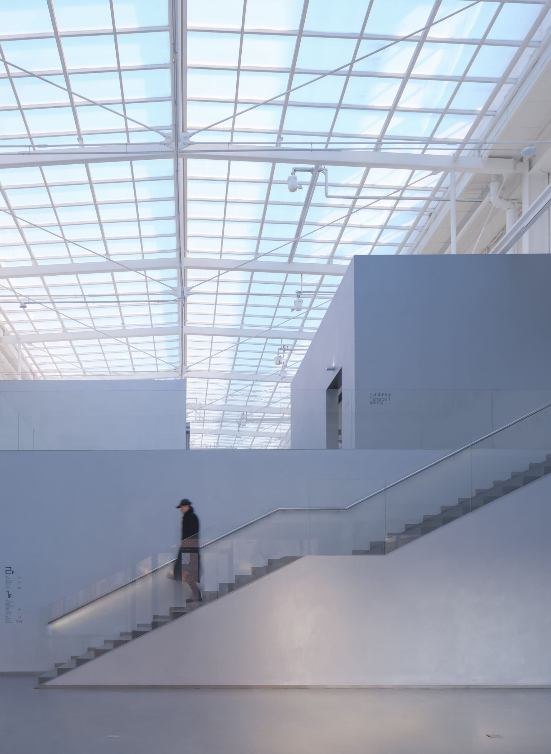
設計は断面の検討から始まった。過去の改修で生まれた記念碑的なトラス構造の天窓屋根が唯一の自然光源となること、そして倉庫の直線的なボリュームと短辺側にメインエントランスがある配置から、この敷地は自然と「谷」のイメージを連想させた。
内部全体を占めていたコンクリートのプラットフォームは、展示室に必要な天井高を満たさず、1階への天窓の光を遮り、来館者が敷地のスケールを認識する妨げとなっていたため、これを撤去し、過去の改修で残された他の部分は維持することを決定した。
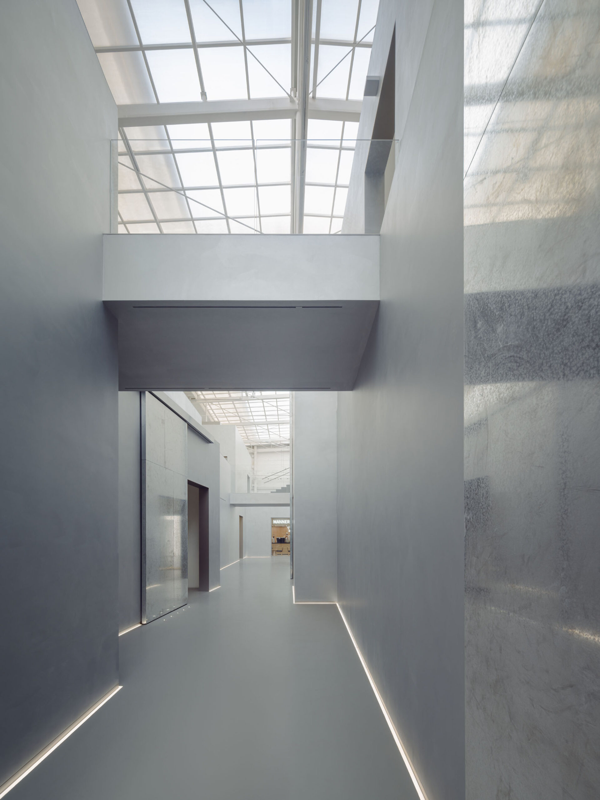
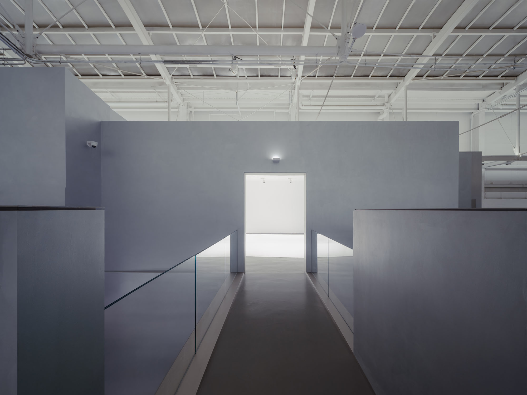
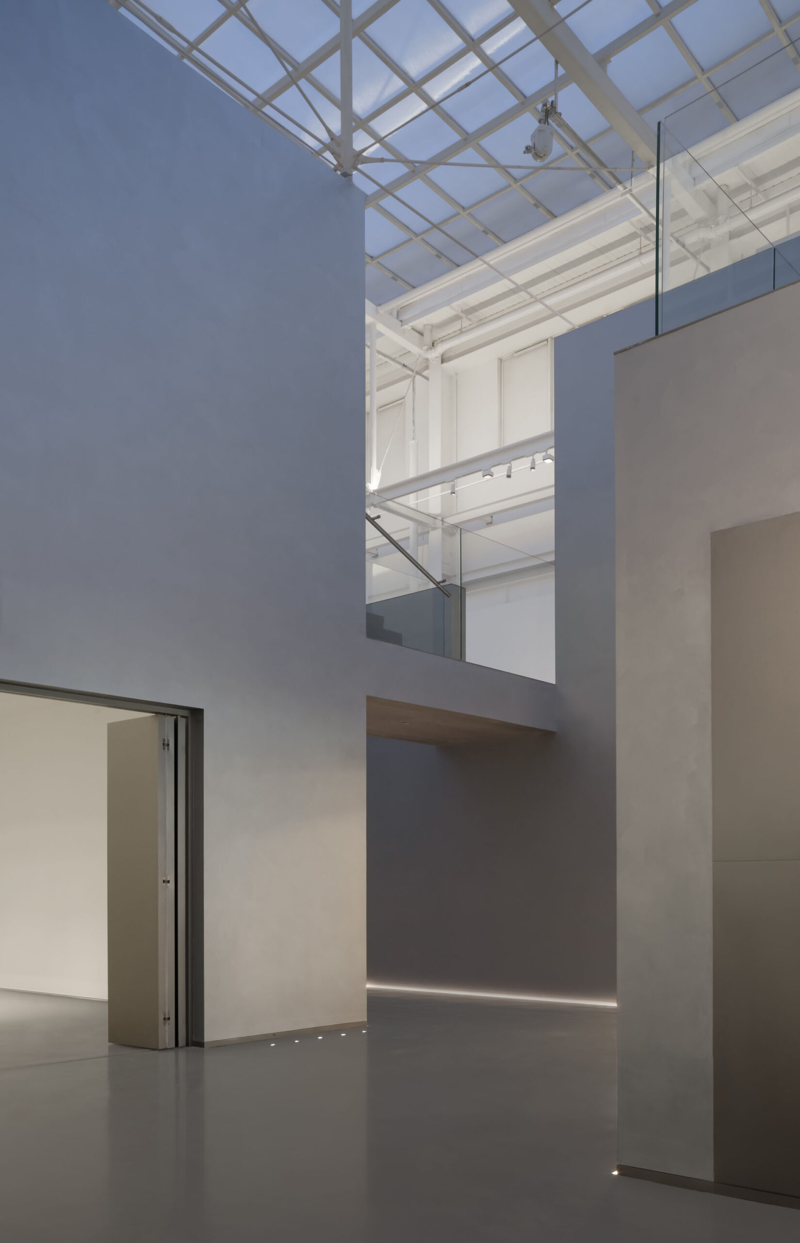
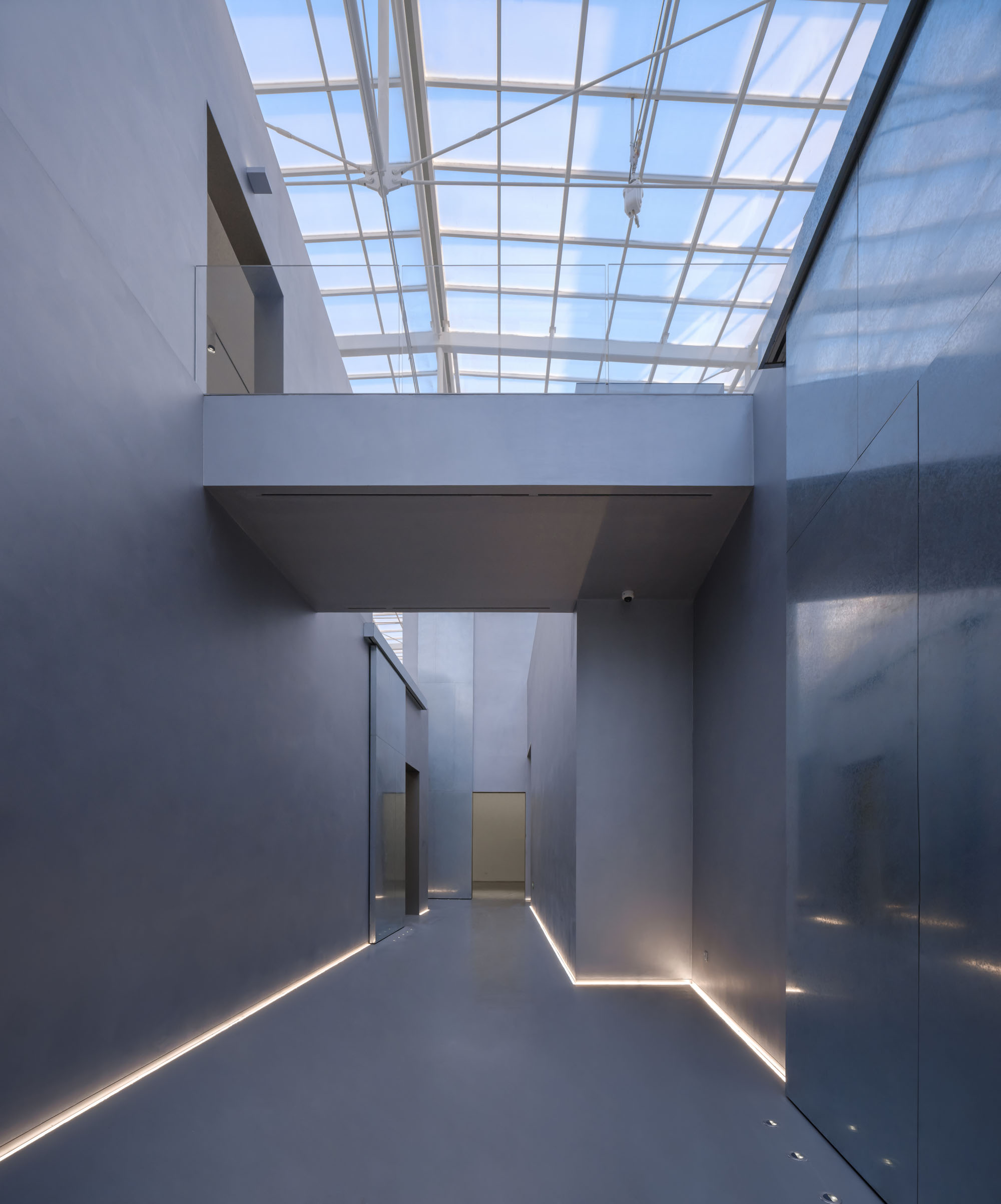
美術館の設計要件で求められる機能空間は2つの長辺壁に沿って配置し、中央には細長い天窓付き空間である「谷」を、主動線兼展示スペースとして残した。この断面空間構成により、それぞれの階が天窓から光を取り入れられると同時に、13mの天井高がもたらす圧倒的な視覚効果を活用できるようになる。一方、以前の改修で設けられた機械室スペースは新たな機能空間に流用可能であり、「谷」の構造は各展示室を独立して管理する可能性を創出している。
断面設計戦略 © Studio NOR
地質学的な変化のように融合する展示空間
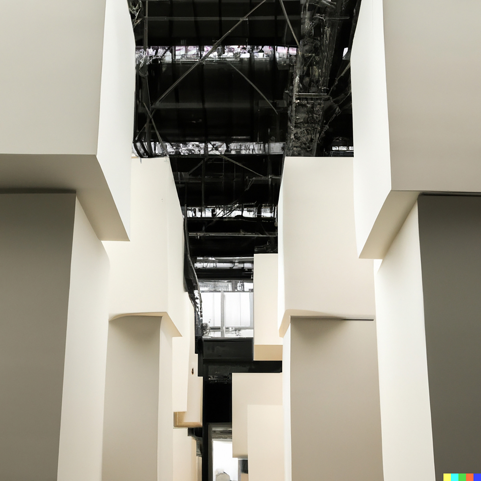
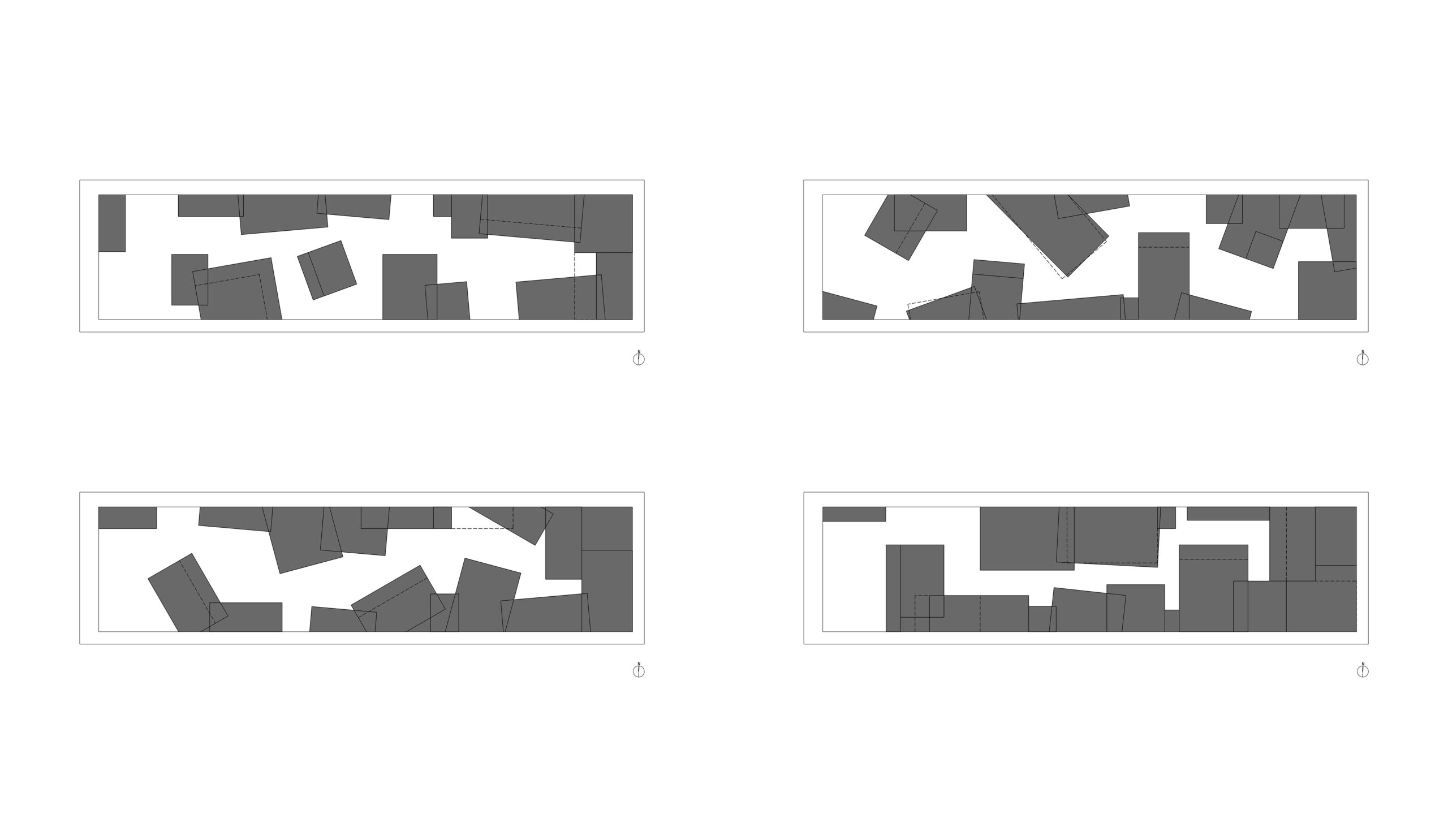
当初、機能別のボリュームは、倉庫の貨物積み上げを想起させるような独立した箱を積み重ねた形態で設計されていた。しかし、設計過程で要求仕様が調整されるにつれ、各機能に必要な面積が次第に拡大していった。その結果、箱は互いに押し合いながら融合し、最終的には完全に一体化するに至ったのである。この融合プロセスは、「谷」の概念を反映した地質学的変化と極めて類似している。したがって、断面の戦略は維持しつつ、箱状の形態的独立性を「許容」し、わずかに傾斜した壁面によってほのめかす程度に退化させた。
こうして「谷」の両側に配置されたプログラムボリュームは、元々は独立していた無数の断片が組み合わさった連続的な「山岩」へと変容した。これらの同型形態の間には空間的な階層が存在せず、差異を持ちながらも一体に混ざり合っている。来館者が美術館空間の全体像や代表的な視点を捉えるのは容易ではないが、連結された断片の素材と形態の均質性は、ある種の漠然とした統一感ある空間体験を依然として提示し得るものである。
AI(DALL·E)を用いて作成した初期積載コンセプトイメージ © Studio NOR
独立したボリューム群の統合過程 © Studio NOR
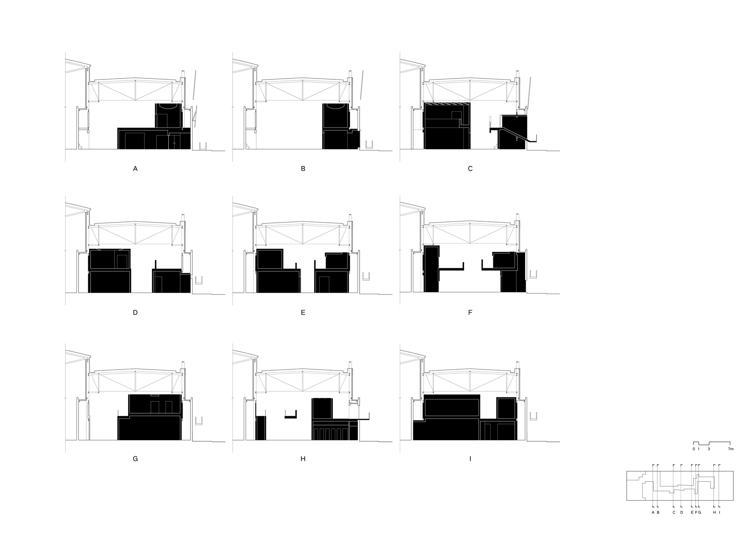
Section © Studio NOR
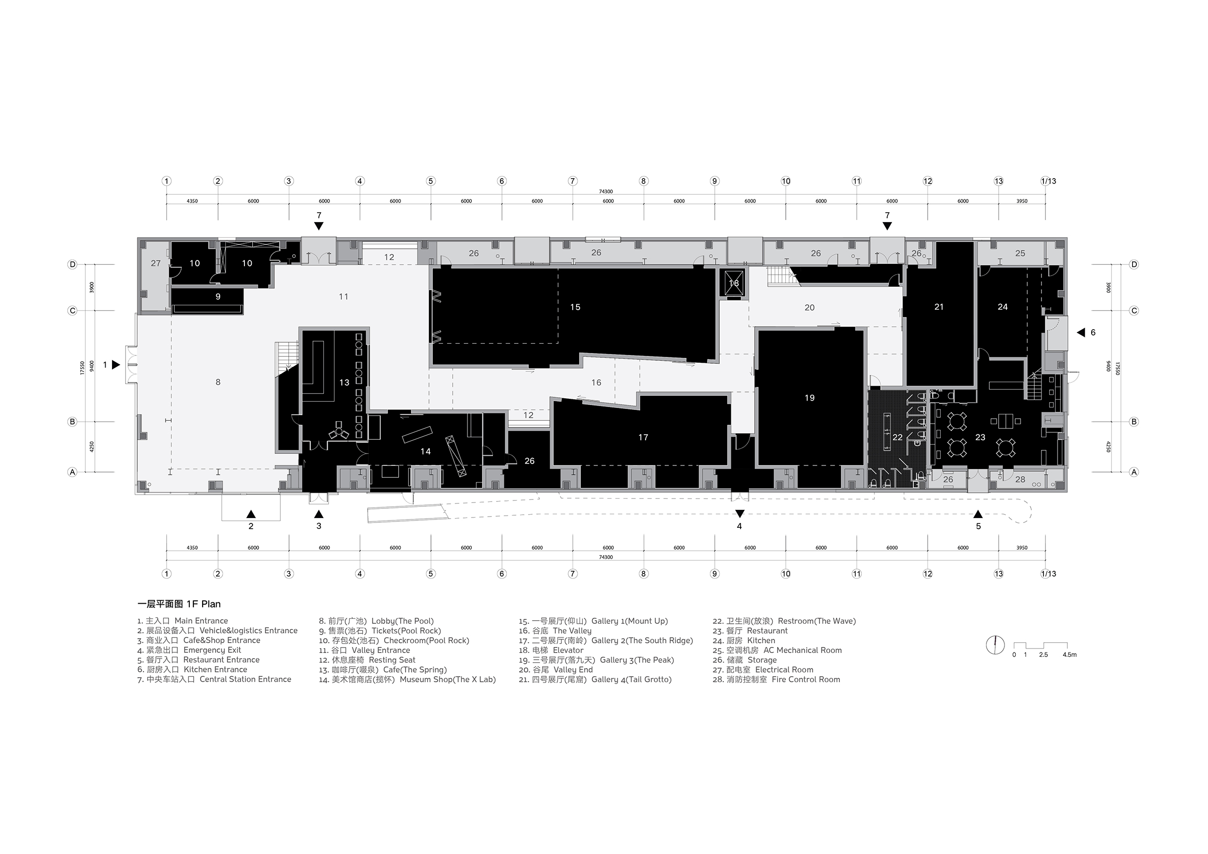
1F Plan © Studio NOR
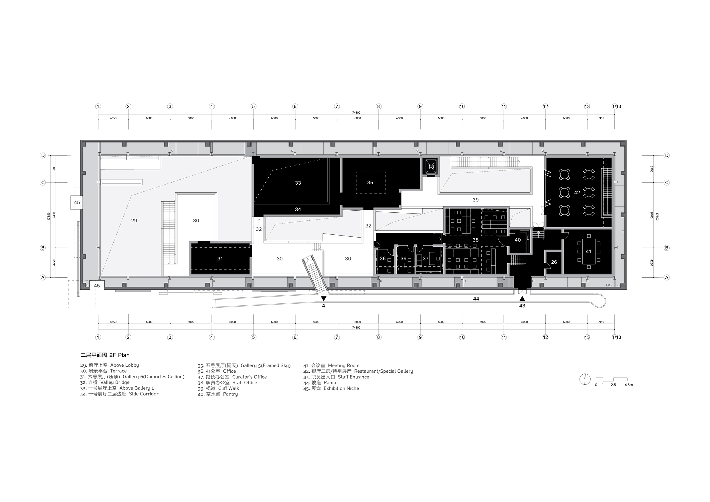
2F Plan © Studio NOR
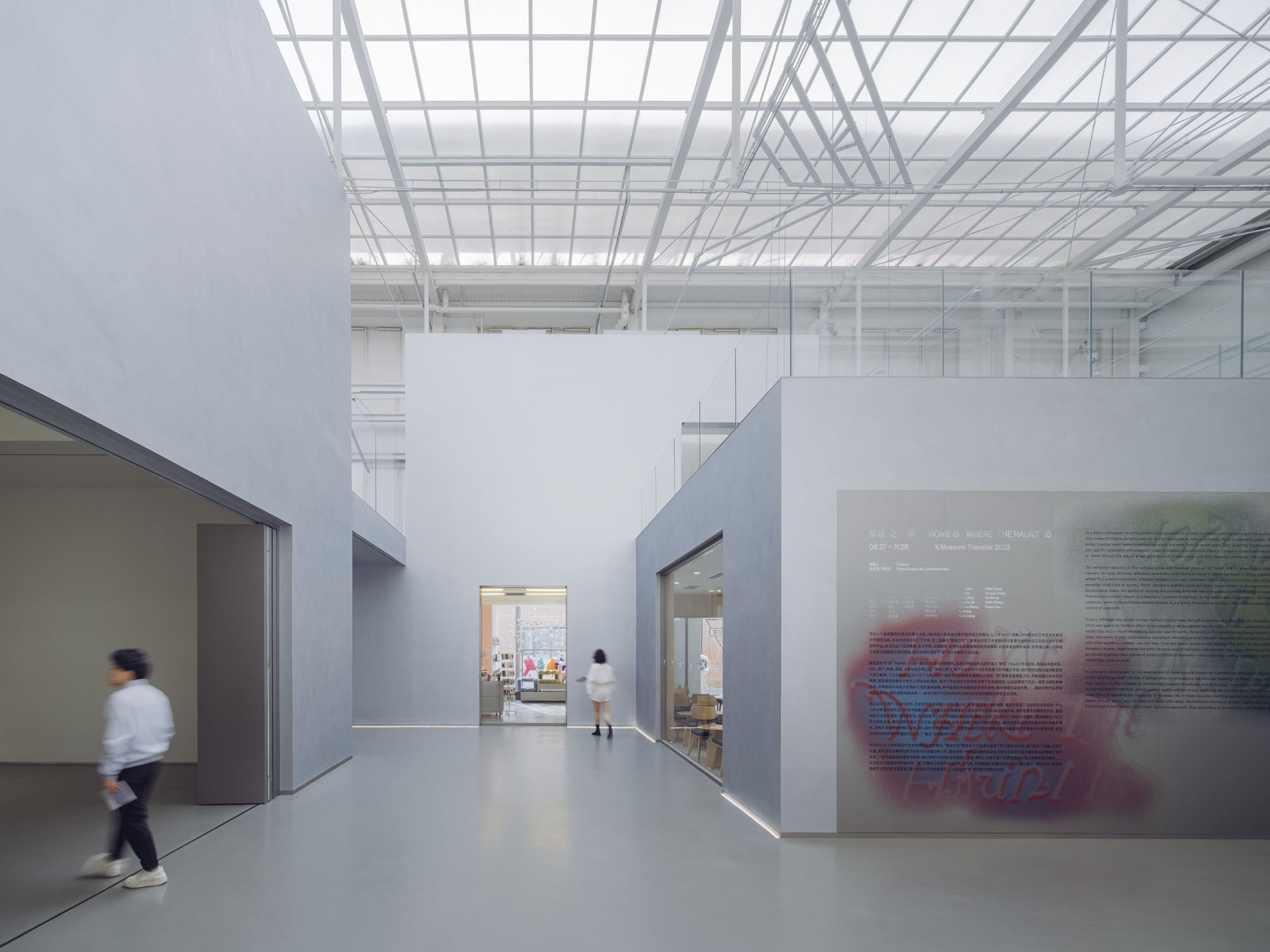
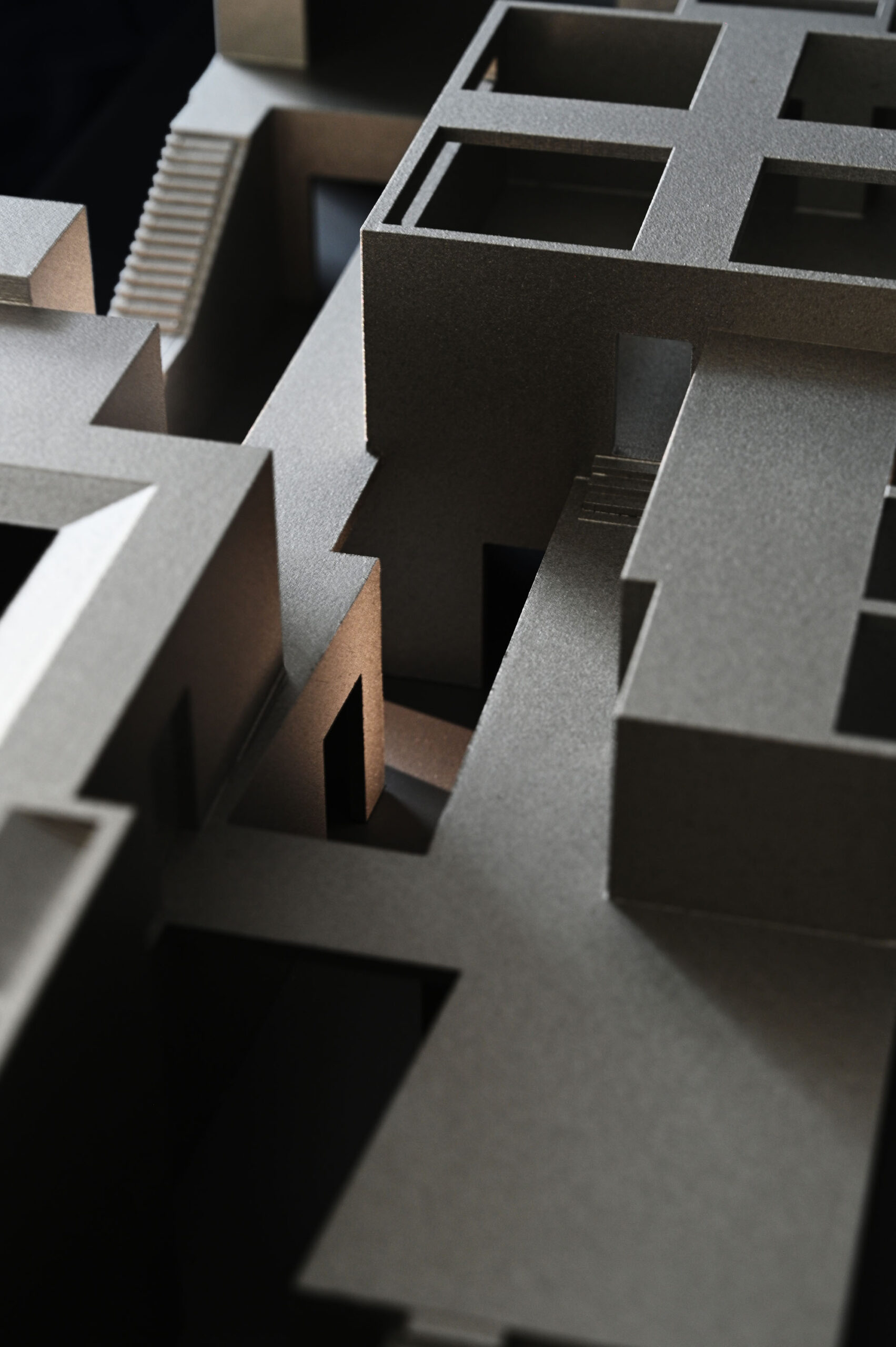
「谷」と「岩山」を巡るシークエンス
谷と岩山の二項対立は、内部空間における「外」と「内」という新たなレイヤーを生み出し、〈X Museum〉での体験を自然の谷間を歩く感覚に比喩的に重ね合わせる。これは中国の伝統的な庭園や絵画が用いる比喩的叙事法と通じるものがあると言えるだろう。
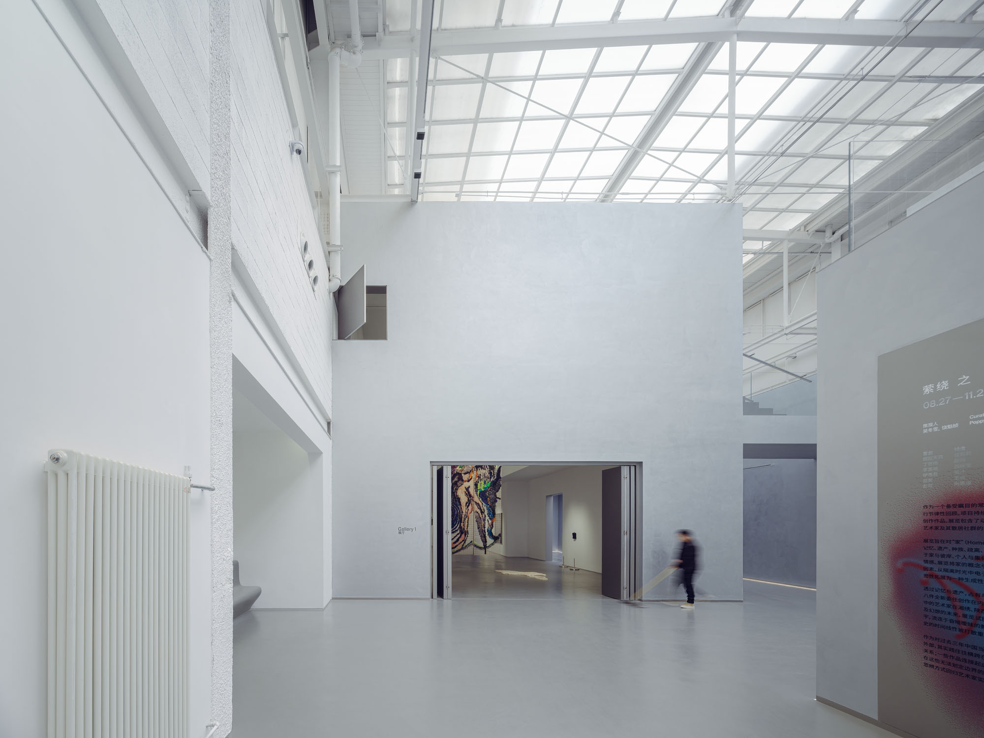
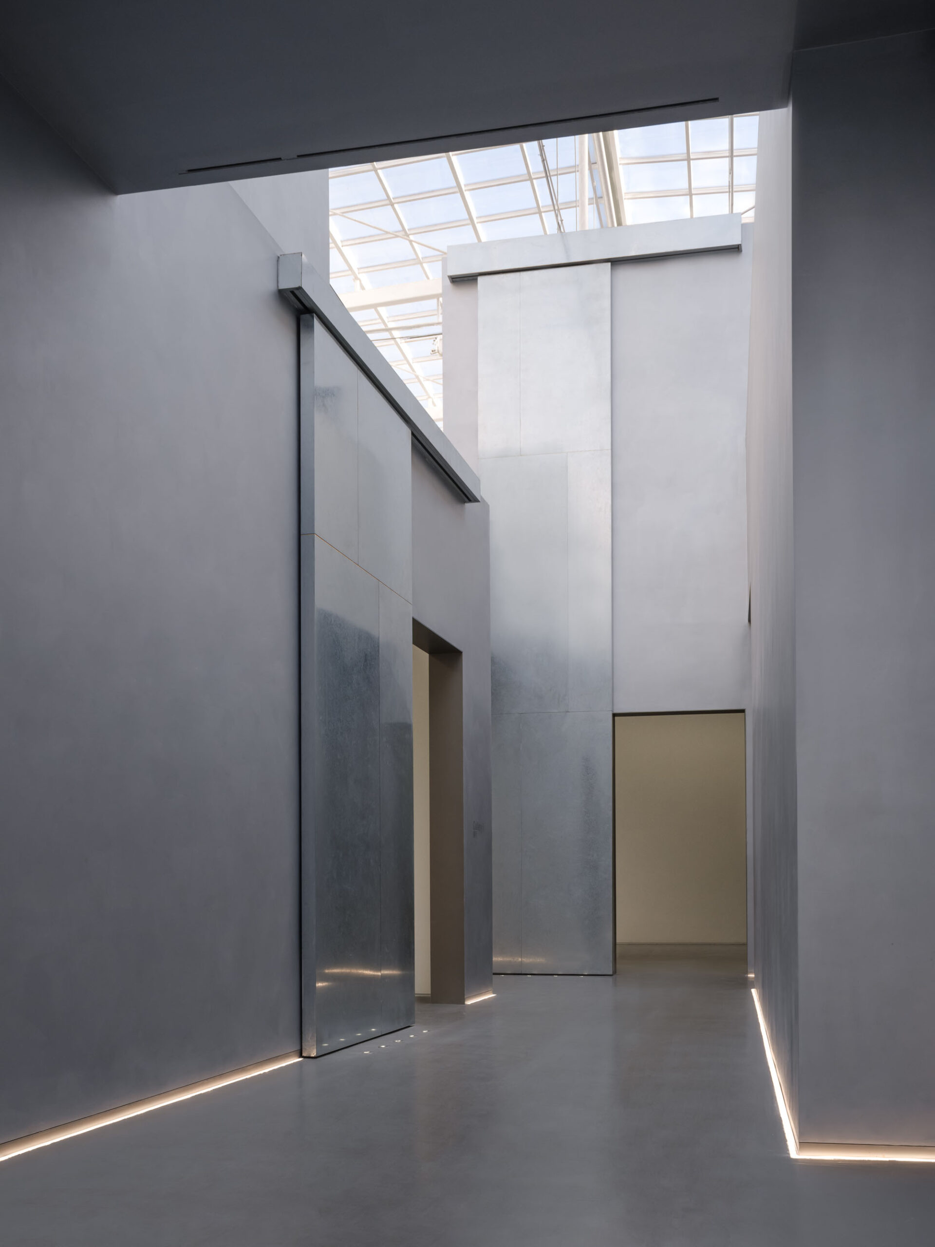
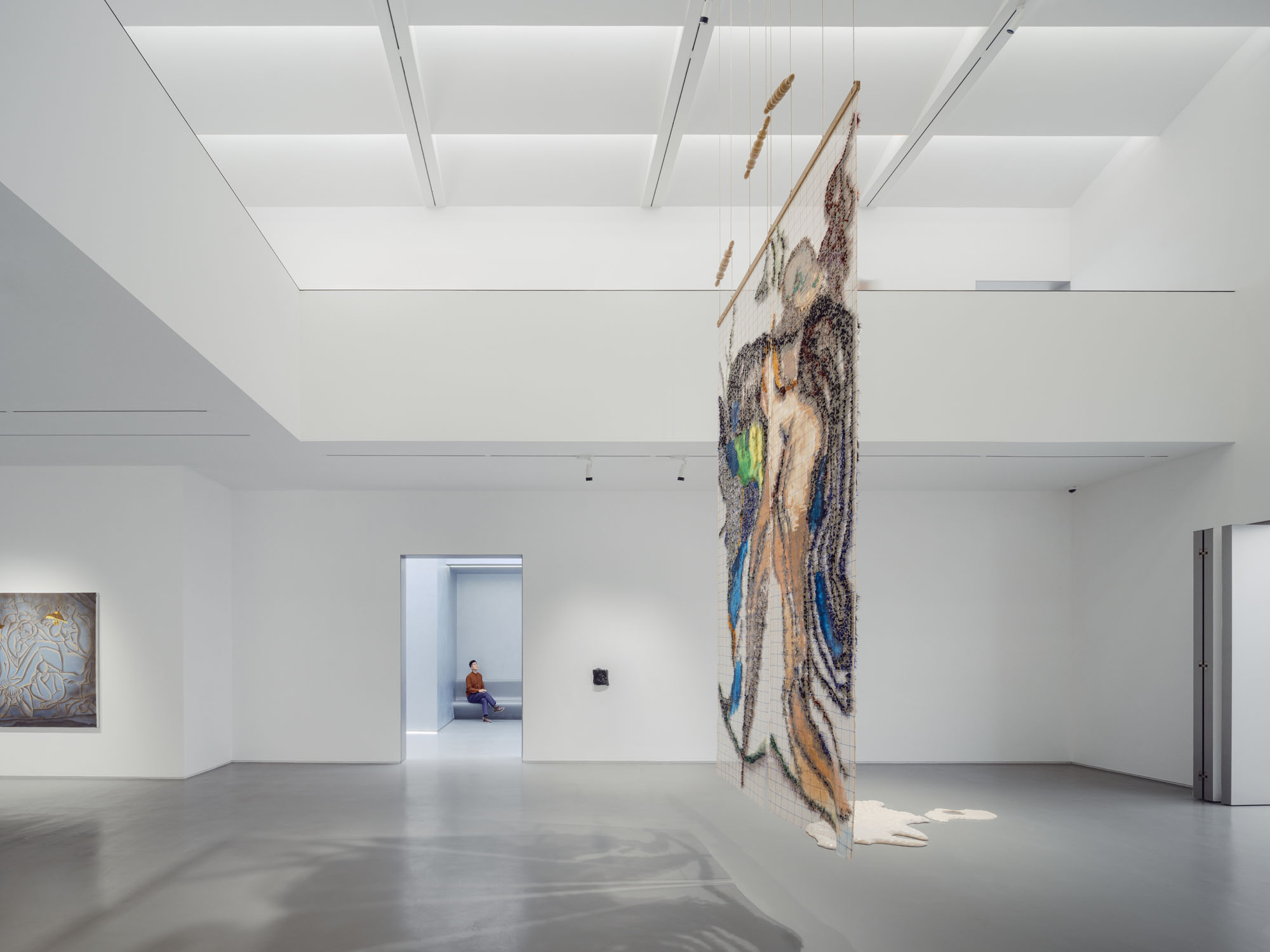
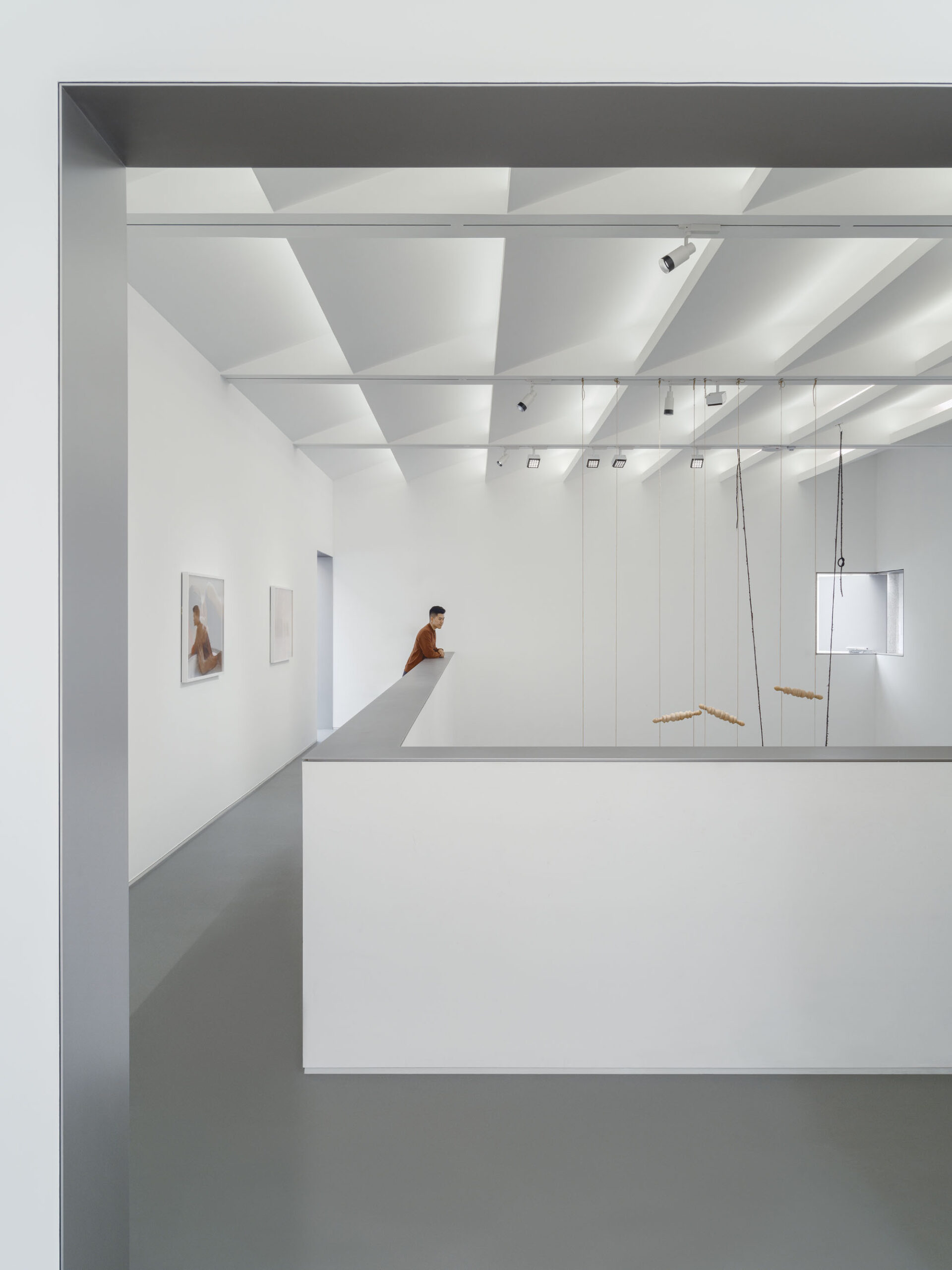
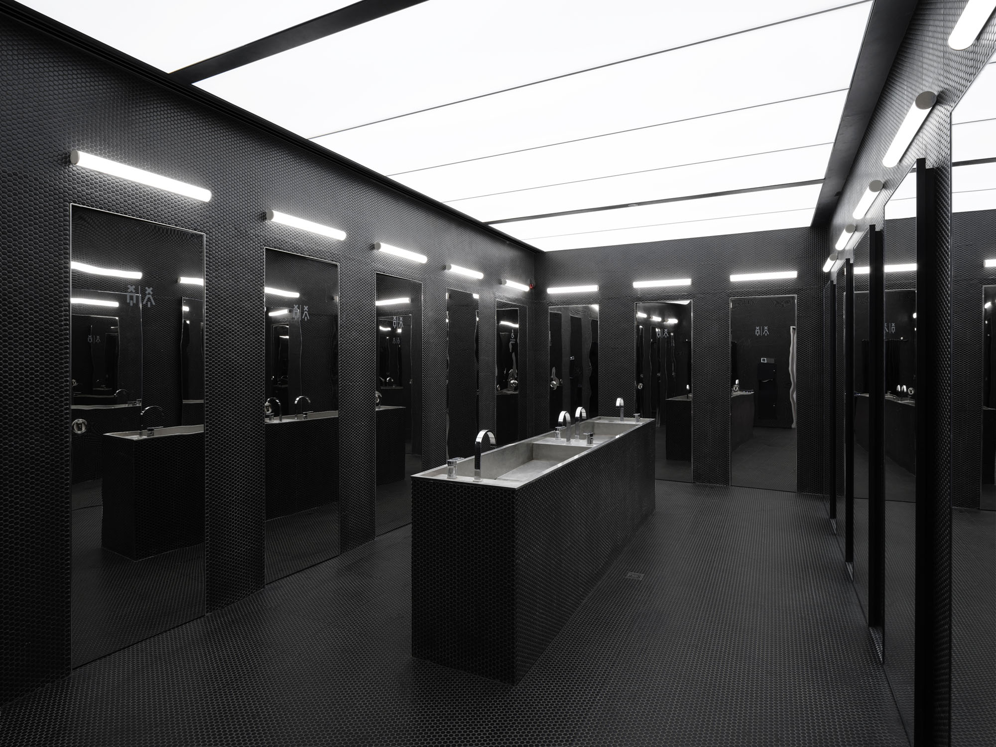
ロビーはイベントや大型インスタレーションのための二重高天井の開放アトリウムであり、「谷」へ入るために渡らねばならない「湖」に見立てられる。第3展示室上部のスタッフオフィスは、美術館全体で最も高いボリュームとして「山脈」の「峰」を象徴する。特殊な倉庫用ゲートレールに吊り下げられた6枚の亜鉛メッキ鋼製スライドドア(最高部は8m)は「滝」を表現している。「谷」に入ると、訪問者は一連の開口部、階段、橋を通じて「谷」と「山」の間を行き来することになる。内部空間を蛇行しながらも、その空間体験はまるで屋外環境のようである。
©︎ Tianzhou Yang
©︎ Tianzhou Yang
©︎ Tianzhou Yang
©︎ Songkai Liu
©︎ Tianzhou Yang
©︎ Songkai Liu
04. 吊り下げフレーム
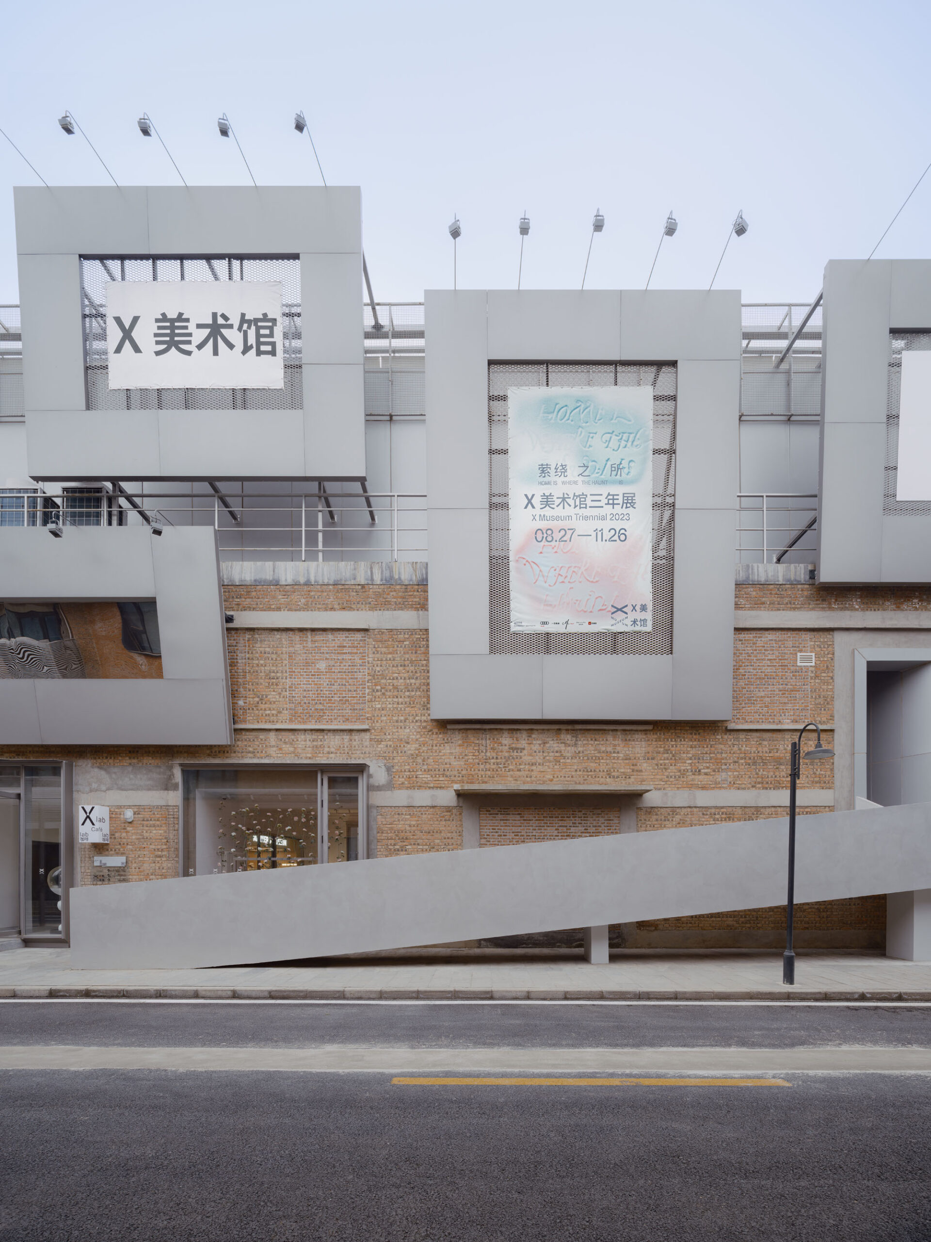
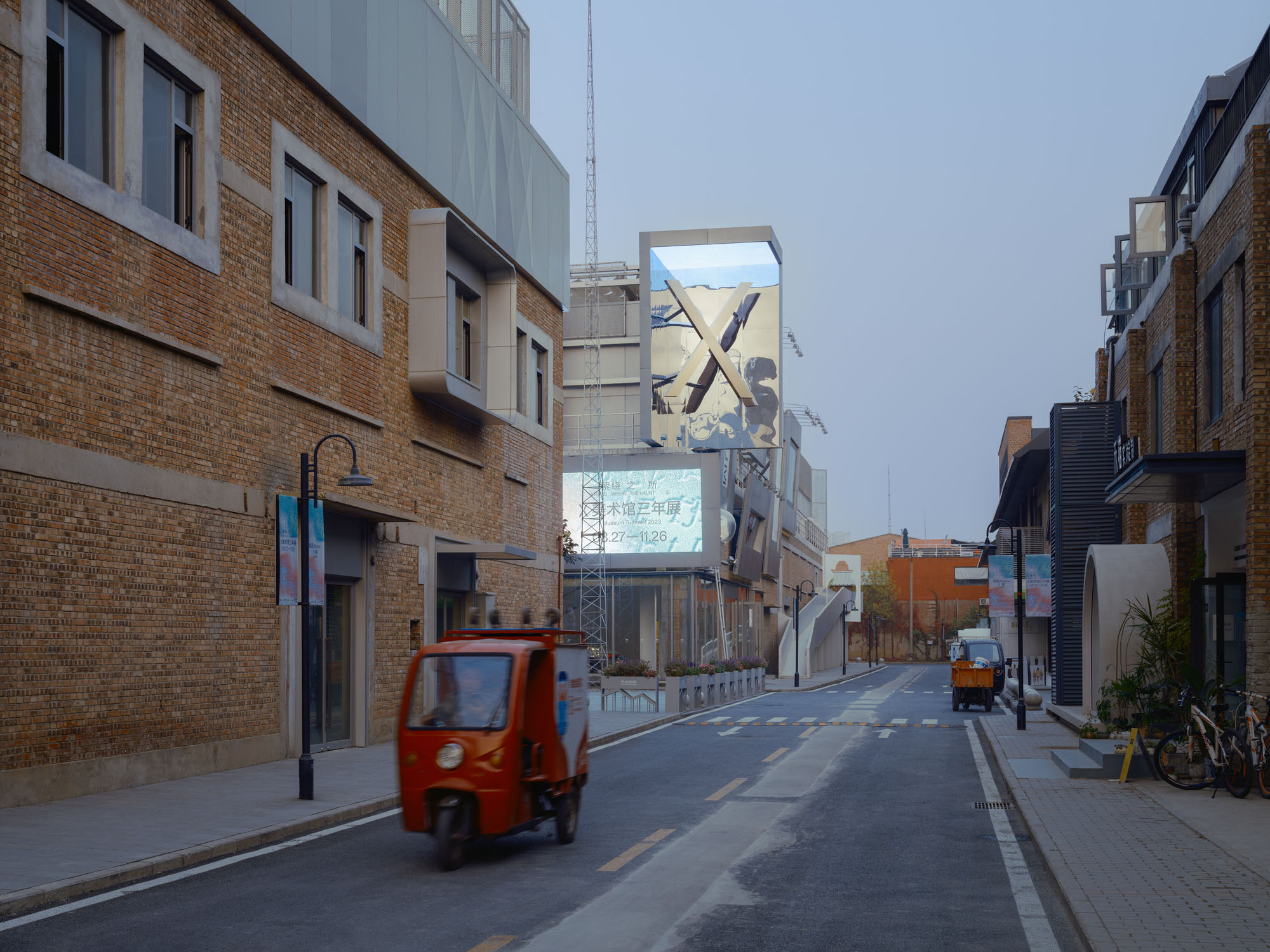
視覚情報の多いまちで注目を集める「より騒がしい」ファサード
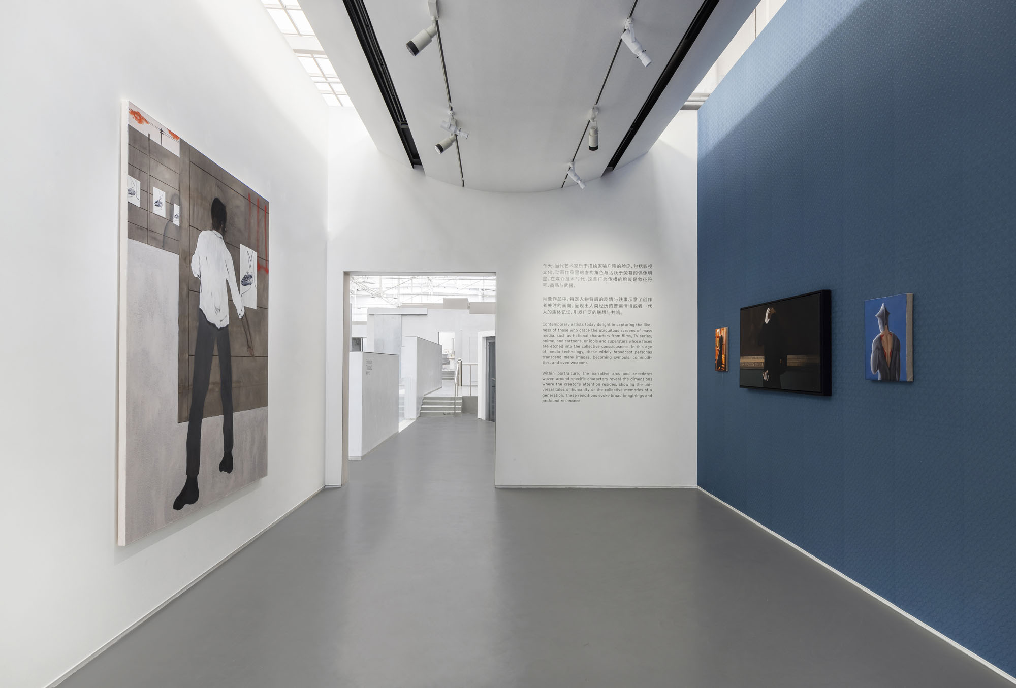
クライアントは、過剰なファサードデザインが乱立し、視覚的過負荷状態にある朗園駅周辺において、人々の注目を集めるために「より騒がしい」ファサードを設計するよう要求した。この要求は、サロン・ド・パリに起源をもつ展示様式「サロン・ハング」を想起させた。壁面に幾重にも密集した絵画が、観客の注目を競い合うこの手法は、本質的にはギャラリーの壁を芸術家と鑑賞者が相互に作用するマスメディアへと変容させる手法であると言える。
さらに私たちは、中国伝統の崖刻銘文、寺院の扁額、巻物や書画の収蔵印から、街頭広告板、ウェブページのメイソンリーレイアウト、さらには動画サイトの弾幕字幕に至るまで、形態的に類似した数々の表現形式を想起した。これらすべての伝達形態は、集合的な方法で差異化された個体の情報を伝え、断片の並置を通じて強力な視覚的緊張感を呈している。
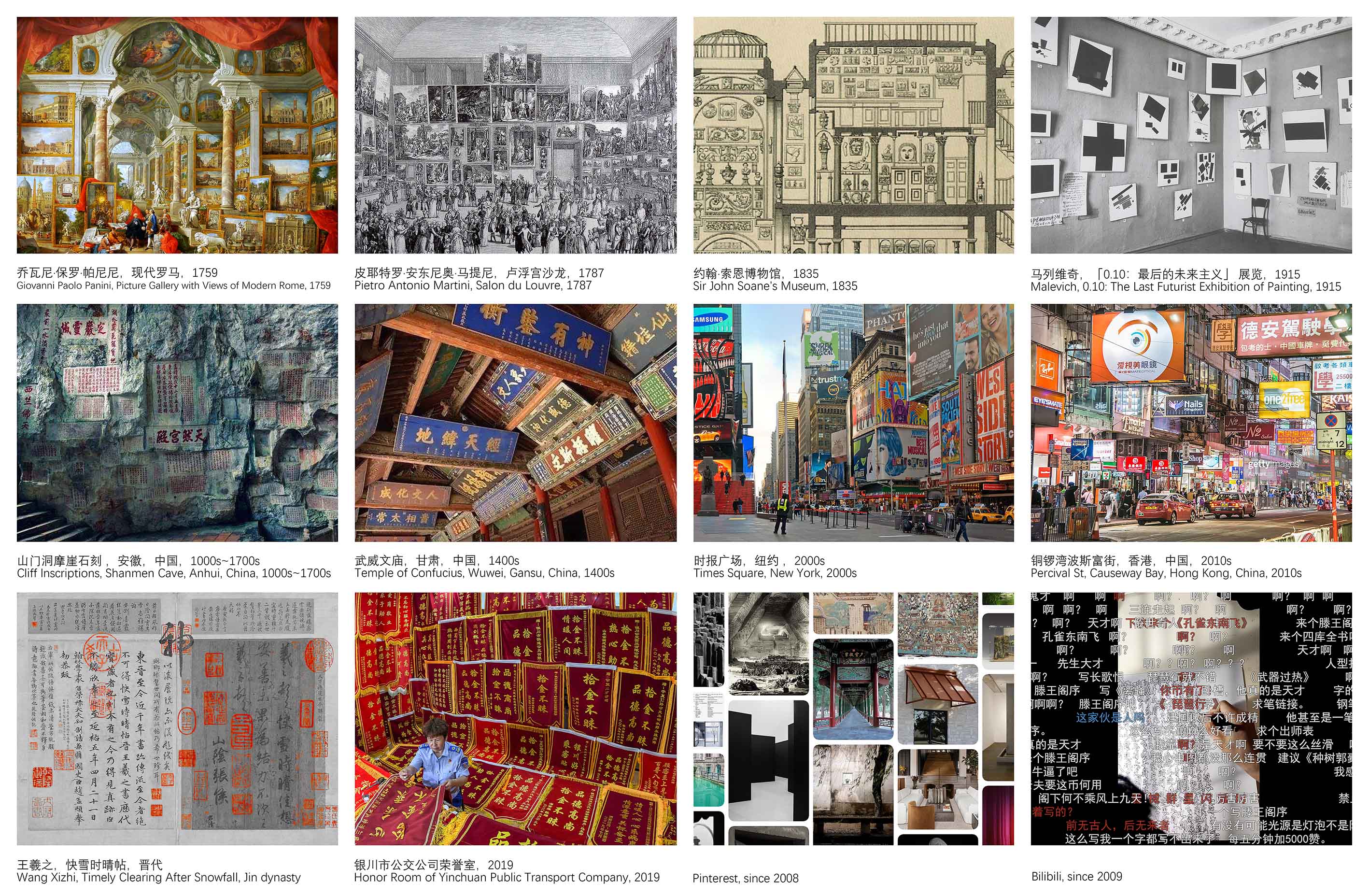
ファサード参照:集合的個人 © Studio NOR
朗園駅周辺にある漫画風装飾ファサード © Studio NOR
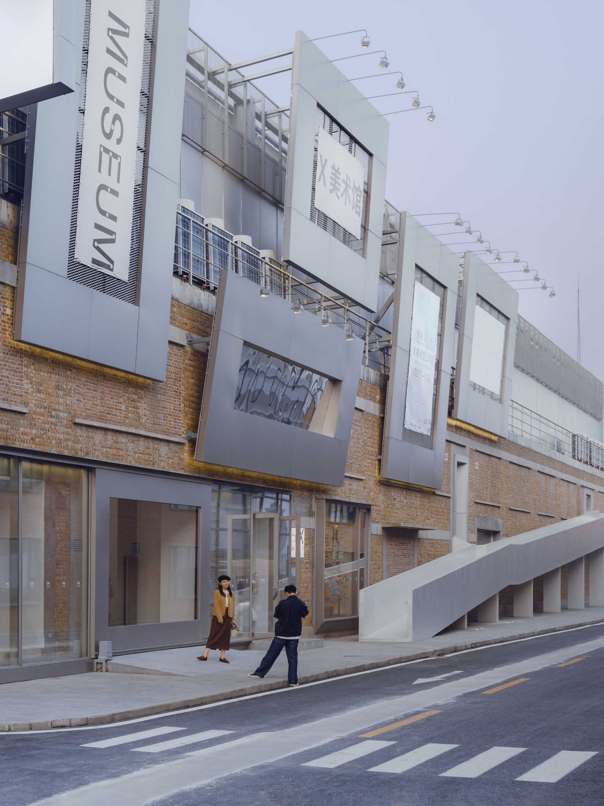
街路をギャラリーへと変貌させる「フレーム」と「展示ニッチ」
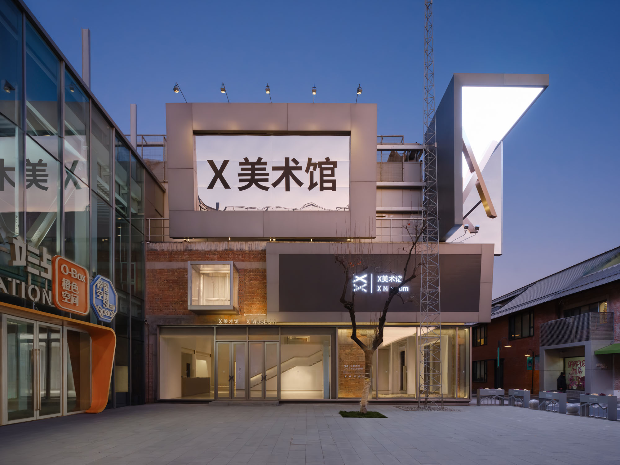
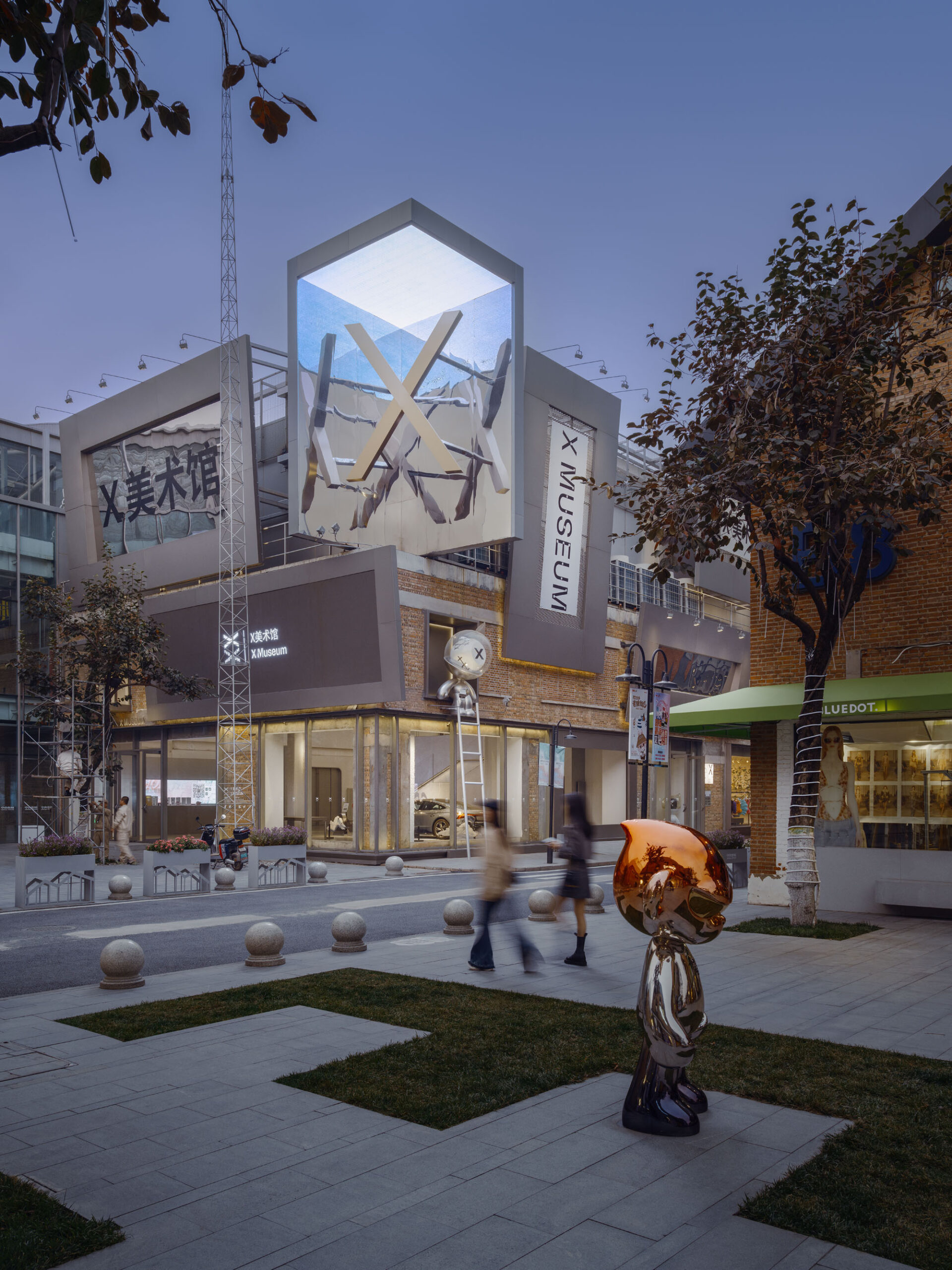
そこで外壁に13の「フレーム」と3つの「展示ニッチ」を設置し、看板・横断幕・グラフィックアート・インスタレーションを展示することとした。これにより街路が美術館の「屋外ギャラリー」と化し、内容の外部化と通行人との対話を実現したのである。
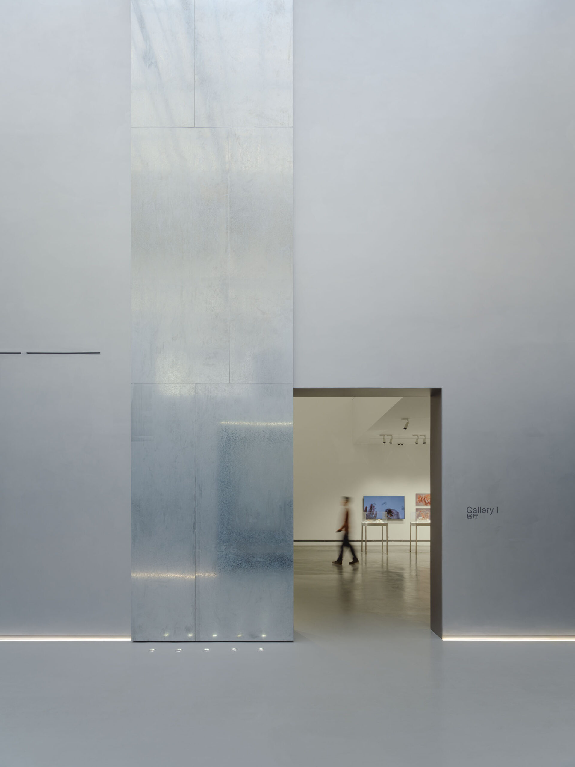
数度のVE検討を経て最終的に設置された8つの「フレーム」は、外壁で最も人通りの多い角地に集中配置されている。1階にある1つのフレームは、車両や大型芸術作品の搬入用スライドゲートとして使用され、残りの7つのフレームにはLEDスクリーン、傾斜鏡ニッチ、エキスパンドメタルメッシュが組み込まれている。
©︎ Tianzhou Yang
©︎ Songkai Liu
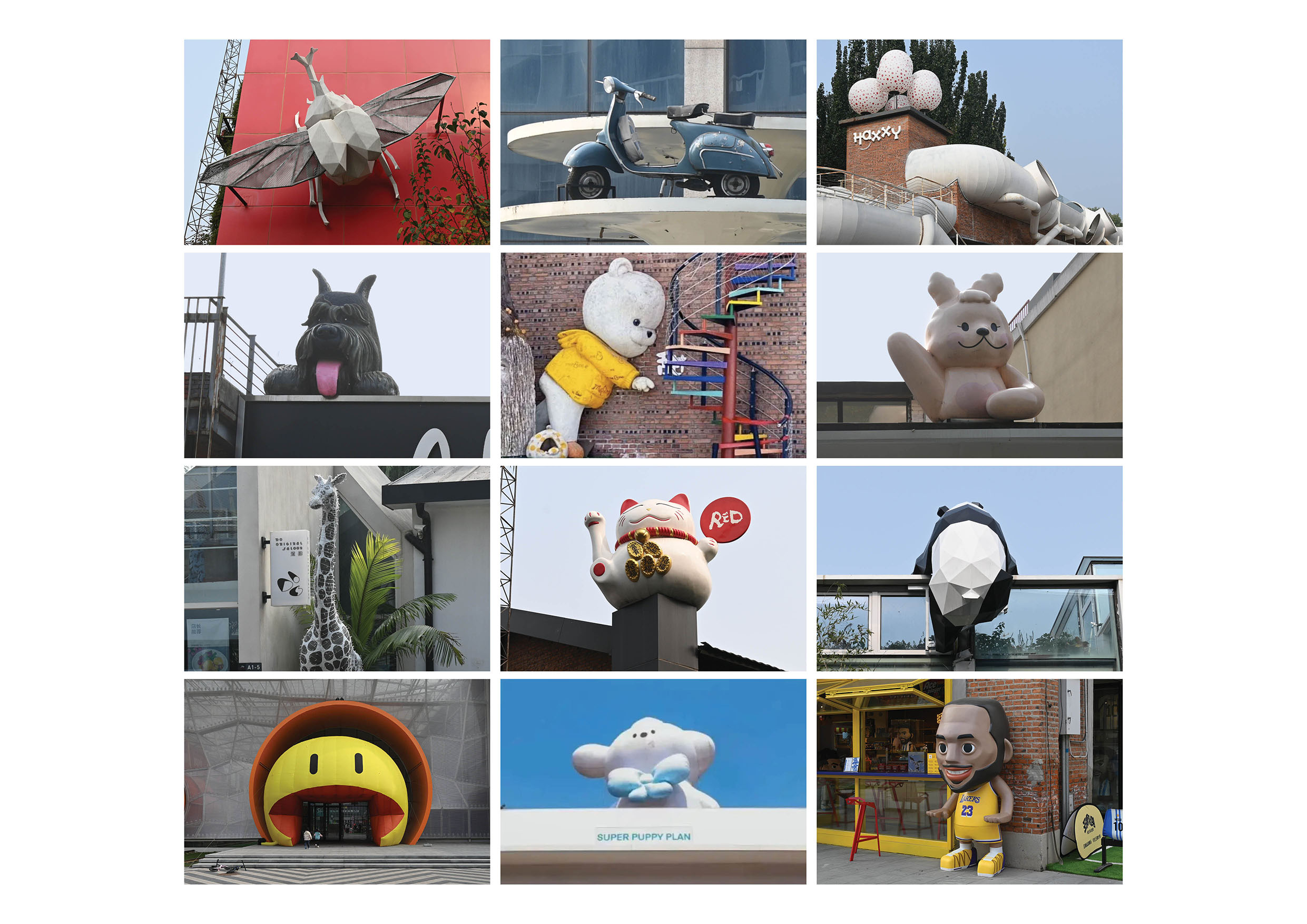
「展示ニッチ」については、1つはファサードから突出し、1つはファサードに彫り込まれ、最大のものとなる3つ目は残存する赤レンガ壁の南西角上に張り出した構造となっている。これは2つの鏡面側壁とLEDスクリーン天井で構成され、巨大な金色のX字標識と、その内角に映し出される3つの鏡像を保持している。このややシュールレアリスム的なインスタレーションは、美術館の主要なシンボルであると同時に、朗園駅周辺に数多く見られる漫画的な装飾ファサード彫刻へのパロディ的応答でもある。
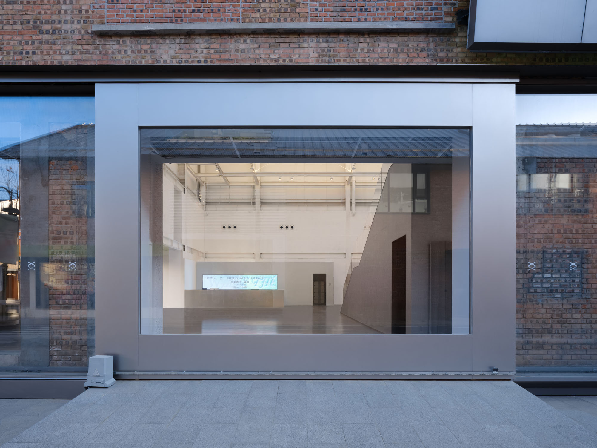
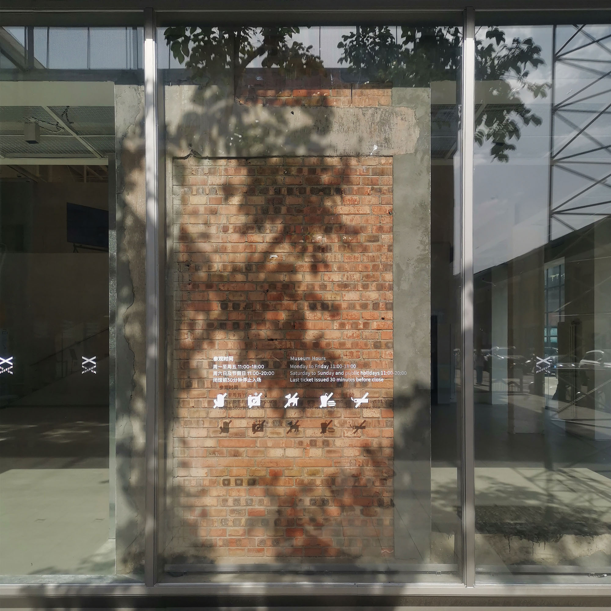
歴史をショーケースに収めるガラスの皮膜
敷地内で唯一残された産業遺構である赤レンガのファサードに対しては、1階レンガ壁の外側に新たなガラスファサード層を窓・扉として付加するという繊細な手法で対応した。このガラス層は開口部とレンガ壁の一部を覆い、元のファサードを通行人のためのガラスショーケースに保護展示する展示物へと変容させ、静かにこの地の歴史を想起させている。
©︎ Tianzhou Yang
© Studio NOR
05. すべての人々のための空間
設計の想定を超えた豊かな活用
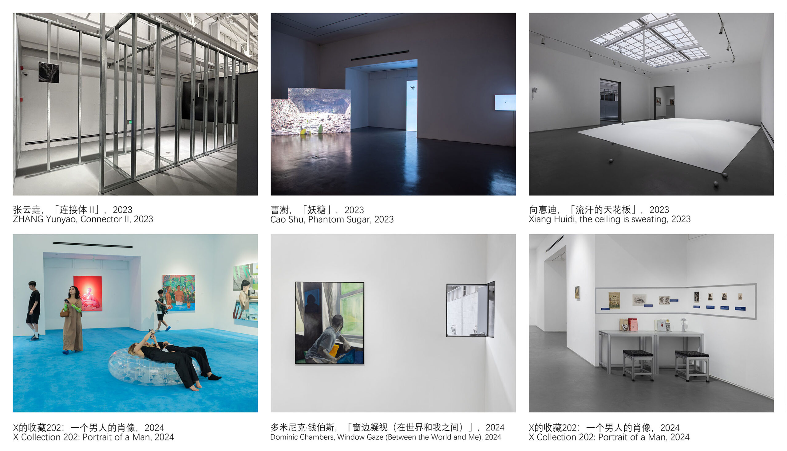
〈X Museum〉の豊かな形態と多様な経路は、絶えず変化しながらも簡潔な空間体験を提供し、キュレーターやアーティストに柔軟性を与えると同時に、さまざまなイベントの可能性を拓く。開館以来、私たちは美術館の日常的な利用状況やSNSでの露出を追跡しているが、キュレーションチームが展示室を創造的に活用し、来館者が特定の空間と対話する様子にしばしば驚かされている。
同型的な「連結された断片」の複雑さと動的なサーキュレーションは、「トップダウン」とも言える設計を緩やかな構造の枠組みへと変容させ、利用者の自発的な「ボトムアップ」的関わりを許容し、さらには喚起するものである。これにより各来館者は、訪れるたびの異なる心境に応じて自身の「お気に入りの空間」を見出しつつも、空間全体から切り離された感覚を抱くことはない。このバランスは、現代社会において個々の独立性と集団的合意を同時に追求しようとする人々の、絡み合った精神状態の反映でもあると言えるだろう。
美術館とアーティストは空間と対話しながら作品を企画・制作 © X Museum
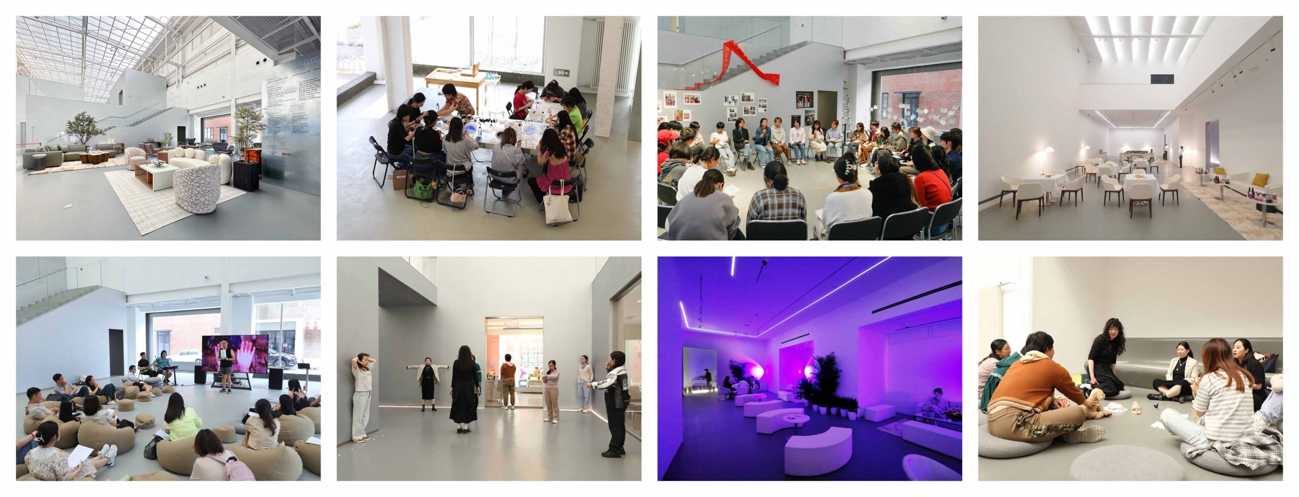
美術館スペースで開催されるさまざまなイベント © X Museum
次世代の美術館が提示する空間像
ゆえに〈X Museum〉の理想的な空間像は、特定の写真に収まることも、特定の来館者の印象に映し出されることもなく、幾重にも重なり合う来館者個人の体験が、ぼんやりとした境界線で交差する集合体として捉えられるべきである。
厳粛な聖域から降り立った美術館は、公衆を惹きつけようと日常に溶け込み、むしろ奔放な方法で未来の境界を探求している。物理的な美術館は次世代にどのような空間像を示すべきなのであろうか? 〈X Museum〉の建築デザインは、曖昧な距離感と記念碑性を帯びた親密な日常風景を提供することで、この問いに答えようとしているのである。
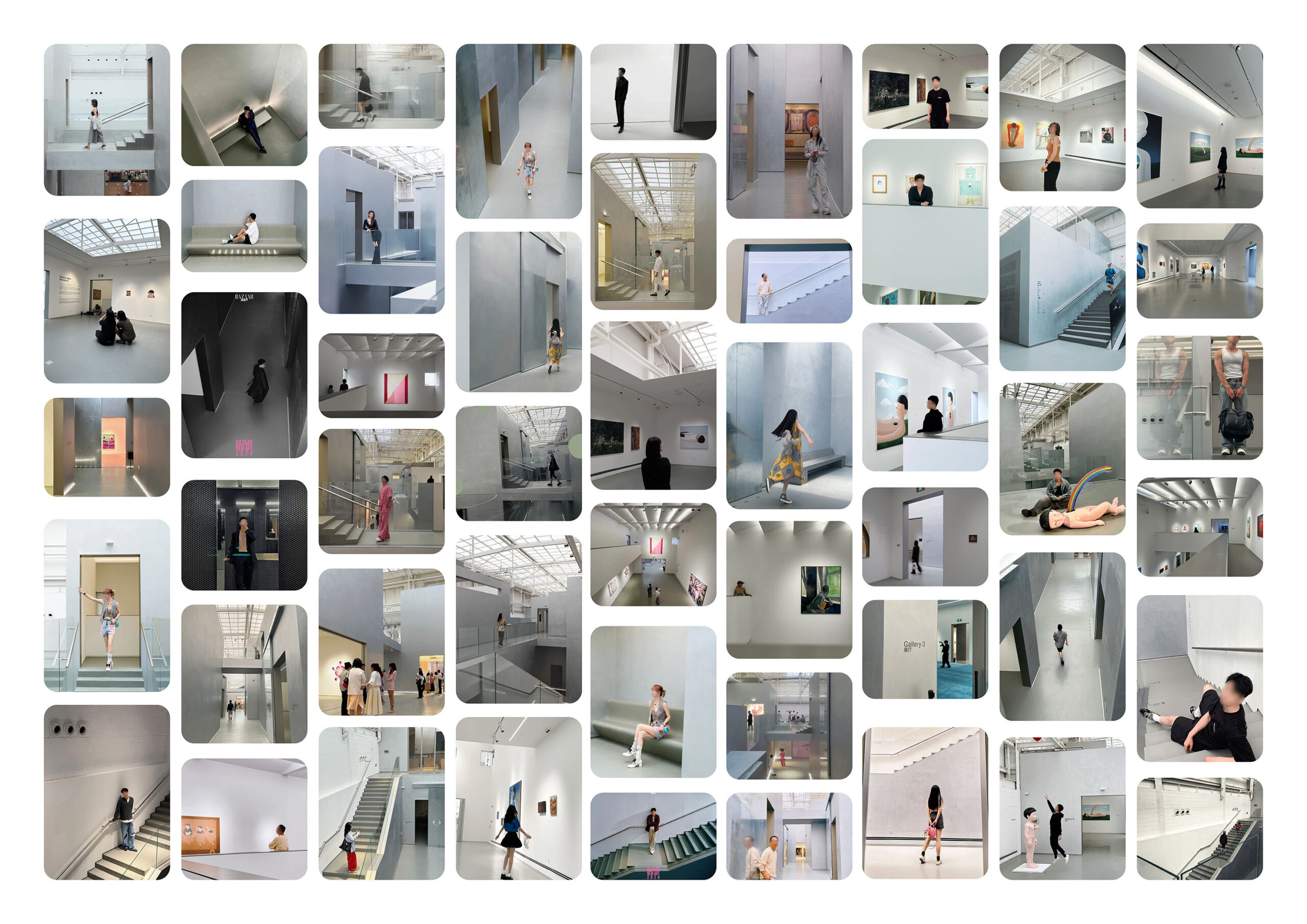
来訪者の個々の印象が集積して形成される、美術館の空間イメージ © Studio NOR
©︎ Songkai Liu
©︎ Songkai Liu
©︎ Tianzhou Yang
©︎ Songkai Liu
©︎ Tianzhou Yang
©︎ Songkai Liu
©︎ Tianzhou Yang
©︎ Songkai Liu
©︎ Tianzhou Yang
©︎ Songkai Liu
© X Museum
©︎ Tianzhou Yang
©︎ Tianzhou Yang
©︎ Songkai Liu
©︎ Tianzhou Yang
©︎ Songkai Liu
©︎ Songkai Liu
©︎ Songkai Liu
©︎ Songkai Liu
©︎ Tianzhou Yang
© Studio NOR
© Studio NOR
© Studio NOR
© Studio NOR
© Studio NOR
Detail Drawing © Studio NOR
以下、Studio NORのリリース(英文)です。
Project Name: X Museum
Completion Year: 2023
Gross Built Area:3000m²
Design Firm: Studio NOR
Company Website: http://www.s-nor.com/
Contact Name: Jingwen Wang
Contact e-mail: wjw@s-nor.com
Firm Location: Beijing, China
Lead Architects: Boyuan Jiang, Jingwen Wang, Shuo Yang
Lead Architects e-mail: byj@s-nor.com wjw@s-nor.com ys@s-nor.com
Project location: Langyuan Station, Beijing,ChinaAdditional Credits
Design Team: Boyuan Jiang, Jingwen Wang, Shuo Yang, Zijie He, Jin Gan, Yichen Jin, Rongqian Qiu, Chenxiao Yan, Yining Zheng
Clients: X Museum
Construction Team:
Shanghai Huamao Building Decoration Engineering Co., LtdLighting Consultant:
Studio BLRRConstruction Documents Consultant:
Shenzhen HitrusDesign
Shanghai c-yuspace Design Co.,LtdMaterial\Branding
1. Paint – TIKKURILAMedia Provider
Photo credits: Songkai Liu
Photographer’s website: www.traceimage.art
Photographer’s e-mail: Kyleliusk@gmail.com
Video link:Photo credits: Tianzhou Yang
Photographer’s e-mail: info@tjapstudio.comValley Strolling: X Museum
The Isomorphic Linked Fragments
01. A Special Design Brief
X Museum was founded by two young collectors born in the 1990s, focusing specifically on new generation of artists and multiculturalism from a young perspective. The site for its new museum is an old warehouse located in Langyuan Station, an “Internet celebrity campus” filled with creative professionals, boutique stores and trendy restaurants. The design brief requires the new museum space should not only fulfill art exhibition needs, but also have the flexibility to hold various events and create “Instagrammable” spatial scenarios for social media publicity. Besides exhibition galleries, the brief also listed three commercial programs as major public spaces within the musuem that can be independently operated regardless of the museum opening hours: a gift shop, a café and a restaurant. The founders’ expectation for the new museum is “a cool, comprehensive lifestyle place to embrace diverse possibilities.
X Museums’ strong willingness to embrace contemporary lifestyle and explore the future is quite special. In the past 30 years, with the diversification of the way people access to new information, museums have already changed their relationship with the visitors from “one-way education” to “two-way interaction”. The architecture of art museums has also changed from serious, self-contained “white box” stereotype to more inclusive and open spaces providing visitors with unique spatial experiences. Clearly, X Museum’s careful selection of its location and vision is trying to interweave art institutions further into the daily life of the mass public and social media popularity. This unreserved embrace of “Trend” renders the project with a Pop-style critical touch since the beginning of the design process.
02. A Renovated Old Warehouse
The red brick building where the museum is located was originally the No. 10 warehouse of the Beijing Textile Warehouse. It was built in the 1960s and was used to store cotton and other strategic supplies during the planned economy era. Small changes and renovations took place along the time until 2018, when the site underwent major changes. The original building was almost demolished, leaving only the red brick exterior facade with window openings filled by new bricks. Within this remained facade, a huge steel structure with a truss skylight roof was erected. The cavity between the old and new walls was used for mechanical conduits and pipelines. A new concrete platform was built in the middle of the new steel structure as functional space, connecting to a new outdoor egress ramp by two bridges.
When we got involved in the project, we were faced with the above-mentioned site that had been drastically renovated and mixed with traces from different times, and there are many even more radical renewal cases in Langyuan Station. On the one hand, the minimal remains of the original building reduced our pressure on historical preservation when dealing with such an industrial relic renovation project; on the other hand however, we didn’t want to blindly ignore what had already been done to the site. From the perspective of budget, sustainability and honest respect to history, we hope to keep the results of previous renovations along the way as much as possible.
03. Valley Making
The design started from section. The prior renovation resulted in the monumental new truss skylight roof to be the only natural light source, plus the linear massing and short-end main entrance location of the warehouse, we naturally associated the site with the idea of a “valley”. Since the concrete platform that occupied the entire interior did not meet the ceiling height requirements of exhibition galleries and blocked the skylight to the first floor as well as visitors’ perception of the actual scale of the site, we decided to dismantle it and keep the rest of the past renovation remnants. The programed volumes required by the museum’s design brief were arranged along the two long side walls, leaving a narrow skylit space-the “Valley”-in the middle as both a main circulation path and an exhibition space. These sectional spatial arrangements allow both the two floors to have access to the skylight, and take advantage of the powerful visual impact of the 13-meter-high floor to ceiling height. Meanwhile, the mechanical cavity from the last renovation can be kept for use by the new programmed volumes, and the “Valley” creates possibility for each exhibition gallery to be managed independently.
The programmed volumes were originally designed as independent boxes stacked together, referring to the warehouse cargo stacking. However, as the design brief was adjusted during the design process, the area needed for each program gradually increased, resulted in the boxes squeezing and merging with each other, and ultimately had to be completely connected into one. We find this merging process is quite similar to geological changes that echoes the “Valley” concept. Therefore, while maintaining the sectional strategy unchanged, we “allowed” the formal independency of the boxes to degrade to only hinted by a few subtly tilted walls. Thus, the programed volumes on both sides of the “Valley” became continuous intriguing “mountain rocks” composed of many originally independent fragments. There is no spatial hierarchy among these isomorphic forms, they are different yet mixed into one. It’s not easy for visitors to capture an overall image or representative angle of the museum space, but the homogeneity of materials and forms of the linked fragments can still present a certain vaguely unified spatial experience.
The binary division of the “Valley” and the “Mountain Rocks” creates a new spatial layering of “outside” and “inside” within the interior, and metaphorically juxtapose the experience that visitors will have in X Museum to one would experiencing in a real valley in the nature – not unlike the metaphorical narrative adopted by traditional Chinese gardens and paintings: the lobby, a double-height open atrium for events and large installations, is the “lake” that one have to cross to enter the “Valley”; the staff office on top of Gallery No.3, as the highest volume in the whole museum, is the “peak” of the “mountains”; six galvanized steel sliding doors – the highest being 8 meters tall – hanging on special warehouse gate tracks, are “waterfalls”. After entering the “Valley”, visitors will shuttle back and forth between the “valley” and the “mountain” via a series of apertures, stairs and bridges. Although meandering in an interior space, the spatial experience is like that of an outdoor environment.04. Hanging Frames
The client clearly required us to design a “more noisy” facade in order to attract public in the visually overload Langyuan Station campus, which filled with exaggerated facade designs. This request reminded us of the “Salon Hang”, an exhibition display style originated from the Paris Salon, featuring with layers of crowded paintings on a wall, competing to show off themselves for public attention – essentially transforming a gallery wall into a mass media for the artists and viewers to interact with each other. We also recalled many typologically similar forms, from traditional Chinese cliff inscriptions, temple plaques, and collection seals on scroll paintings and calligraphies, to the street billboards, the “Masonry Layouts” of webpage, and even the Danmaku subtitle of online videos. All of these communicating forms convey information of differentiated individuals in a collective way, presenting powerful visual tensions through the juxtaposition of fragments.
Therefore, we set up 13 “Frames” and 3 “Exhibition Niches” on the exterior facade to display signs, banners, graphic arts and installations, turning the street into an “outdoor gallery” for the museum to externalize its content and interact with pedestrians. The 8 “Frames” that were eventually implemented after several rounds of value engineering are concentrated on the most populated street corner of the facade. The one “Frame” on the ground floor is used as a sliding gate for vehicles and large art works to enter the building, while the rest 7 “Frames” contain LED screens, slanted mirror niches and expanded metal mesh. As for the “Exhibition Niches”, there are one protruding out and one carved into the facade, while the third and largest one being cantilevered above the southwest corner of the remaining red brick wall, consisting of two mirroring side surfaces and a LED screen ceiling. It holds a huge golden X sign as well as three mirrored reflections of the X in its inside corner. This slightly surrealist installation is both the major sign of the museum and a parody response to the many cartoonish decorative facade sculptures in the Langyuan Station campus.
As for the red brick facade-the only original industrial relic remained on site, we responded in a subtle way by attaching a new layer of glass facade outside of the first-floor brick wall as windows and doors. This layer of glass covers the openings as well as part of the brick wall, transforming the original facade into an exhibit protected in glass showcase for the pedestrians walking by, silently reminding them of the stie’s past history.05. A space for each and all
The rich forms and diverse paths of X Museum offer an ever-changing yet concise spatial experience, which provides flexibility for curators and artists, as well as possibilities for different kinds of events. Since the opening of the new building, we have been tracking the daily use status and social media exposure of the museum, and are often surprised by how creatively the curation team use the galleries and the visitors interact with certain spaces. The intricacy of the isomorphic “linked fragments” and the dynamic circulation makes our “top-down” design into a loosely structured framework allowing and even inspiring users’ spontaneous “bottom-up” interaction. This grants each visitor to find their own “favored space” according to the different state of mind each time they visit, while not feeling segregated from the overall space. This balance may also be a reflection of the entangled mentality of people trying to pursue individual independence and collective consensus at the same time in today’s society. Therefore, our ideal spatial image of the X Museum cannot be captured in a specific photo or reflected in a specific visitor’s impression, but should be the overlaid, fuzzy-edged intersection of layers of visitors’ personal experiences superimposed together.
Stepping down from the serious aloof altar, a museum is trying to attract the public, squeezing into people’s daily life, and exploring the future boundaries in a rather exuberant manner – this could not be more serious. What kind of spatial image should a physical art museum present to the younger generations? The architectural design of X Museum attempts to answer this question by offering an intimate daily life scene with an ambiguous sense of detachment and monumentality.
Studio NOR 公式サイト
https://www.s-nor.com
![[Report]第20回ヴェネチア・ビエンナーレ国際建築展 日本館展示概要発表! キュレーターは金野千恵氏、アジアの建築家らが出展](https://magazine-asset.tecture.jp/wpcms/wp-content/uploads/2026/06/16124421/20260615venezia-biennale-jp-ex2027_teco-konno_mag-endo0515-900x675.jpeg)