Study Series
Interview with Koichi Suzuno
鈴野浩一「発見と協働で発想を拓いていく」
#01 現場の感覚を次のプロセスに転換する
#02 プロダクトは発想の変換で解を探る
#03 プロジェクトは掛け算でドライブさせる
#04 外に出て別の視点を持つべし
(このページは #01 現場の感覚を次のプロセスに転換する の続き)
Study Series
Interview with Koichi Suzuno
“Developing ideas through discovery and collaboration”
# 01 Transform the sense of the field to the next process
# 02 Exploring Product Solutions by converting ideas
# 03 Drive the project by multiplication
# 04 Go outside and have a different perspective
(This page is a continuation from #01 Transform the sense of the field to the next process)
プロダクトのデザインで世界が広がる
── トラフは、これまで建築やインテリア以外に、プロダクトも多く手掛けてきました。空間デザインとの違いを、具体的に教えていただけますか?
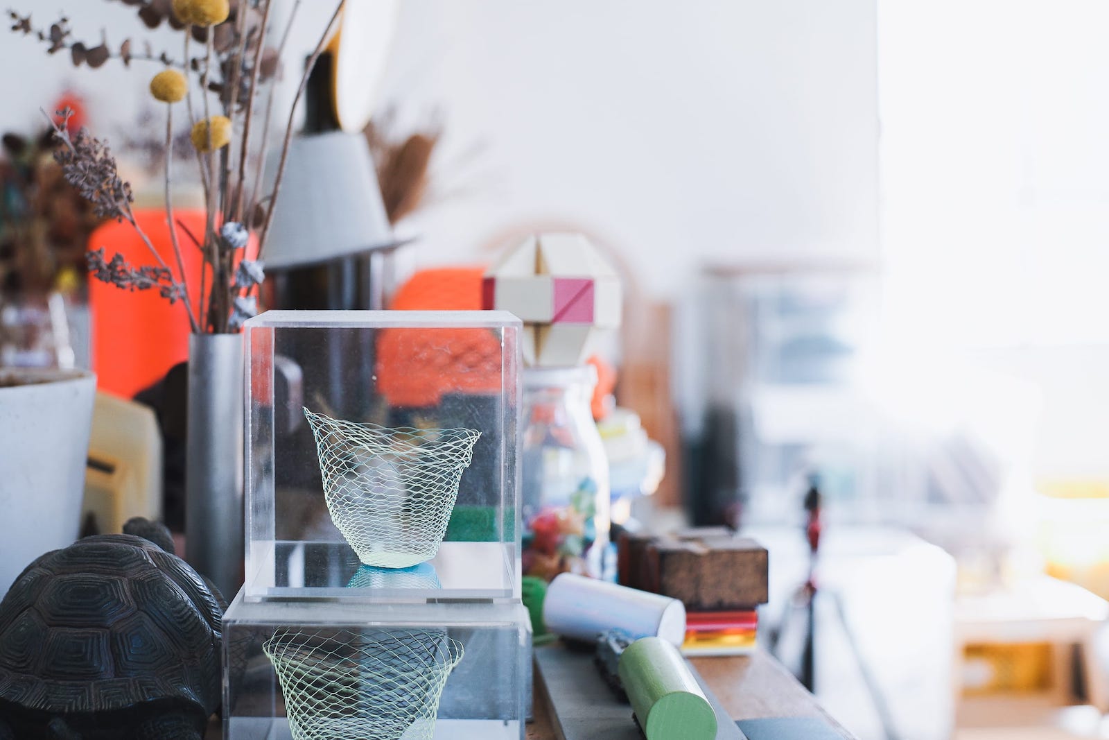
鈴野:トラフオリジナルでつくった〈空気の器〉は、福永紙工との協働プロジェクトです。
2010年に発表したので、もう10年になりますね。〈空気の器〉は色や模様のバリエーションが変えられるので、今では100パターンくらいになっています。
プロダクトは、制作した後の販売がしっかりとしていないと、なかなか続かないんですよね。
〈空気の器〉の前にも展覧会に発表するような単発のものをいくつか手掛けたのですが、職人さんとがんばってつくっても、みんなが疲弊して終わってしまう。
〈空気の器〉も、最初はギャラリーでの展示・販売というかたちだったので、大丈夫かなあと心配したんですけど。
Expanding the world through product design
─ In addition to architecture and interior design, you have worked on many products at TORAFU. Can you tell us the difference between product design and architecture / interior design?
Suzuno: TORAFU’s original <airvase> is a collaborative project with Fukunaga Print.
We launched it in 2010, so it’s been a decade now. <airvase> can be made in various colors and patterns, so now there are about 100 patterns.
It’s hard to keep selling products unless there is a sales system after they have been created.
Before <airvase>, we worked on several one-off pieces that were to be shown in exhibitions, but the artisans and we worked very hard on them, everyone just got tired of working on the project. As a result, the project could not continue.
<airvase> was initially exhibited and sold in a gallery, so we were worried about its continuity.
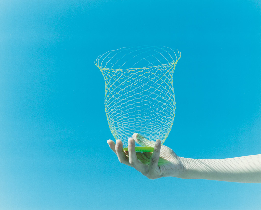
〈空気の器〉を開発したきっかけは、もともと「緑色」というお題が与えられて、紙を利用するというプロジェクトでした。僕たちは「黄色と青色から緑色をつくろう」と考えたんです。
そこに「紙って2次元だけど、建築的に3次元にしていこう」というアイデアを合わせて2つのアプローチからつくりました。
建築とは違って、自分たちで切りながら1分の1でスタディできて、そのままのサイズで販売されます。そして、毎日モノができていくという過程も、なかなか面白かったんです。
家具をつくろうとするときでも、図面を描いてモックアップができるのに1カ月はかかります。待っている間に、テンションが下がってしまったりする。
でも〈空気の器〉の場合、事務所でスタッフが黙々と「じゃあ次は1.2ミリだ」「次は1.1ミリだ」って、切り込みの間隔をどんどん変えていって。
そういった、その場で結果が得られる過程も手ごたえがありましたね。
切り込みは最初は1センチ間隔から始まって、最終的には0.9ミリ幅になりました。
もう少し切れ込みの幅が広かったり、紙が厚かったりするだけで、ペタっとつぶれちゃうんですよね。
重力と紙の可塑性がピタっと釣り合ったときに、張りと強度が出て自立する。そのとき、「あっ、できた」と思ったんです。
一方で、紙のプロダクトは自分たちでつくれてしまうぶん、「買ってくれるのだろうか?」とも感じていました。紙は毎日手に取り、捨てたりする。そういった意味で、難しくもあり、興味深くもある作業でした。
プロダクトを考えるときの「建築的な発想」っていうのも、最初から「こうやっていこう」と意識しているわけではないのですが。
この紙のプロジェクトは、半年以上にわたり、1カ月に1度デザイナーが集まって話し合い、アイデアを交換しながら、つくっていきました。
同じように特定のテーマに沿って何組かのデザイナーが関わるプロジェクトに参加したこともありますが、分かれてつくって、発表会で最終形を見せ合うようなプロジェクトもあります。
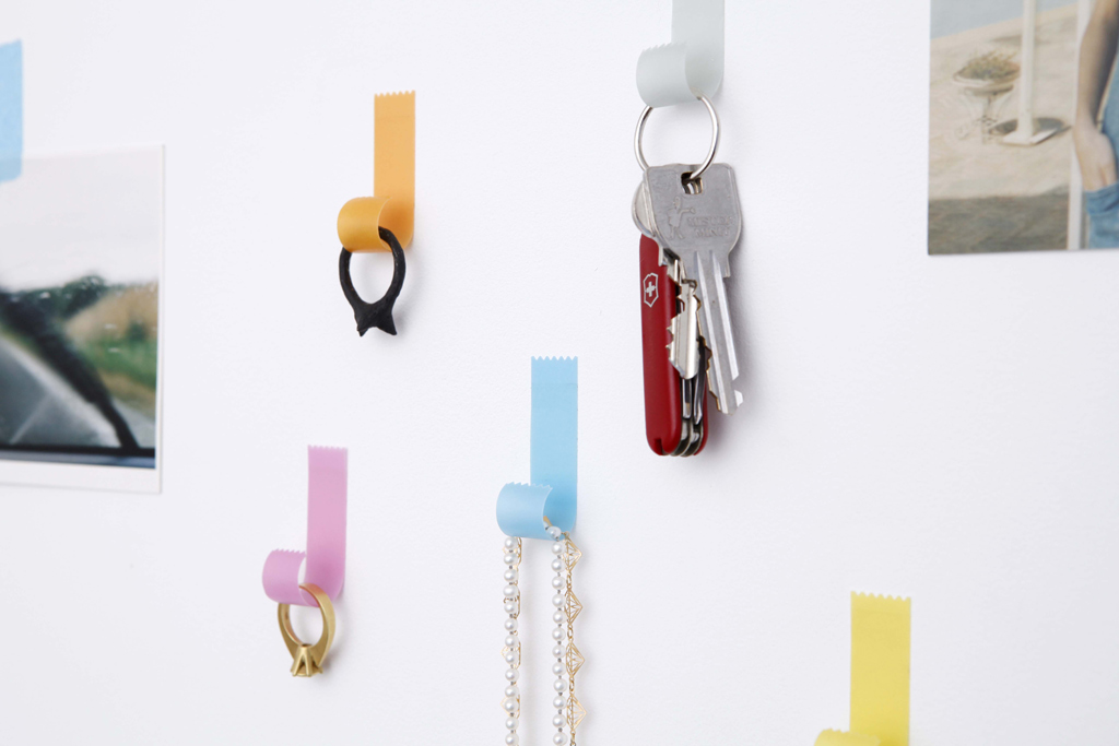
この紙のプロジェクトは好評だったので、第2弾以降もって、〈tapehook(テープフック)〉もできました。
The story behind the development of <airvase> was initially based on a project whose theme was “green”, and involved the use of paper. We thought, “Let’s make a green color from yellow and blue,” and that’s what we did.
And then we combined that with the idea that “paper is two-dimensional, but let’s make it three-dimensional architecturally,” and we took two approaches.
Unlike architecture, we could study the paper at a fraction of its original size while cutting it ourselves, and it would be sold at its original size. And the process of creating things every day was quite interesting.
Even when we work on furniture, it would take us a month to draw the plans and create a mock-up. While we are waiting, our motivation might go down.
But with <airvase>, our staff would sit in the office and quietly say, “Okay, next time, let’s try 1.2 mm,” “Next time, 1.1 mm,” and so on, changing the interval between cuts.
The process of getting results on the spot was advantageous.
The interval between the cuttings started at 1 cm and ended up at 0.9 mm.
If the incisions were just a little wider or the paper was thicker, it would flatten out.
When gravity and the paper’s plasticity are perfectly balanced, the paper gives strength and resistance, and it can stand on its own. That’s when we realized “we did it”.
On the other hand, since we could make paper products ourselves, we wondered if people would buy them. Paper is a daily product; we use and throw it away every day. So in that sense, it was a challenging and exciting process at the same time.
When we think of a product, we don’t always have “architectural ideas” in mind from the start.
This paper product project has been developed for more than half a year, with the designers meeting once a month to discuss and exchange ideas.
We’ve also participated in projects where several designers were involved in a specific theme. Still, there were also projects where we split up to create the project and showed each other the final product at a presentation.
This paper project was so well received that after the second project, we created <tapehook>.
プロダクトは人に見てもらって、広がっていく面白さがあります。自分たちの手を離れて、名刺代わりになって可能性が大きくなっていくというか。
〈空気の器〉は京都でインスタレーションをしたり、中国やイスタンブール、スイスでもインスタレーションを開催してくれたりと、ふわふわと世界のいろんなところに行ったりしました。
いまだにクリエイターからコラボレーションしたいと言ってもらったり、ミュージアムでオリジナルの〈空気の器〉をつくりたいという話をもらったりしています。
What we find interesting about products is that they have the possibility to spread out our connection with people who choose our products. They leave our hands and become a substitute for our business cards, and their potential grows.
We held an installation of <airvase> in Kyoto, and also people in China, Istanbul and Switzerland invited us for the installations, and <airvase> traveled to many places around the world.
Even today, we still receive inquiry from creators who want to collaborate with us, and we have been asked to create original <airvase> for museums.

経年変化をプロダクトにも持ち込む
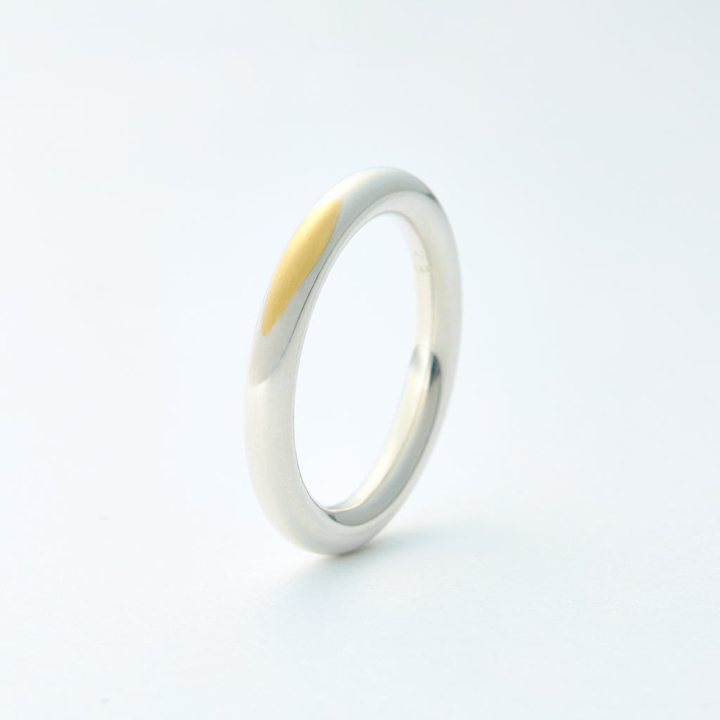
鈴野:〈gold wedding ring k18〉は、「ギャラリードゥポワソン」というジュエリーギャラリーの依頼を受けてつくった結婚指輪です。いまだに人気があるようです。
指輪って本当にいろんな種類とデザインがあるんですけど、そのなかでも結婚指輪をデザインしてほしい、という依頼でした。
そこで、「結婚とはなんだろう?」というところから、結婚指輪をする意味を「2人が共有する時間を可視化するようなものだな」「結婚指輪を着けてから、2人の家をつくったりするので、もしかしたら建築よりも長いんじゃないか?」などと考えて、「時間」をテーマにしました。
建築でも時間を考えると、引き渡したときがベストではなく、経年変化していけるのが価値だと思っています。
そういう「キズ」という点で、金のリングに銀メッキをして、エイジングで金が出てくるのが楽しみになる、というプロダクトを実現しました。
Bringing aging into products as well
Suzuno: <gold wedding ring k18> is a wedding ring that we were commissioned to make for a jewelry gallery called gallery deux poissons. It seems that it is still very popular.
There are so many different types and designs of rings, but we were asked to design a wedding ring among them.
So we asked ourselves, “What is marriage?” From that point on, the meaning of wearing a wedding ring, “It’s like visualizing the time you two share,” and “You wear your wedding ring, and then you build a house together, so maybe it’s longer than building?” and so on.
In architecture as well, when you think about time, the value of a product is not that it’s best when it’s delivered, but that it can change over time. With that in mind, we created a gold ring with a silver-plated finish, so that people can look forward to seeing the gold come out of it as it ages.
「自分だったらどういうものがいいかな」「シルバーか、金のシンプルなものがいいかな。だったら人と違うものにしたいな」と、お題のように自分で問いをつくって、シンプルなアイデアで解決できたらいいなと考えています。
それは建築やインテリアも同じで、発想を変えるところからつくっていく。これは、プロダクト的な考え方であったりしますね。
We asked ourselves, “What would we want?” “Something simple, like silver or gold. Then we want to do something different,” and we think it would be great to ask ourselves questions like the theme and solve them with simple ideas.
It’s the same with architecture and interior design: you have to start by changing the way you think. This can be a product-like way of thinking.
発想を変換してアップサイクルする
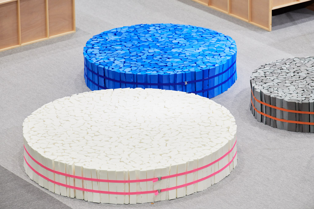
鈴野:〈もこもこソファ〉や〈SPONGE STOOL〉は、「アップサイクル展」(註:インテリアライフスタイルリビング2019特別展示「アップサイクルって何?」展)で発表しました。
三和化工という発泡材のメーカーを見学したとき、ビート板などをつくる際に出る端材の断面がきれいだなと思ったんです。
そこで、バラバラな端材の断面を切って、結わえて束ねただけのベンチみたいなソファにしました。これが〈もこもこソファ〉で、試験もして人が載っても大丈夫です。
Convert and upcycle your ideas
Suzuno: <MOKOMOKO SOFA> and <SPONGE STOOL> are parts of the “Upcycle Exhibition” (Note: IFFT Interior Lifestyle Living 2019 special exhibition “What is upcycling? ).
When we visited Sanwa Kako, a manufacturer of foam materials, we thought the cross-sections of the scrap pieces of foam that are produced when making things like swimming kickboard were beautiful.
So we cut sections of the scraps, tied them together, and bound them together to make a sofa that resembles a bench. This is <MOKOMOKO SOFA>, and it was tested and can be used by people.
そして、このポリエチレン樹脂からつくる発泡素材を、オリジナルの配色で混ぜて熱圧着することで「カラーポリモック」という材料も開発しました。ディレクションとデザインを担当しています。
「カラーポリモック」のサンプルと一体となったカタログもつくり、クッションなどのプロダクトもつくりました。
スツールにしたのが〈SPONGE STOOL〉です。
We also developed a material called “COLOR POLYMOCK” by mixing this foam material from polyethylene resin with the original color scheme and thermo-compression. We are in charge of direction and design.
We also created a catalog with “COLOR POLYMOCK” samples and cushions and other products.
<SPONGE STOOL> is a stool made from “COLOR POLYMOCK.”
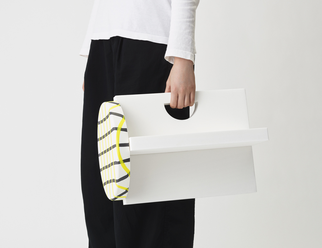
〈SPONGE STOOL〉は全部がスポンジで軽く、同じ素材なのに圧縮率の違いで固くなったり、柔らかくなったりします。
座面のチェック模様は印刷ではなくて、色の異なるスポンジにスポンジを重ねて圧縮しているので、面白い歪みになったりするんですよね。
「アップサイクル展」への出展を機に、「発想を変える」という考えがより強いものになりました。
リサイクルだと、プラスチックなどでもせっかく元々の形状のものがあるのに、溶かしてまたゼロからつくっている。そうではなくて、「こうしただけで使えるよ」みたいなことだったり、逆にもっといいものになったり、そこから別の方向へと発展するのはいいなと思います。
1回溶かして材料に戻して、というリサイクルではなく、アップサイクルは発想で変換してしまう。そういうものはすごく好きです。
日本ではまだ、あまりなじみがないんですけどね。
<SPONGE STOOL> is all sponge and light, and even though it’s the same material, it becomes harder or softer depending on the compression rate.
The checkered pattern on the seat surface is not printed but is made by compressing sponges on top of each other using different colored sponges, which creates exciting distortions.
Our participation in the “Upcycling exhibition” reinforced the idea of “changing the way,” we think.
There are plastics and other materials that have their original shape when it comes to recycling, but they have to be melted down and made again from scratch. It’s good to see how a product can be used simply by doing this, or conversely, how it can be made into something better, and how it can be developed in a different direction.
It’s not just recycling by melting it down and putting it back into the material once, but upcycling is a way to convert it into something new with a new idea. We like that kind of thing a lot.
In Japan, though, it’s not very common.
(Continued on #03 Drive the project by multiplication)
Study Series
Interview with Koichi Suzuno
鈴野浩一「発見と協働で発想を拓いていく」
#01 現場の感覚を次のプロセスに転換する
#02 プロダクトは発想の変換で解を探る
#03 プロジェクトは掛け算でドライブさせる
#04 外に出て別の視点を持つべし
Study Series
Interview with Koichi Suzuno
“Developing ideas through discovery and collaboration”
# 01 Transform the sense of the field to the next process
# 02 Exploring Product Solutions by converting ideas
# 03 Drive the project by multiplication
# 04 Go outside and have a different perspective
![[Interview]iF Design代表のウヴェ氏に聞く、建築と都市の2026年メガトレンド](https://magazine-asset.tecture.jp/wpcms/wp-content/uploads/2026/07/23221054/iF_AwardCeremony_2026_AwardCeremony-82-900x600.jpg)
![[Report]激変する時代の中で、建築とデザインはどう拡張するか。「iF DESIGN AWARD 2026」授賞式&最新トレンド](https://magazine-asset.tecture.jp/wpcms/wp-content/uploads/2026/07/24010304/iFDesignTrendConference26-45-900x600.jpg)
![[Report]RUI Architectsが可動モジュールを設計して松竹のアートスペースをリニューアル、柿落とし展「継承のトランジション」の会場デザインも担当](https://magazine-asset.tecture.jp/wpcms/wp-content/uploads/2026/07/24141011/20260713shutl_press11-01309-c-900x629.jpeg)
![[Interview]BIM図面審査がスタート! さまざまな設計者のニーズに応えるVectorworksによる「限界のないデザイン」の世界](https://magazine-asset.tecture.jp/wpcms/wp-content/uploads/2026/07/13084316/rinterview_vectorworks_056-e1784200974912-900x555.jpg)